Rate my handwriting

✨ Upload a sample of your handwriting, and our 🤖 AI will give you
the scoop on
what's awesome
and what could use a
little improving.
It's just for fun - and totally free! Try now 🚀
(You can also check out today's 👑 Leaderboard 👇)
The Friendly Font
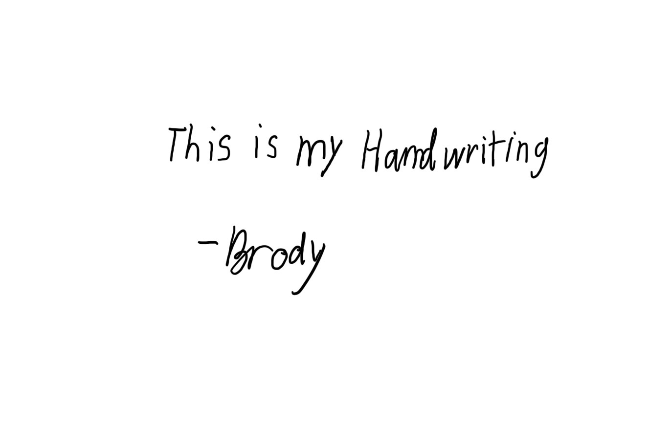
The handwriting sample reveals an approachable and enthusiastic individual, with a friendly nature, who could benefit from practicing consistency in letter size and spacing.
The handwriting sample displays a simple, unpretentious style. The letter forms are rounded, as seen in the 'o' and 'd' of "Brody," with a noticeable forward slant. The baseline is relatively stable, suggesting a steady hand, although there is some variability in letter size, particularly between the uppercase 'H' and the lowercase letters. The overall impression is neat but informal, with a clear separation between words. The loops on the 'y' in "my" and "Brody" are elongated, adding a touch of flair.
This handwriting suggests someone who is approachable and easygoing. The rounded forms indicate a friendly nature, while the forward slant points to enthusiasm and a willingness to engage with the world. The clear word separation and relatively neat appearance suggest someone organized and thoughtful, but not overly concerned with perfection. The elongated loops could indicate a desire for attention or a creative streak.
To improve your handwriting, focus on maintaining a consistent letter size and spacing. Practice writing slowly and deliberately to develop more uniform strokes. Pay attention to the pressure you apply to the pen, as this can affect the overall appearance of your handwriting. Experiment with different pen types to find one that suits your style and allows for greater control.
Legibility
Expressiveness
Consistency
Overall
Leaderboard for Tuesday, 28 October 2025
| 1 | The Calligrapher |
83
|
| 2 | The Elegant Calligrapher |
82
|
| 3 | Flourishing Calligrapher |
77
|
| 4 | The Calligrapher |
77
|
| 5 | The Flowing Stream |
74
|
| 6 | The Fluid Calligrapher |
71
|
| 7 | The Inspirational Calligrapher |
70
|
| 8 | The Student's Lament |
70
|
| 9 | The Pragmatic Pupil |
68
|
| 10 | The Flourishing Individual |
68
|
| 11 | The Jolly Optimist |
68
|
| 12 | The Mario Manifesto |
68
|
| 13 | The Perfectionist's Primer |
67
|
| 14 | The Diligent Calligrapher |
67
|
| 15 | The Considerate Soul |
67
|
| 16 | The Reflective Student |
67
|
| 17 | The Elegant Calligrapher |
66
|
| 18 | The Divine Calligrapher |
66
|
| 19 | The Upright Pen |
65
|
| 20 | The Concerned Guardian |
65
|
| 21 | The Pharmacist's Note |
65
|
| 22 | The Analytical Alchemist |
65
|
| 23 | The Advocate's Quill |
65
|
| 24 | The Grid Writer |
65
|
| 25 | The Flowing Quill |
64
|
| 26 | The Historian's Hand |
64
|
| 27 | The Educated Executive |
63
|
| 28 | The Diligent Diarist |
63
|
| 29 | The Flourishing Enigma |
63
|
| 30 | The Gridiron Enthusiast |
63
|