Rate my handwriting

✨ Upload a sample of your handwriting, and our 🤖 AI will give you
the scoop on
what's awesome
and what could use a
little improving.
It's just for fun - and totally free! Try now 🚀
(You can also check out today's 👑 Leaderboard 👇)

The Curious Case of the Looping Letters
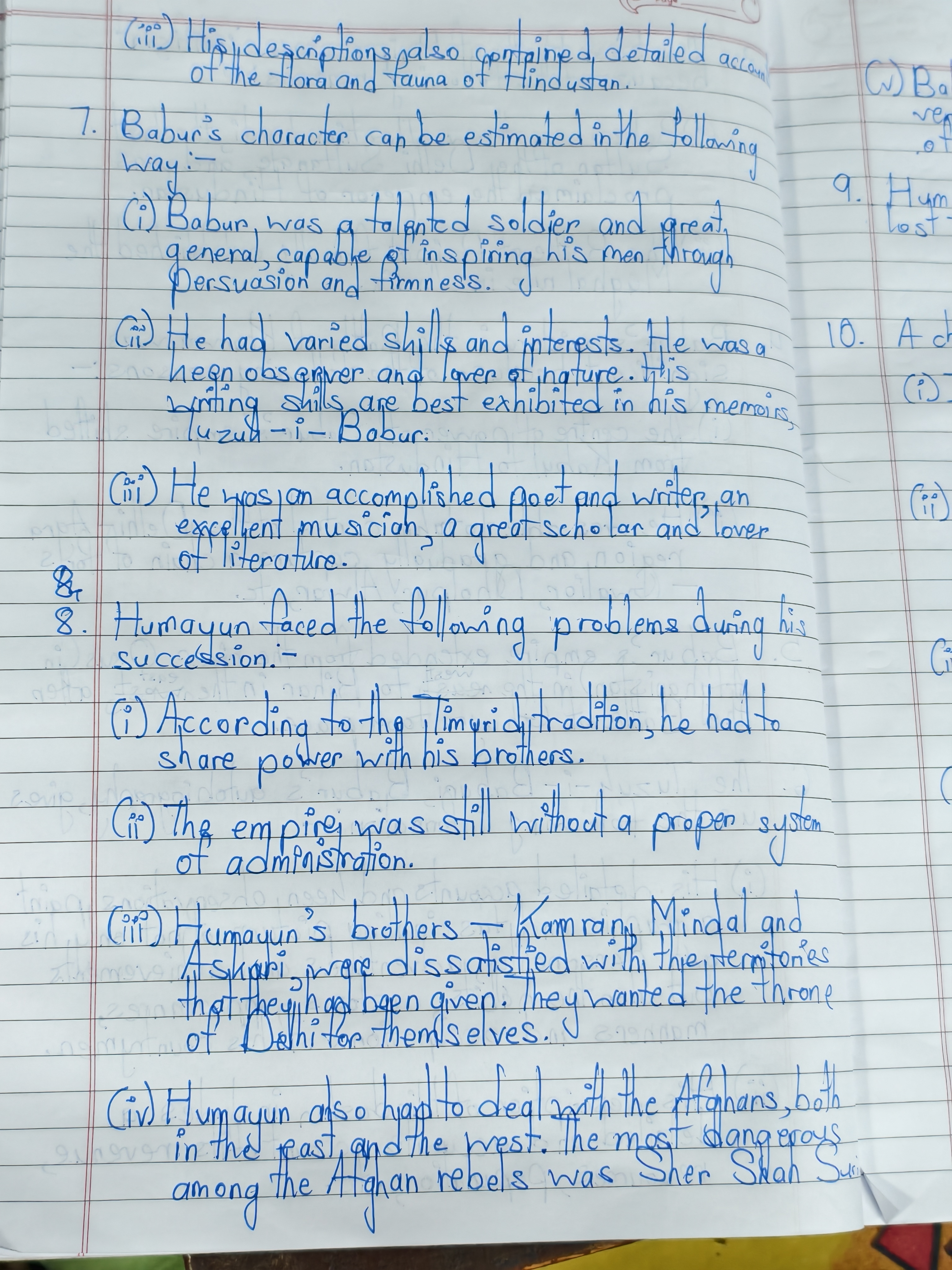
This handwriting is a neat and thoughtful blend of cursive and print, hinting at a structured yet expressive personality. Improving letter differentiation and flow would enhance legibility and inject even more personality.
The handwriting presents as a blend of cursive and print, with a slight rightward slant. The letter formations are generally rounded, for example the 'o's and 'a's, with some letters like 'g' and 'y' featuring pronounced lower loops. The writing has a moderate degree of fluency, although there are instances where the flow seems to pause, particularly noticeable in words with multiple strokes. Spacing between words is consistent. Overall, the handwriting is quite neat, showing attention to form and structure, even though it can appear slightly cramped in places. The legibility is reasonably good, although some letter distinctions, like 'n' and 'u', could be clearer.
Based on these characteristics, the writer might possess a personality that values structure and clarity, yet also appreciates a touch of flair and creativity, as suggested by the looped descenders. They likely approach tasks with a thoughtful and deliberate manner, reflected in the moderate pace and careful letter formation. The consistency in spacing indicates a considerate nature, while the slight rightward slant hints at a friendly and approachable demeanor. A desire for expression and individuality could be inferred from the blend of styles.
To improve legibility, focusing on differentiating letters with similar forms (like 'n' and 'u') would be beneficial. Practicing letter connections to enhance fluency could also create a more effortless flow. While neatness is a strength, exploring slightly more open letterforms might introduce a greater sense of ease and personality into the handwriting. Finally, maintaining consistent letter sizes will improve the overall uniformity.
Legibility
Expressiveness
Consistency
Overall
Leaderboard for Monday, 03 November 2025
| 1 | The Studious Storyteller |
74
|
| 2 | The Guitar Breaker's Hand |
74
|
| 3 | The Bold Type |
74
|
| 4 | The Geometer's Script |
72
|
| 5 | The Atomic Note-Taker |
71
|
| 6 | The Spirited Signature |
70
|
| 7 | The Upright Citizen |
68
|
| 8 | The Signature's Secrets |
68
|
| 9 | The Minimalist's Hand |
68
|
| 10 | The Patriot's Quill |
68
|
| 11 | The Open Doorway |
68
|
| 12 | The Refined Quill |
67
|
| 13 | The Upward Slant |
67
|
| 14 | The Scientific Mind |
67
|
| 15 | The Geometric Hand |
66
|
| 16 | The Pragmatic Pen |
65
|
| 17 | The Diligent Geographer |
65
|
| 18 | The Earnest Note-Taker |
65
|
| 19 | The Meticulous Minimalist |
65
|
| 20 | The Blue Alchemist |
65
|
| 21 | The Artful Calligrapher |
64
|
| 22 | The Pragmatic Planner |
64
|
| 23 | The Forthright Penman |
64
|
| 24 | The Artistic Calligrapher |
64
|
| 25 | The Articulate Instructor |
64
|
| 26 | The Inky Inventor |
63
|
| 27 | The Flowing Poet |
63
|
| 28 | The Curious Linguist |
63
|
| 29 | The Pragmatic Narrator |
63
|
| 30 | The Pragmatist's Penmanship |
62
|