Rate my handwriting

✨ Upload a sample of your handwriting, and our 🤖 AI will give you
the scoop on
what's awesome
and what could use a
little improving.
It's just for fun - and totally free! Try now 🚀
(You can also check out today's 👑 Leaderboard 👇)
The Determined Teen
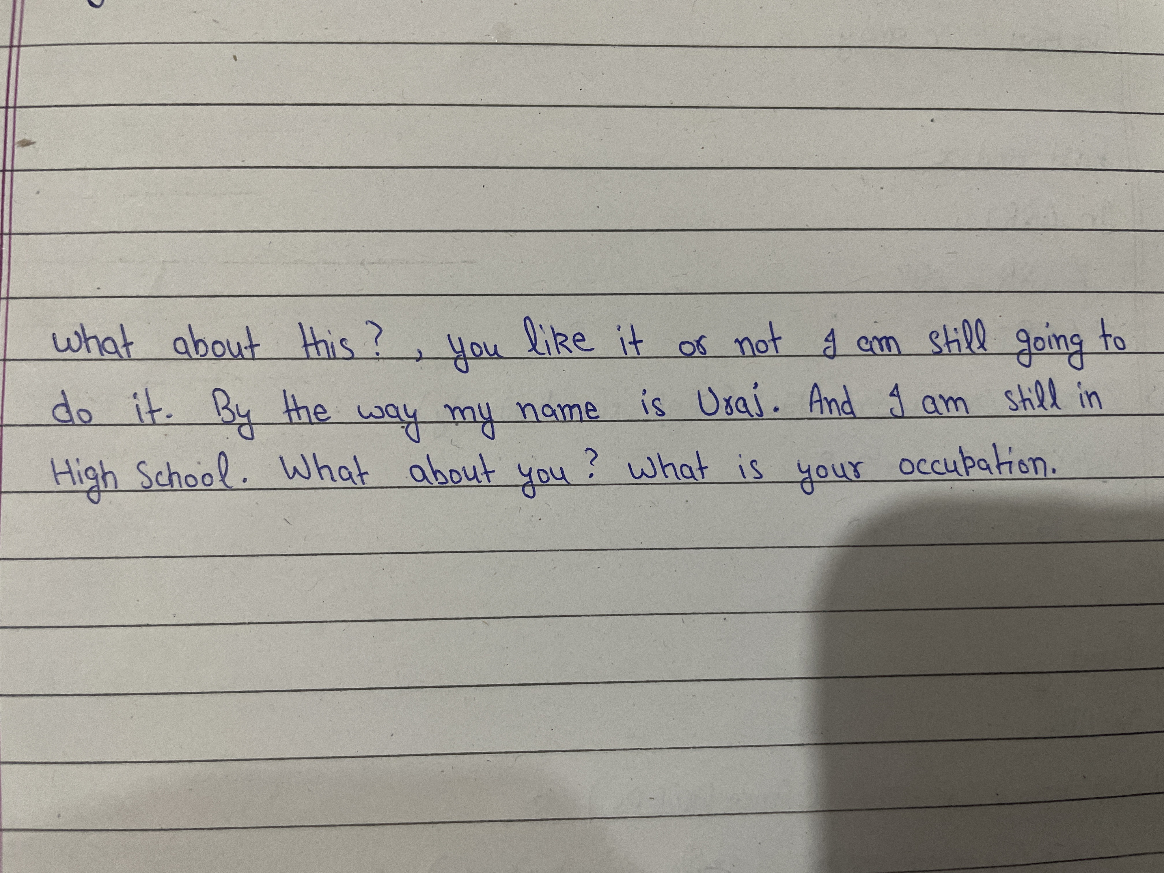
This handwriting suggests a determined and inquisitive individual with a clear sense of self, whose slightly inconsistent script hints at an independent spirit. Improving the spacing between words and letters, and practicing consistent letter formation, could enhance legibility.
This handwriting sample presents a style that is generally legible and consistent, with a few notable quirks. The letters are neatly formed, for example in words like "about" and "this", and maintain a fairly uniform size and slant. The baseline is relatively straight, adhering closely to the ruled lines of the paper. This adherence to the lines, along with the consistency in letter formation, speaks to a desire for order and structure. The slightly irregular spacing between words, such as between "you" and "like", hints at an independent streak, someone who follows their own rhythm. There's a youthful energy in the quick, connected strokes.
This handwriting suggests a personality that is both determined and inquisitive. The assertive statement, "I am still going to do it," combined with the questions about the reader, implies a curious mind that is not easily swayed by external opinions. The neatness and consistency of the writing indicate a methodical approach to tasks, while the slight irregularities suggest a touch of rebelliousness or independence. The overall impression is of a young person with a clear sense of self and a drive to pursue their goals, regardless of others' opinions. The consistent slant of the handwriting to the right further reinforces this sense of forward momentum and a focus on the future.
While the handwriting is generally legible, there's room for improvement in the spacing between words and letters. Some words, like "occupation," are slightly cramped, while others are more spread out. Paying more attention to consistent spacing would enhance the overall neatness and readability. Additionally, while the quick strokes contribute to the youthful energy of the writing, slowing down slightly and focusing on the formation of certain letters, particularly ascenders and descenders (like 'h' and 'g'), could further improve clarity. Practicing consistent letter formation, especially in words with double letters like 'still', could also be beneficial.
Legibility
Expressiveness
Consistency
Overall
Leaderboard for Tuesday, 28 October 2025
| 1 | The Calligrapher |
83
|
| 2 | The Elegant Calligrapher |
82
|
| 3 | Flourishing Calligrapher |
77
|
| 4 | The Calligrapher |
77
|
| 5 | The Flowing Stream |
74
|
| 6 | The Fluid Calligrapher |
71
|
| 7 | The Inspirational Calligrapher |
70
|
| 8 | The Student's Lament |
70
|
| 9 | The Pragmatic Pupil |
68
|
| 10 | The Flourishing Individual |
68
|
| 11 | The Jolly Optimist |
68
|
| 12 | The Mario Manifesto |
68
|
| 13 | The Perfectionist's Primer |
67
|
| 14 | The Diligent Calligrapher |
67
|
| 15 | The Considerate Soul |
67
|
| 16 | The Reflective Student |
67
|
| 17 | The Elegant Calligrapher |
66
|
| 18 | The Divine Calligrapher |
66
|
| 19 | The Upright Pen |
65
|
| 20 | The Concerned Guardian |
65
|
| 21 | The Pharmacist's Note |
65
|
| 22 | The Analytical Alchemist |
65
|
| 23 | The Advocate's Quill |
65
|
| 24 | The Grid Writer |
65
|
| 25 | The Flowing Quill |
64
|
| 26 | The Historian's Hand |
64
|
| 27 | The Educated Executive |
63
|
| 28 | The Diligent Diarist |
63
|
| 29 | The Flourishing Enigma |
63
|
| 30 | The Gridiron Enthusiast |
63
|