Rate my handwriting

✨ Upload a sample of your handwriting, and our 🤖 AI will give you
the scoop on
what's awesome
and what could use a
little improving.
It's just for fun - and totally free! Try now 🚀
(You can also check out today's 👑 Leaderboard 👇)
The Philosophical Pen
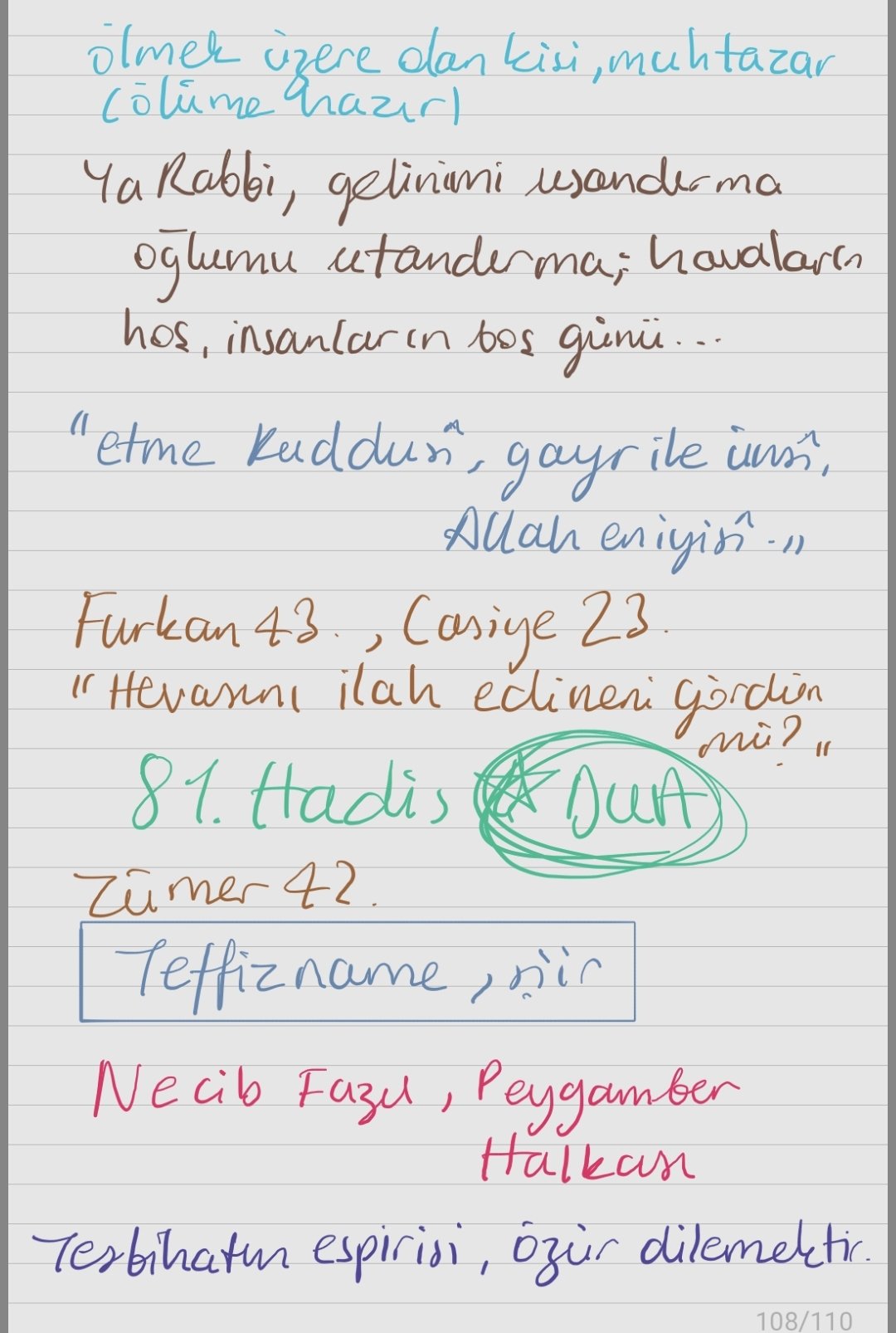
The handwriting is a mix of clarity and expressiveness, suggesting a thoughtful individual who could benefit from more consistent spacing and letter formations. The sample is largely legible, demonstrating an above-average style.
The handwriting presents a blend of cursive and print styles, with a slight rightward slant. Letter formations are generally clear, though some inconsistencies are noted, for example the 'g' in 'günü' compared to 'gördün'. The spacing between words varies, creating a somewhat uneven rhythm. The size of the writing is fairly consistent, but there's a slight pressure variation, observable in the thickness of the strokes.
This handwriting suggests a thoughtful and expressive individual. The mix of cursive and print might indicate adaptability and a desire to communicate clearly. The rightward slant could imply a warm and outgoing nature, while the variable word spacing might reflect a mind that occasionally races ahead. The individual appears to be detail-oriented, as evidenced by the generally neat letter formations, but perhaps also prone to occasional lapses in concentration.
To improve, focus on maintaining consistent spacing between words. Practicing letter formations, especially those that appear less uniform (like the 'g'), can enhance legibility. Paying attention to consistent pressure can add to the overall harmony of the handwriting, giving it a more polished appearance.
Legibility
Expressiveness
Consistency
Overall
Leaderboard for Sunday, 26 October 2025
| 31 | The Diligent Student |
53
|
| 32 | The Steadfast Student |
53
|
| 33 | The Architect of Letters |
53
|
| 34 | The Flowing River |
53
|
| 35 | The Approximator's Script |
52
|
| 36 | The Optimistic Loopist |
51
|
| 37 | The Provocateur's Quill |
51
|
| 38 | The Visionary's Script |
51
|
| 39 | The Pragmatic Penman |
47
|