Rate my handwriting

✨ Upload a sample of your handwriting, and our 🤖 AI will give you
the scoop on
what's awesome
and what could use a
little improving.
It's just for fun - and totally free! Try now 🚀
(You can also check out today's 👑 Leaderboard 👇)
The Impressionist
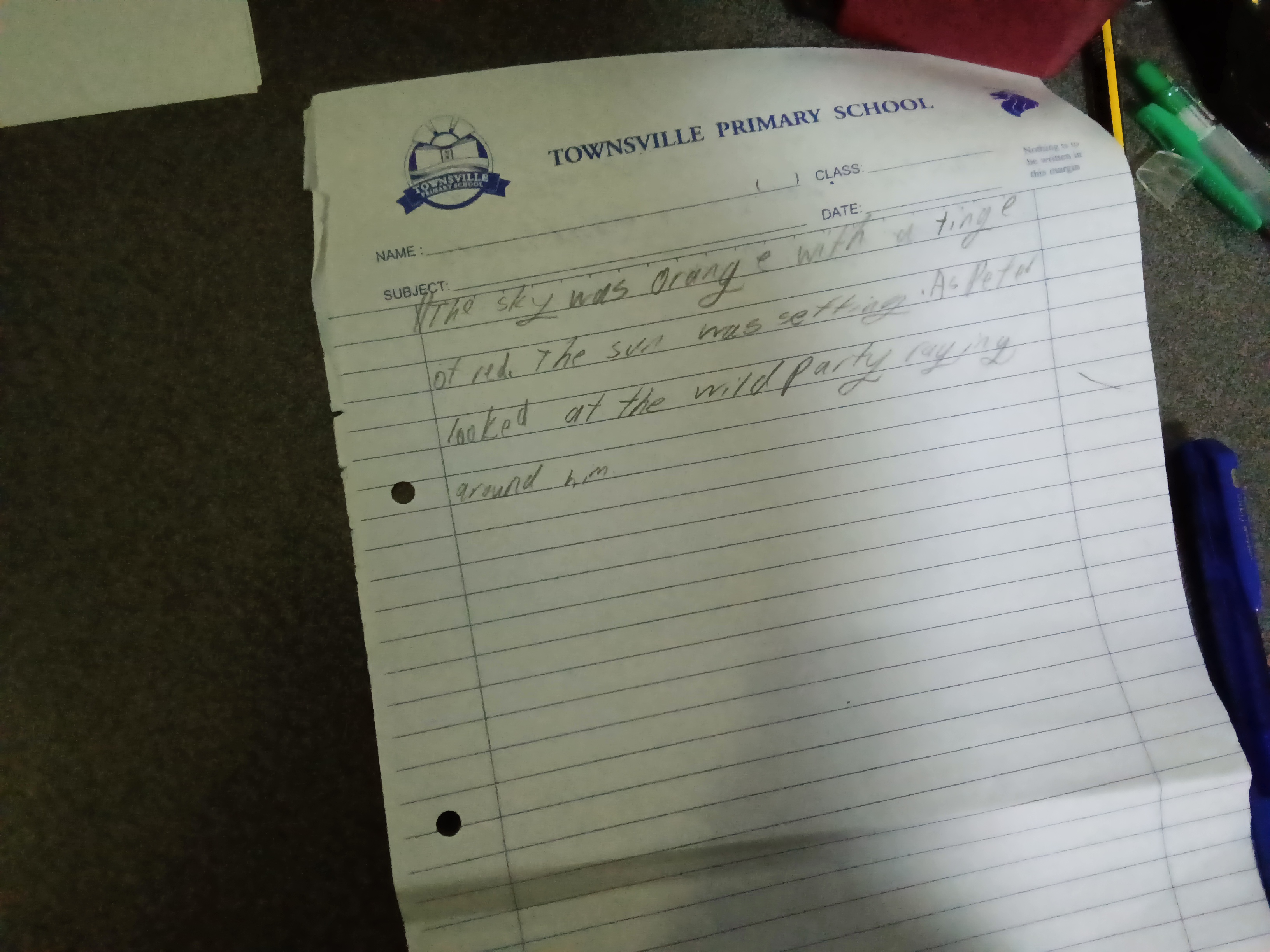
This handwriting indicates a thoughtful and expressive individual with a balanced approach to emotions and logic. Improvements in consistency and letter formation could enhance the handwriting's legibility and visual appeal.
The handwriting presents as a cursive style, though not fully joined, with a mixture of rounded and angular forms. The baseline is mostly steady, but there is a slight upward slant towards the end of some lines, suggesting a degree of optimism or ambition. The letter size is moderate and relatively consistent, though there is some variation. The pressure appears light to medium, which can be seen in the thin strokes of letters like 'e' and 't'. The writing speed seems moderate, based on the overall flow and rhythm. The loops in letters like 'g' and 'y' are somewhat closed, indicating a degree of introspection.
Based on the handwriting, the individual might be characterized as someone who is thoughtful and expressive, yet also grounded and practical. The mix of rounded and angular forms suggests a balance between emotional sensitivity and logical thinking. The relatively consistent letter size and spacing indicate a desire for harmony and order in their environment. The slight upward slant suggests a positive outlook, while the closed loops indicate a degree of caution or reserve.
To improve legibility, try focusing on consistent letter formations and spacing. Practicing drills to connect letters more fluidly could enhance the overall flow of the handwriting. Experimenting with different pen grips and paper surfaces might also help to achieve a more consistent pressure and line quality. Paying attention to the alignment of letters on the baseline could further improve the visual appeal and readability of the handwriting.
Legibility
Expressiveness
Consistency
Overall
Leaderboard for Monday, 27 October 2025
| 31 | The Quill of Conviction |
62
|
| 32 | The Forthright Font |
61
|
| 33 | The Flowing Script |
61
|
| 34 | The Agile Artisan |
61
|
| 35 | Coastal Rhapsody |
60
|
| 36 | The Diplomat's Quill |
60
|
| 37 | Coastal Contemplations |
59
|
| 38 | The Curious Chemist |
59
|
| 39 | The Elaborate Chronicler |
58
|
| 40 | The Idealist's Cursive |
58
|
| 41 | The Grand Calligrapher |
58
|
| 42 | The Practical Notetaker |
58
|
| 43 | The Deliberate Doodler |
57
|
| 44 | The Advocate's Quill |
56
|
| 45 | The Considerate Confidant |
56
|
| 46 | The Fantastical Dreamer |
56
|
| 47 | The Hurried Healer |
55
|
| 48 | The Principled Pen |
54
|
| 49 | The Eloquent Essayist |
54
|
| 50 | The Diligent Note-Taker |
53
|
| 51 | Neptune's Prose |
53
|
| 52 | The Gentle Leaning Tower |
53
|
| 53 | The Coastal Contemplator |
53
|
| 54 | The Flourishing Academic |
53
|
| 55 | The Aspiring Typesetter |
53
|
| 56 | The Introspective Historian |
52
|
| 57 | Celestial Notes |
52
|
| 58 | The Ambitious Note-Taker |
52
|
| 59 | The Pragmatic Note-Taker |
52
|
| 60 | The Energetic Author |
51
|