Rate my handwriting

✨ Upload a sample of your handwriting, and our 🤖 AI will give you
the scoop on
what's awesome
and what could use a
little improving.
It's just for fun - and totally free! Try now 🚀
(You can also check out today's 👑 Leaderboard 👇)
The Practical Penman
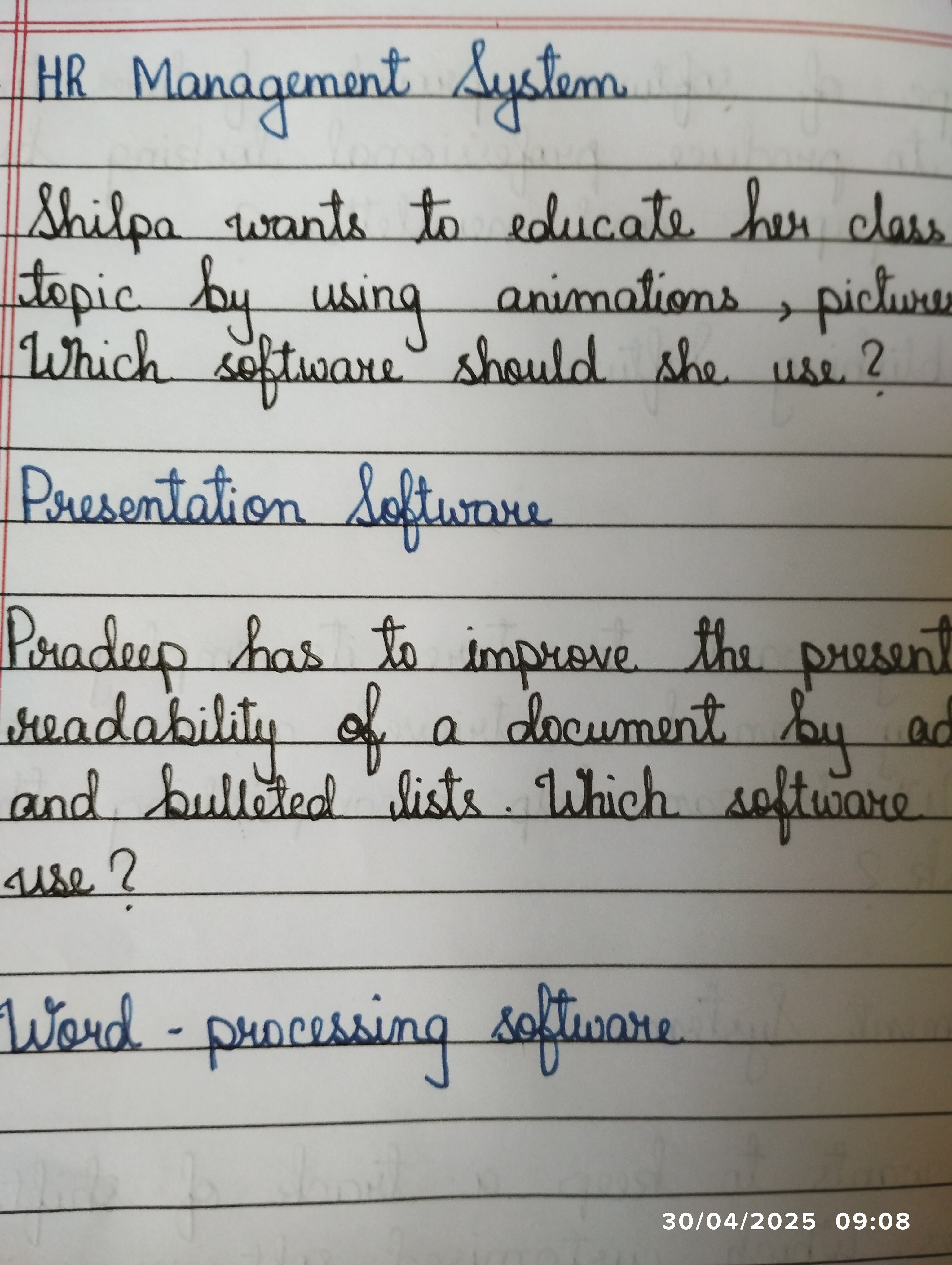
This is a practical and legible handwriting style that would benefit from some attention to individual letterforms and connections to improve aesthetics.
This handwriting sample is generally legible and consistent, with a slight rightward slant. The letters are of medium size and fairly well-formed, although there's a tendency for some letters, like "a" and "g", to be slightly compressed. The overall impression is one of efficiency and a focus on getting the message across, as seen in phrases like "Which software should she use?".
The consistent slant and even spacing suggest someone who is organized and methodical in their approach to tasks. The practical nature of the questions indicates a focus on finding solutions and achieving specific outcomes. The slightly compressed letters could imply a desire to be concise and avoid unnecessary embellishment.
While legible, there's room for improvement in terms of overall aesthetics. Focusing on the formation of individual letters, particularly rounded letters like "a", "o", and "g", would enhance the overall appearance. Practicing connecting letters smoothly within words could improve fluency and writing speed. Lastly, ensuring consistent letter height and spacing would add to the neatness and professionalism of the writing.
Legibility
Expressiveness
Consistency
Overall
Leaderboard for Wednesday, 29 October 2025
| 31 | The Artisan's Flourish |
60
|
| 32 | The Spirited Student |
60
|
| 33 | The Global Trotter |
59
|
| 34 | The Flourishing One |
59
|
| 35 | The Flowing Hand |
59
|
| 36 | The Chromatic Calligrapher |
59
|
| 37 | Angelic Impressions |
59
|
| 38 | The Determined Hand |
58
|
| 39 | The Energetic Student |
58
|
| 40 | The Energetic Note-Taker |
58
|
| 41 | The Idealist's Italic |
57
|
| 42 | The Artful Calligrapher |
57
|
| 43 | The Neatly Ordered Lexicographer |
56
|
| 44 | The Earnest Author |
56
|
| 45 | The Diligent Biologist |
56
|
| 46 | The Scientific Hand |
54
|
| 47 | The Ponderer's Prose |
54
|
| 48 | The Spirited Soul |
54
|
| 49 | The Diligent Planner |
54
|
| 50 | The Data Architect's Italic Hand |
53
|
| 51 | The Continental Explorer |
53
|
| 52 | The Sensitive Soul's Script |
53
|
| 53 | The Diligent Note-Taker |
53
|
| 54 | The Pensive Pupil |
53
|
| 55 | The Budding Engineer |
53
|
| 56 | The Diligent Student |
53
|
| 57 | The Whirlwind Writer |
53
|
| 58 | The Biologist's Itch |
52
|
| 59 | The Studious Hand |
52
|
| 60 | Le Calligraphe Méthodique |
52
|