Rate my handwriting

✨ Upload a sample of your handwriting, and our 🤖 AI will give you
the scoop on
what's awesome
and what could use a
little improving.
It's just for fun - and totally free! Try now 🚀
(You can also check out today's 👑 Leaderboard 👇)
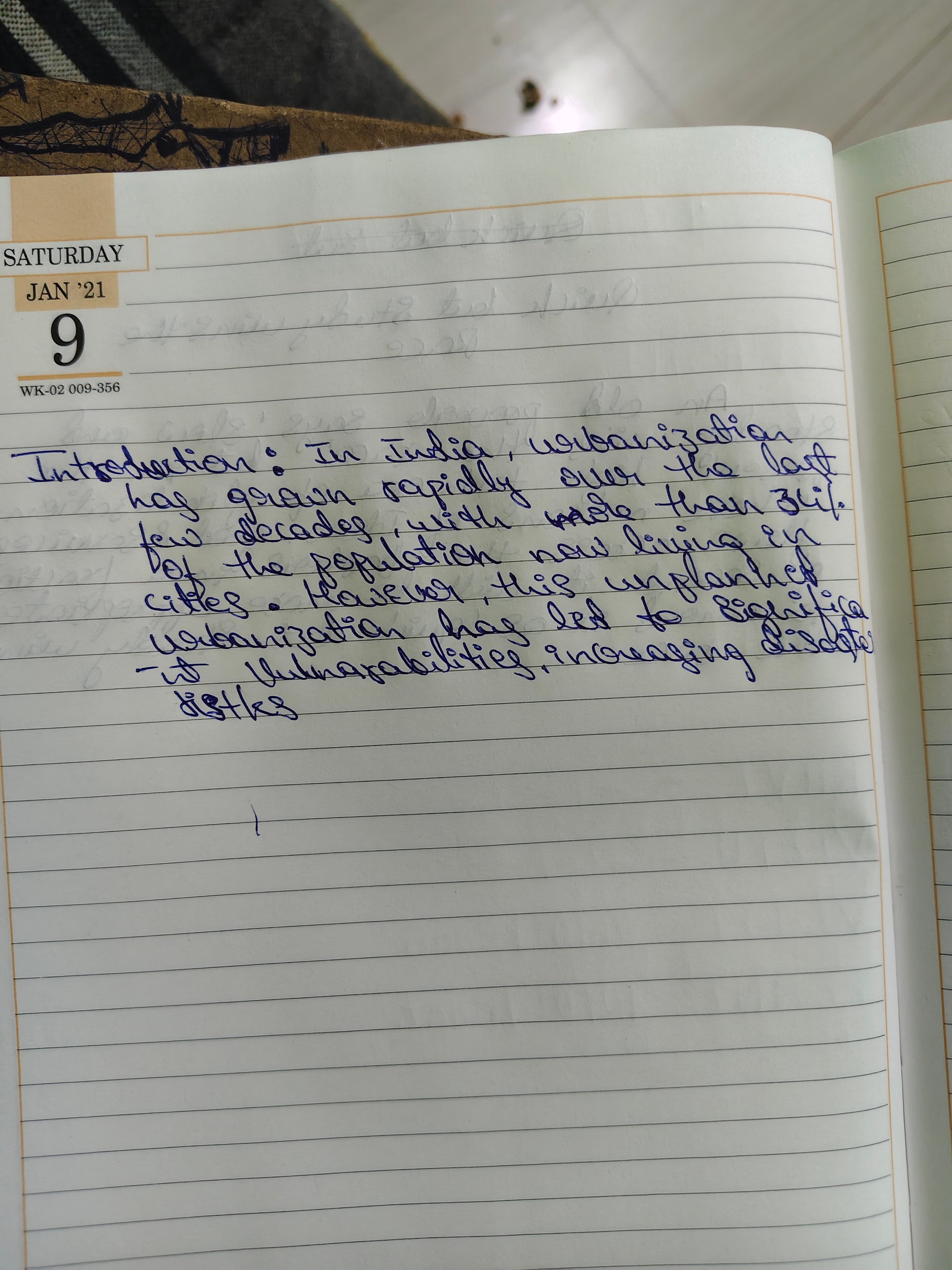
The Ambitious Urbanist
The handwriting is functional and enthusiastic, indicating a driven personality, but would benefit from increased clarity and consistency. By focusing on letter formations and baseline consistency, the writer can enhance legibility and refine their overall style.
The handwriting sample presents a generally consistent, yet somewhat hurried, style. The letter formations, particularly in words like "urbanization" and "vulnerabilities," showcase a degree of looping and connecting strokes. The size of the letters is fairly uniform, although the baseline wavers slightly, indicating a possible lack of strict adherence to the lines on the page. The pressure applied seems moderate, suggesting a steady hand, though there are instances where the ink is darker, possibly due to variations in pen pressure or writing speed. The slant is slightly towards the right, indicating a forward-moving approach. Overall, the writing is functional but could benefit from increased clarity.
Based on this handwriting, the individual likely possesses a driven and enthusiastic personality. The forward slant suggests someone who is outgoing and eager to engage with the world. The connecting strokes hint at a logical and analytical mind, capable of synthesizing information and forming connections. The wavering baseline may indicate adaptability and a willingness to go with the flow, rather than rigid adherence to rules. While there's a focus on communication, there's also a sense of efficiency, prioritizing speed and clarity of thought over aesthetic precision.
To improve legibility, focus on refining letter formations and maintaining a more consistent baseline. Practicing slower, more deliberate strokes can help improve neatness and clarity. Pay particular attention to closing loops and differentiating between similar letter shapes. Consistent spacing between words can also enhance readability. While speed and efficiency are valuable, prioritizing clarity will ensure that the written message is easily understood and effectively conveyed. Regular practice and conscious effort can lead to a more polished and professional handwriting style.
Legibility
Expressiveness
Consistency
Overall
Leaderboard for Tuesday, 28 October 2025
| 1 | The Calligrapher |
83
|
| 2 | The Elegant Calligrapher |
82
|
| 3 | Flourishing Calligrapher |
77
|
| 4 | The Calligrapher |
77
|
| 5 | The Flowing Stream |
74
|
| 6 | The Fluid Calligrapher |
71
|
| 7 | The Inspirational Calligrapher |
70
|
| 8 | The Student's Lament |
70
|
| 9 | The Pragmatic Pupil |
68
|
| 10 | The Flourishing Individual |
68
|
| 11 | The Jolly Optimist |
68
|
| 12 | The Mario Manifesto |
68
|
| 13 | The Perfectionist's Primer |
67
|
| 14 | The Diligent Calligrapher |
67
|
| 15 | The Considerate Soul |
67
|
| 16 | The Reflective Student |
67
|
| 17 | The Elegant Calligrapher |
66
|
| 18 | The Divine Calligrapher |
66
|
| 19 | The Upright Pen |
65
|
| 20 | The Concerned Guardian |
65
|
| 21 | The Pharmacist's Note |
65
|
| 22 | The Analytical Alchemist |
65
|
| 23 | The Advocate's Quill |
65
|
| 24 | The Grid Writer |
65
|
| 25 | The Flowing Quill |
64
|
| 26 | The Historian's Hand |
64
|
| 27 | The Educated Executive |
63
|
| 28 | The Diligent Diarist |
63
|
| 29 | The Flourishing Enigma |
63
|
| 30 | The Gridiron Enthusiast |
63
|