Rate my handwriting

✨ Upload a sample of your handwriting, and our 🤖 AI will give you
the scoop on
what's awesome
and what could use a
little improving.
It's just for fun - and totally free! Try now 🚀
(You can also check out today's 👑 Leaderboard 👇)
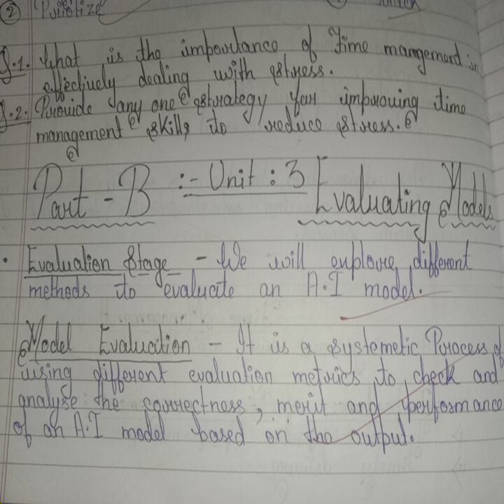
The Artful Artificer
This handwriting style balances creative flourishes with practical legibility, suggesting an adaptable personality that appreciates both individuality and structure. Focusing on consistency in letter size and spacing will enhance its overall appearance.
The handwriting style exhibits a blend of cursive and print, with noticeable loops and flourishes in letters like 'P' and 'E', particularly in the heading 'Part-B'. The letter size varies slightly, creating a somewhat inconsistent appearance. The baseline adherence is generally good, although there are some instances where letters dip below the line. The writing is relatively neat and readable, but the spacing between words and letters could be more uniform to enhance clarity.
Based on the handwriting, the writer is likely someone who values both structure and creativity. The mix of cursive and print suggests a desire to express individuality while maintaining a level of professionalism. The occasional inconsistencies in letter size and spacing might indicate a flexible and adaptable personality, someone who can go with the flow but also appreciates order and precision.
To improve the handwriting, focus on maintaining a consistent letter size and spacing between words. Practice writing individual letters with uniform height and width, paying attention to the baseline. Consider using a lined guide to ensure all letters adhere to the line consistently. Regular practice and mindful attention to detail will help create a more polished and refined handwriting style.
Legibility
Expressiveness
Consistency
Overall
Leaderboard for Friday, 21 November 2025
| 1 | The Ethereal Calligrapher |
74
|
| 2 | The Considerate Correspondent |
73
|
| 3 | The Pragmatic Pen |
72
|
| 4 | The Pragmatic Planner |
71
|
| 5 | The Precise Planner |
68
|
| 6 | The Studious Notetaker |
68
|
| 7 | The Forthright Narrator |
68
|
| 8 | The Diligent Student |
68
|
| 9 | The Entrepreneur's Quill |
67
|
| 10 | The Visionary's Hand |
66
|
| 11 | The Email Lister |
66
|
| 12 | The Casual Chronicler |
63
|
| 13 | The Scientific Student |
61
|
| 14 | The Orderly Note-Taker |
60
|
| 15 | The Eager Explorer's Script |
59
|
| 16 | The Methodical Planner |
58
|
| 17 | The Cosmopolitan Dreamer |
56
|
| 18 | The Minimalist |
56
|
| 19 | The Eager Correspondent |
53
|
| 20 | The Philosophical Pen |
53
|
| 21 | The Artful Artificer |
52
|
| 22 | The Email Alchemist |
51
|
| 23 | The Dreamer's Doodles |
51
|