Rate my handwriting

✨ Upload a sample of your handwriting, and our 🤖 AI will give you
the scoop on
what's awesome
and what could use a
little improving.
It's just for fun - and totally free! Try now 🚀
(You can also check out today's 👑 Leaderboard 👇)
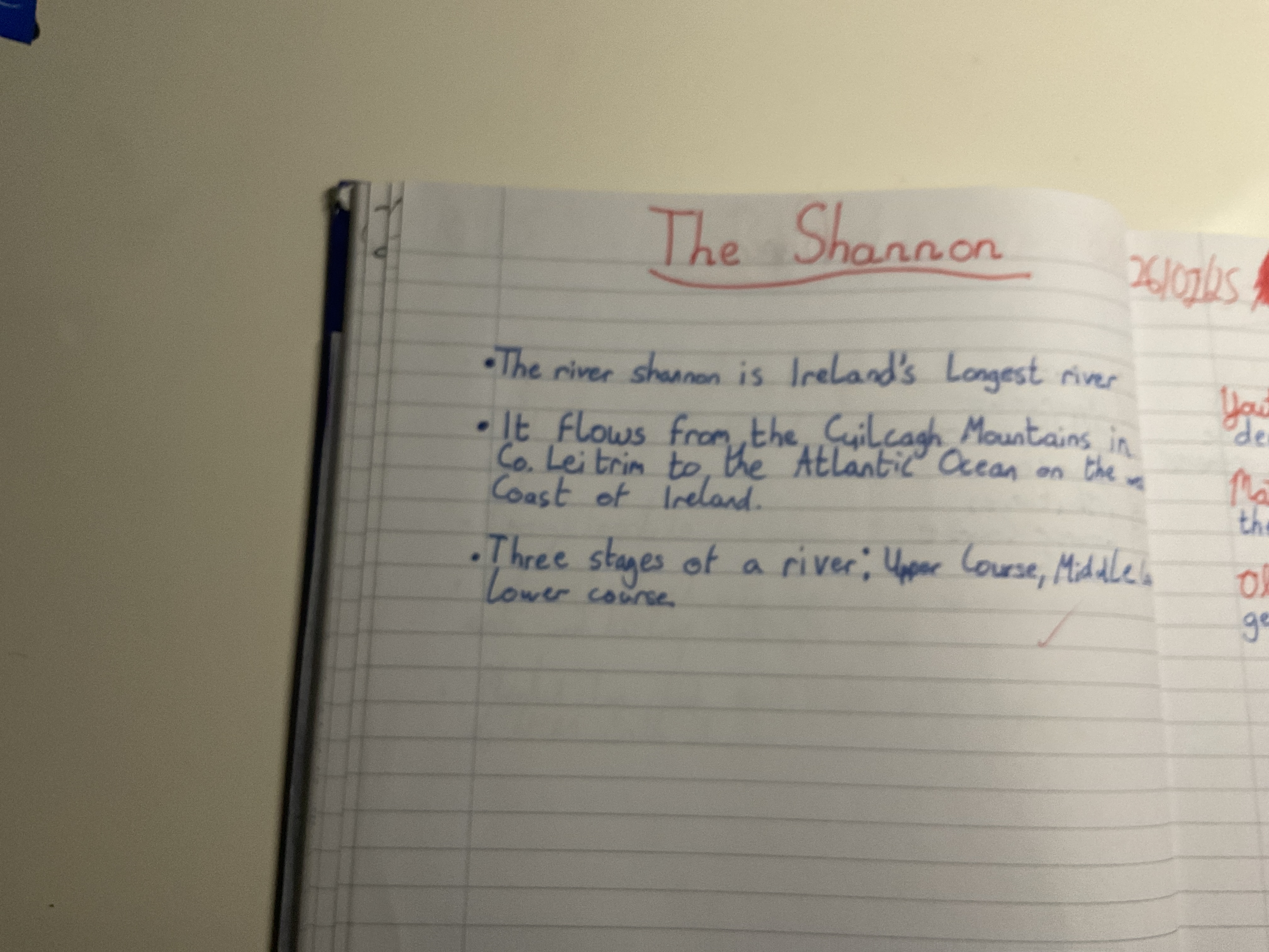
The River's Flow
This handwriting sample displays a neat and consistent style, implying diligence and conscientiousness, although fluidity could be improved. Overall, the writing is organized and legible, suggesting a balanced temperament and attention to detail.
The handwriting is mostly printed, with some cursive elements visible. The writing is somewhat compact, and leans slightly to the right. The size of the letters is generally consistent, although there are some variations. The baseline adherence is good, with the writing staying mostly on the lines. There are distinct spaces between words, which contributes to legibility. The pressure appears relatively even, resulting in consistent line thickness. Examples include the clear formation of letters in the words "Ireland's Longest river" and "Atlantic Ocean".
Based on the handwriting, one might infer traits such as diligence and conscientiousness. The neatness and consistency suggest an organized approach. The slight rightward slant could indicate a degree of sociability and a forward-looking perspective. The careful letter formation implies attention to detail and a desire for clarity. The consistent pressure indicates a balanced temperament and a steady approach to tasks.
To improve, focus on increasing the fluidity of letter connections. Practice cursive strokes to create a more natural flow. Experiment with varying pressure to add expressiveness to the writing. Try to maintain consistency in letter size to enhance the overall appearance. Consider slant, and consciously decide whether you want to write with more or less of an incline.
Legibility
Expressiveness
Consistency
Overall
Leaderboard for Monday, 27 October 2025
| 61 | Celestial Notes |
52
|
| 62 | Coastal Rhythms |
51
|
| 63 | The Maverick's Mark |
51
|
| 64 | Pierre's Ponderings |
51
|
| 65 | The Energetic Author |
51
|
| 66 | The Budding Chemist |
51
|
| 67 | Coastal Reverie |
50
|
| 68 | The Discontented Calligrapher |
50
|
| 69 | The Pensive Penman |
49
|