Rate my handwriting

✨ Upload a sample of your handwriting, and our 🤖 AI will give you
the scoop on
what's awesome
and what could use a
little improving.
It's just for fun - and totally free! Try now 🚀
(You can also check out today's 👑 Leaderboard 👇)
The Architect
The handwriting suggests an organized and detail-oriented personality, while encouraging a touch of spontaneity could further enhance its character.
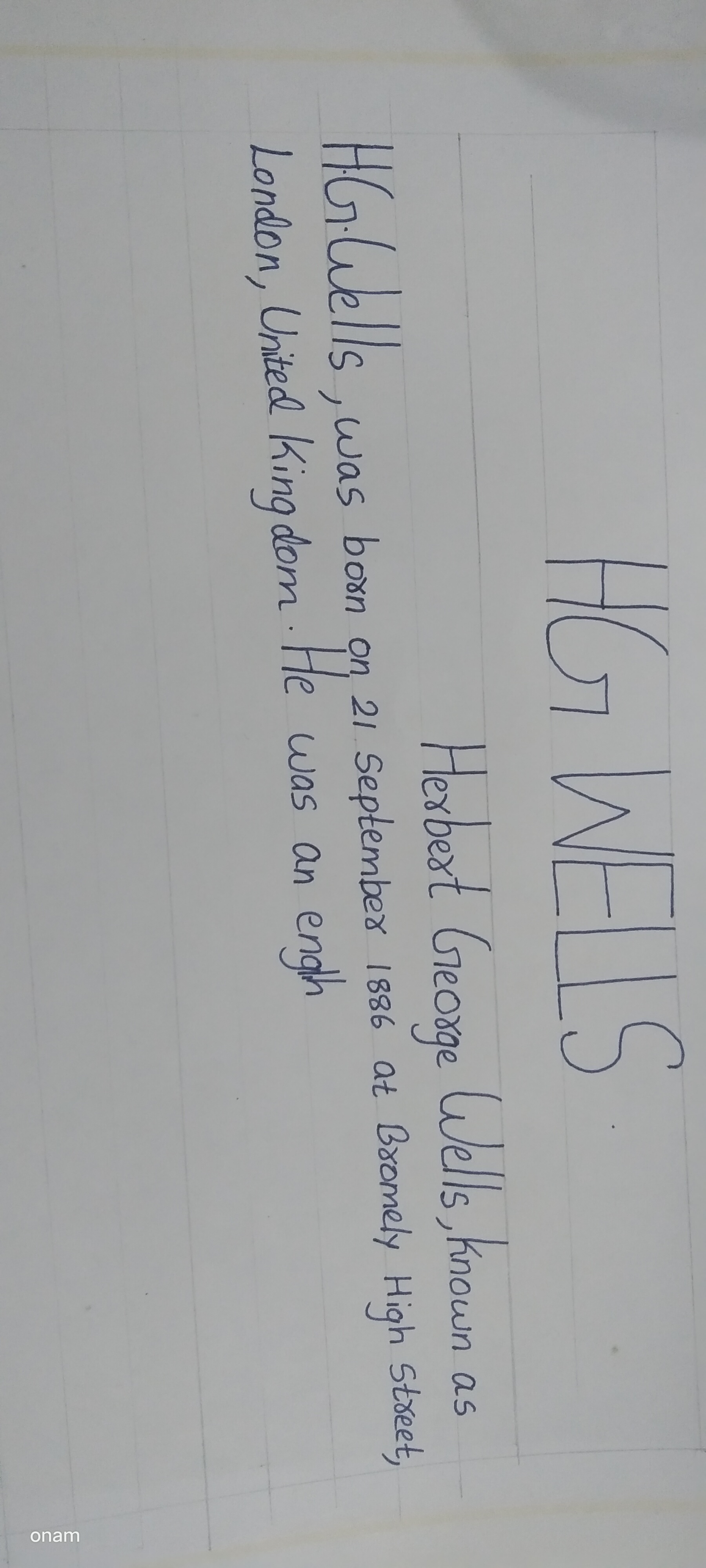
This handwriting presents as carefully constructed, with a preference for distinct letterforms and deliberate spacing. The upright stance of the letters and consistent baseline suggest a controlled approach. There's a mix of print and cursive, with individual letters meticulously formed, particularly noticeable in the clear distinction between uppercase and lowercase. The regularity in letter size and the absence of flamboyant loops or excessive ornamentation point towards a writer who values clarity and precision. The angularity of certain strokes contrasts with the roundedness of others, creating a balanced yet slightly formal appearance. For example, the 'H' and 'W' in "HG WELLS" show sharp, deliberate strokes, while the 'o' and 'e' exhibit a softer, more rounded quality.
The handwriting implies a personality that is organized, methodical, and attentive to detail. The controlled strokes and neat presentation suggest a person who is disciplined and values structure. There is a hint of introversion, as the lack of excessive flourishes indicates a reserved nature. The emphasis on clarity and legibility points to a desire to communicate effectively and be understood. This individual likely possesses a strong sense of responsibility and takes pride in their work, ensuring it is presented in a precise and orderly manner.
To enhance the writing, consider focusing on achieving greater fluidity and naturalness. Experiment with connecting letters more smoothly to encourage a more relaxed flow. Incorporating subtle variations in stroke weight could add depth and character. While maintaining legibility is essential, embracing a touch of spontaneity can inject personality and prevent the handwriting from appearing overly rigid. Practice varying the slant slightly to introduce a sense of movement and individuality.
Legibility
Expressiveness
Consistency
Overall
Leaderboard for Sunday, 26 October 2025
| 1 | The Pristine Penman |
76
|
| 2 | The Determined Diarist |
75
|
| 3 | The Flowing Quill |
74
|
| 4 | The Student |
73
|
| 5 | The Pragmatic Planner |
73
|
| 6 | Geometric Author |
73
|
| 7 | The Diligent Dreamer |
73
|
| 8 | The Curator's Script |
72
|
| 9 | The Pragmatist's Script |
72
|
| 10 | The Eloquent Calligrapher |
71
|
| 11 | The Dreamer's Quill |
70
|
| 12 | The Organized Storyteller |
69
|
| 13 | The Flowing Quill |
68
|
| 14 | The Looping Luminary |
68
|
| 15 | The Hopeful Heart's Script |
68
|
| 16 | The Flowing Hand |
68
|
| 17 | The Unassuming Hand |
66
|
| 18 | The Optimistic Artist |
65
|
| 19 | The Studious Student |
65
|
| 20 | The Classicist's Quill |
65
|
| 21 | The Efficient Note-Taker |
64
|
| 22 | The Minimalist's Mark |
64
|
| 23 | Diligent Student |
63
|
| 24 | The Flowing Font |
63
|
| 25 | The Gentle Flow |
63
|
| 26 | The Looping Legend |
62
|
| 27 | The Loop Whisperer |
61
|
| 28 | The Liberty Lover's Cursive |
61
|
| 29 | The Congratulatory Cursive |
60
|
| 30 | The Contemplative Calligrapher |
60
|