Rate my handwriting

✨ Upload a sample of your handwriting, and our 🤖 AI will give you
the scoop on
what's awesome
and what could use a
little improving.
It's just for fun - and totally free! Try now 🚀
(You can also check out today's 👑 Leaderboard 👇)
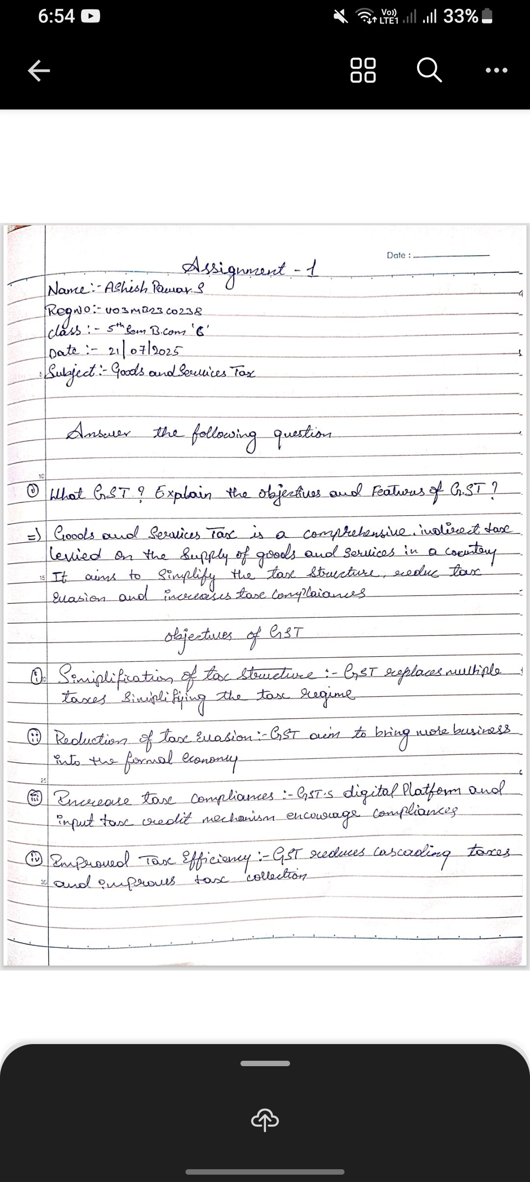
The Fiscal Formalist
This handwriting suggests an organized and meticulous individual with a preference for structure, although improvements in letter fluidity and spacing would enhance its overall appearance and legibility.
The handwriting presents a consistent slant and letter formation throughout the sample. The size of the letters is generally uniform, contributing to an overall neat appearance. There's a degree of fluency, as evidenced by the connected strokes within words, although some letters like the 't' in 'tax' and the 'g' in 'goods' appear to be formed with a slight angularity. The writing is relatively legible, though some letter distinctions could be improved, such as the differentiation between 'a' and 'u' in words like 'evasion'. The overall impression is of a controlled and deliberate hand.
Based on this handwriting, it suggests someone who is organized, meticulous, and values clarity. The consistent slant and uniform letter size indicate a person who is dependable and strives for balance in their approach. The deliberate formation of letters points towards a methodical nature, suggesting a preference for structure and precision. This person likely pays attention to detail and is conscientious in their work.
To further enhance the handwriting, focus on smoothing out the angularities in letters like 't' and 'g' for a more fluid appearance. Practicing consistent spacing between words can improve legibility and create a more balanced visual rhythm. Deliberately differentiating between similar letterforms like 'a' and 'u' will contribute to overall clarity and reduce potential ambiguities.
Legibility
Expressiveness
Consistency
Overall
Leaderboard for Tuesday, 28 October 2025
| 1 | The Calligrapher |
83
|
| 2 | The Elegant Calligrapher |
82
|
| 3 | Flourishing Calligrapher |
77
|
| 4 | The Calligrapher |
77
|
| 5 | The Flowing Stream |
74
|
| 6 | The Fluid Calligrapher |
71
|
| 7 | The Inspirational Calligrapher |
70
|
| 8 | The Student's Lament |
70
|
| 9 | The Pragmatic Pupil |
68
|
| 10 | The Flourishing Individual |
68
|
| 11 | The Jolly Optimist |
68
|
| 12 | The Mario Manifesto |
68
|
| 13 | The Perfectionist's Primer |
67
|
| 14 | The Diligent Calligrapher |
67
|
| 15 | The Considerate Soul |
67
|
| 16 | The Reflective Student |
67
|
| 17 | The Elegant Calligrapher |
66
|
| 18 | The Divine Calligrapher |
66
|
| 19 | The Upright Pen |
65
|
| 20 | The Concerned Guardian |
65
|
| 21 | The Pharmacist's Note |
65
|
| 22 | The Analytical Alchemist |
65
|
| 23 | The Advocate's Quill |
65
|
| 24 | The Grid Writer |
65
|
| 25 | The Flowing Quill |
64
|
| 26 | The Historian's Hand |
64
|
| 27 | The Educated Executive |
63
|
| 28 | The Diligent Diarist |
63
|
| 29 | The Flourishing Enigma |
63
|
| 30 | The Gridiron Enthusiast |
63
|