Rate my handwriting

✨ Upload a sample of your handwriting, and our 🤖 AI will give you
the scoop on
what's awesome
and what could use a
little improving.
It's just for fun - and totally free! Try now 🚀
(You can also check out today's 👑 Leaderboard 👇)
The Pragmatic Pen
This handwriting is functional and legible, suggesting a practical and straightforward personality. Improving rhythm and flow could enhance the overall aesthetic appeal.
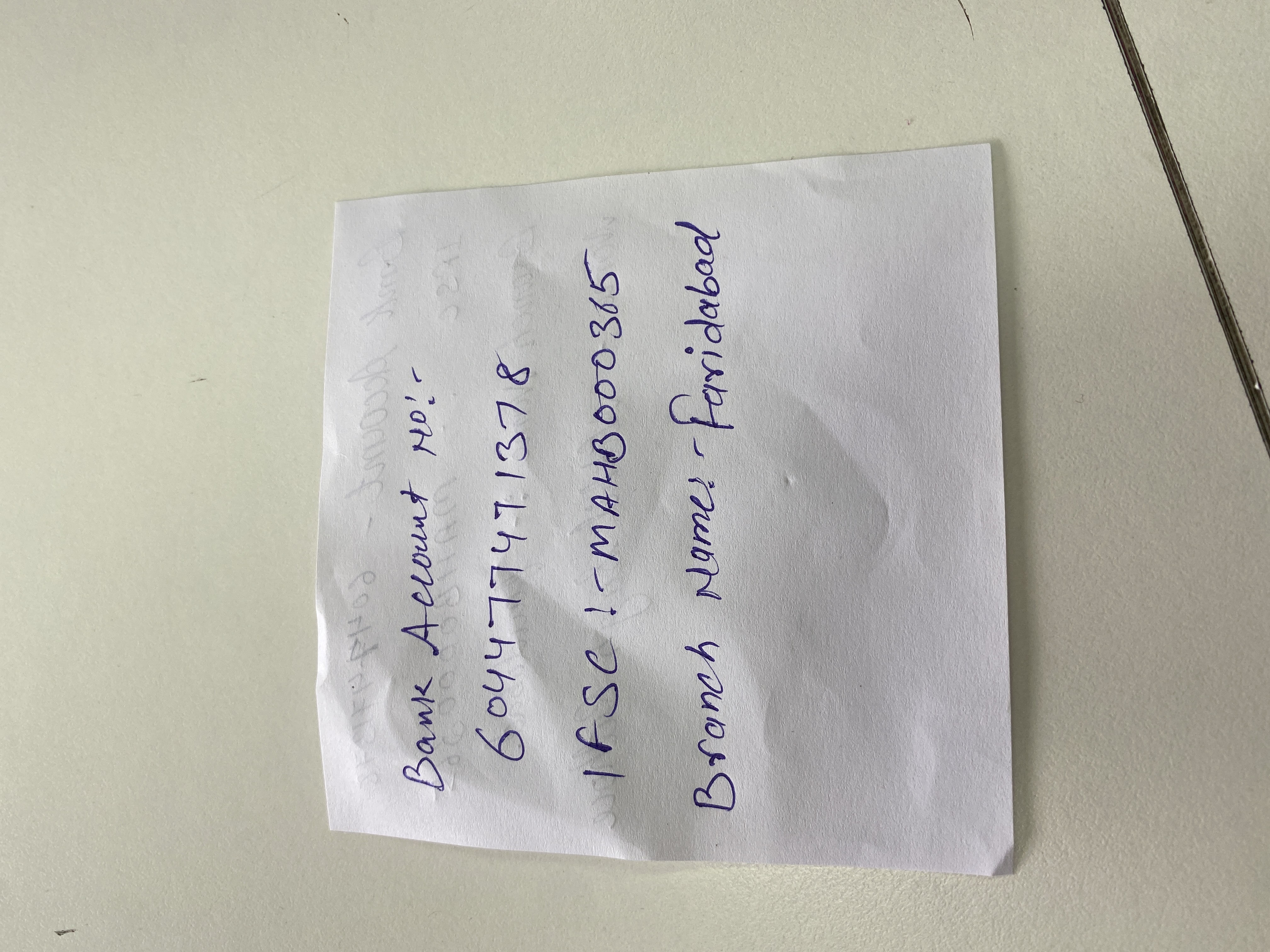
The handwriting presents as a functional, practical style. The letter forms are generally rounded and the writing appears deliberate rather than rushed. The sizing of the letters is consistent, with the upper and lower zones relatively short. There is a noticeable lack of ornamentation, suggesting a straightforward approach to communication. Spacing between words is adequate, and while not exceptionally neat, it is generally legible. The digits are also clearly formed, with each number easily distinguishable, e.g. "604477471378".
This handwriting suggests a personality that is pragmatic and down-to-earth. The individual likely values clarity and directness in their interactions. The rounded letter forms may indicate a degree of empathy and a willingness to cooperate, while the overall simplicity points to someone who is unfussy and focused on practicality. The consistent letter sizing suggests a stable and balanced temperament. This individual probably prefers efficiency and avoids unnecessary embellishment.
To improve the handwriting, consider focusing on rhythm and flow. Practicing connecting letters smoothly can enhance the overall aesthetic. Pay attention to the slant of the letters, ensuring a consistent angle for a more unified appearance. Varying the pressure applied to the pen could add depth and personality to the writing. Try experimenting with different pen types to find one that complements your style and allows for more expressive strokes. Practicing with lined paper can also improve the consistency of the letter height.
Legibility
Expressiveness
Consistency
Overall
Leaderboard for Wednesday, 29 October 2025
| 31 | The Flourishing One |
59
|
| 32 | The Chromatic Calligrapher |
59
|
| 33 | The Flowing Hand |
59
|
| 34 | Angelic Impressions |
59
|
| 35 | The Energetic Note-Taker |
58
|
| 36 | The Energetic Student |
58
|
| 37 | The Artful Calligrapher |
57
|
| 38 | The Idealist's Italic |
57
|
| 39 | The Earnest Author |
56
|
| 40 | The Diligent Biologist |
56
|
| 41 | The Neatly Ordered Lexicographer |
56
|
| 42 | The Ponderer's Prose |
54
|
| 43 | The Spirited Soul |
54
|
| 44 | The Scientific Hand |
54
|
| 45 | The Diligent Planner |
54
|
| 46 | The Pensive Pupil |
53
|
| 47 | The Diligent Note-Taker |
53
|
| 48 | The Sensitive Soul's Script |
53
|
| 49 | The Diligent Student |
53
|
| 50 | The Whirlwind Writer |
53
|
| 51 | The Data Architect's Italic Hand |
53
|
| 52 | The Budding Engineer |
53
|
| 53 | The Biologist's Itch |
52
|
| 54 | The Studious Hand |
52
|
| 55 | Le Calligraphe Méthodique |
52
|
| 56 | The Precise Correspondent |
51
|
| 57 | The Ledger's Lament |
51
|
| 58 | The Typist |
50
|
| 59 | The Civic Mind |
49
|
| 60 | The Energetic Flow |
49
|