Rate my handwriting

✨ Upload a sample of your handwriting, and our 🤖 AI will give you
the scoop on
what's awesome
and what could use a
little improving.
It's just for fun - and totally free! Try now 🚀
(You can also check out today's 👑 Leaderboard 👇)
The Poet's Quill
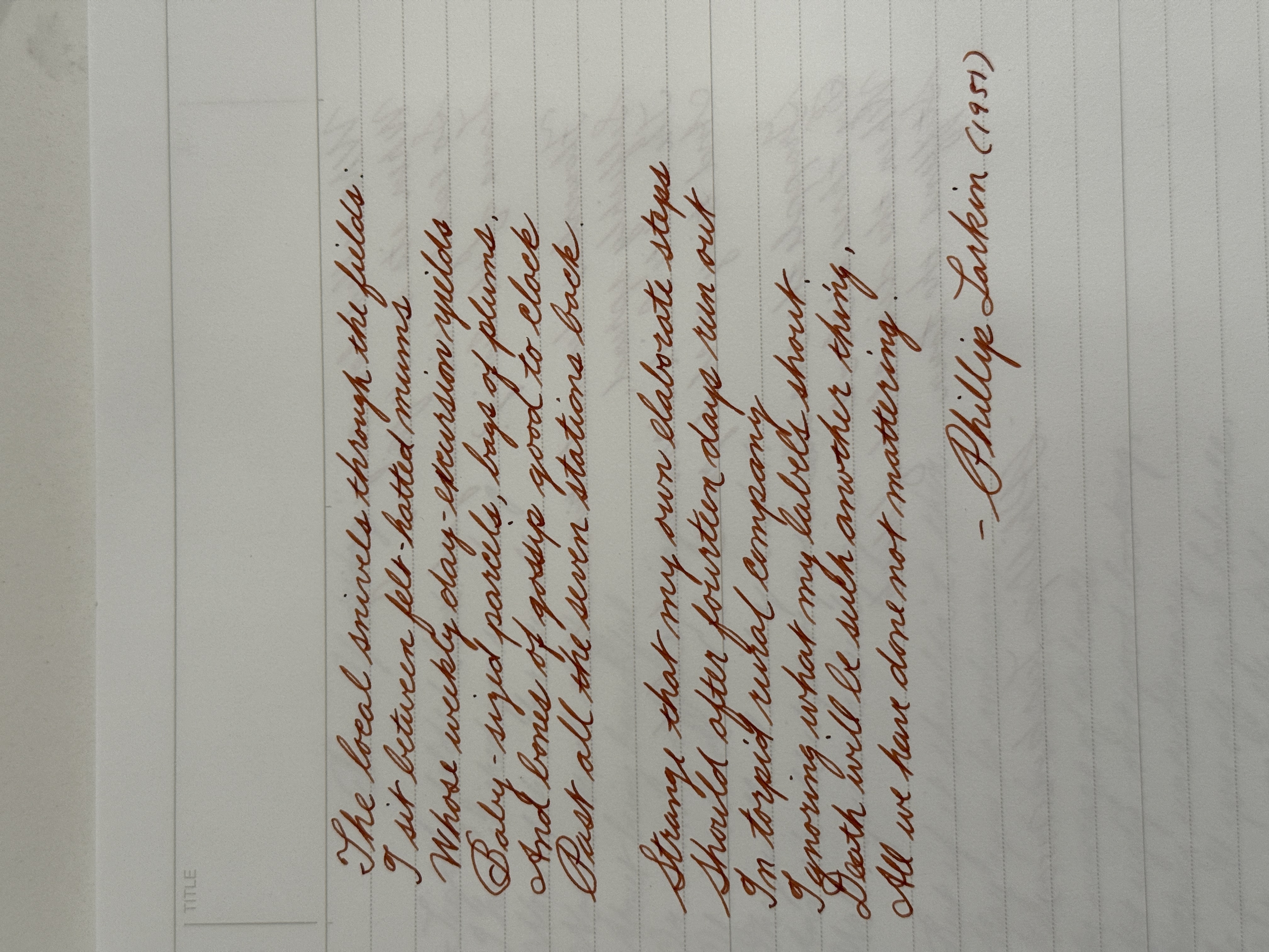
This handwriting suggests a thoughtful and sensitive individual with an artistic inclination, demonstrating both elegance and attention to detail.
This handwriting style leans towards a cursive script, exhibiting a delicate and flowing quality. The loops in letters like 'l', 'y', and 'g' are generously formed, and there's a gentle slant to the right, which adds to the overall elegance. The baseline is fairly consistent, and the spacing between words is generally well-maintained, although there are some minor inconsistencies. The letter 't' has a long crossbar.
Given the flowing and elegant nature of the handwriting, it suggests someone who is thoughtful, sensitive, and possibly inclined towards artistic expression. The consistency in the baseline hints at emotional stability, while the slight rightward slant might indicate a warm and outgoing personality. The careful formation of letters suggests a meticulous nature and attention to detail.
To further refine this handwriting, focus on maintaining consistent letter sizes and spacing between words. Practicing drills to ensure uniformity in the loops and slants can also enhance the overall legibility and aesthetic appeal. Paying attention to the consistency of the 't' crossbar would also help.
Legibility
Expressiveness
Consistency
Overall
Leaderboard for Monday, 27 October 2025
| 61 | Pierre's Ponderings |
51
|
| 62 | The Maverick's Mark |
51
|
| 63 | The Budding Chemist |
51
|
| 64 | Coastal Rhythms |
51
|
| 65 | The Discontented Calligrapher |
50
|
| 66 | Coastal Reverie |
50
|
| 67 | The Pensive Penman |
49
|