Rate my handwriting

✨ Upload a sample of your handwriting, and our 🤖 AI will give you
the scoop on
what's awesome
and what could use a
little improving.
It's just for fun - and totally free! Try now 🚀
(You can also check out today's 👑 Leaderboard 👇)
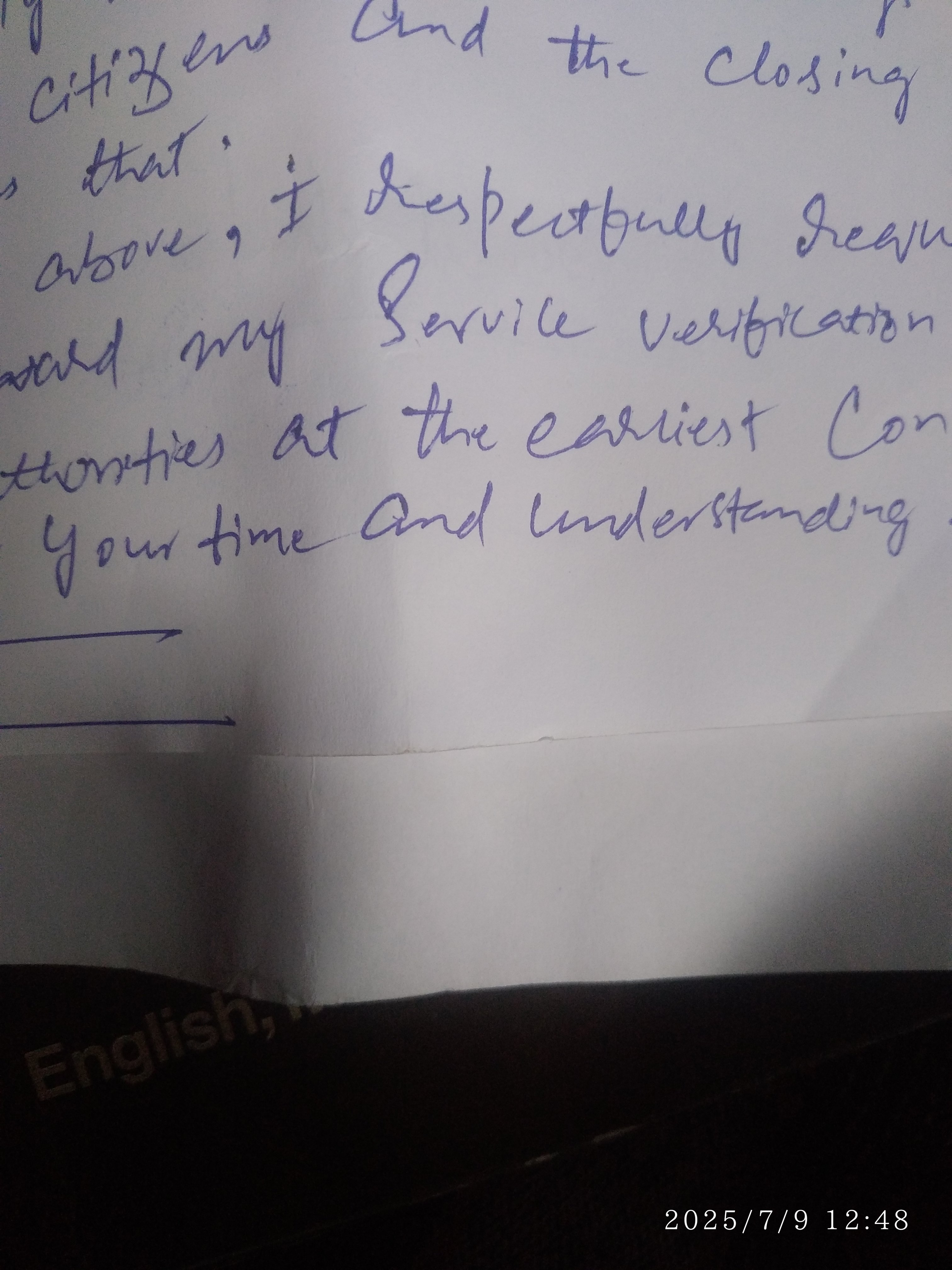
The Respectful Requester
This sample shows a connected cursive style with polite phrasing, implying respectfulness and eagerness, but could benefit from improved consistency and baseline control for enhanced legibility.
This handwriting sample presents a connected cursive style, with moderate slant and varied letter sizes. Words like "Respectfully" and "Verification" showcase a distinctive blend of rounded and looped letters, interspersed with sharp, decisive strokes. The baseline of the writing tends to drift slightly upwards across the page, which could be attributed to the writer's eagerness. The overall flow suggests a good writing speed, though perhaps at the expense of consistency.
The writer appears to be respectful and considerate, evident in their polite phrasing ("Respectfully") and expression of gratitude ("Your time and understanding"). The slightly upward-sloping baseline hints at optimism and enthusiasm. However, the inconsistencies in letter sizes and shapes could also suggest a degree of impulsivity or a lack of attention to detail. This style implies someone who values communication and strives to express themselves effectively.
While generally legible, certain words like "Citizens" or "Closing" exhibit less precision, making them slightly harder to decipher at first glance. To enhance legibility and neatness, the writer could focus on maintaining consistent letter sizes and shapes. Practicing controlled, downward strokes and adhering to the baseline would further improve the overall clarity. This attention to detail would convey a more polished and professional impression.
Legibility
Expressiveness
Consistency
Overall
Leaderboard for Monday, 27 October 2025
| 31 | Celestial Notes |
52
|
| 32 | The Ambitious Note-Taker |
52
|
| 33 | The Approximator's Script |
52
|
| 34 | The Visionary's Script |
51
|
| 35 | The Provocateur's Quill |
51
|
| 36 | The Pragmatic Penman |
47
|