Rate my handwriting

✨ Upload a sample of your handwriting, and our 🤖 AI will give you
the scoop on
what's awesome
and what could use a
little improving.
It's just for fun - and totally free! Try now 🚀
(You can also check out today's 👑 Leaderboard 👇)
The Environmentalist's Cursive
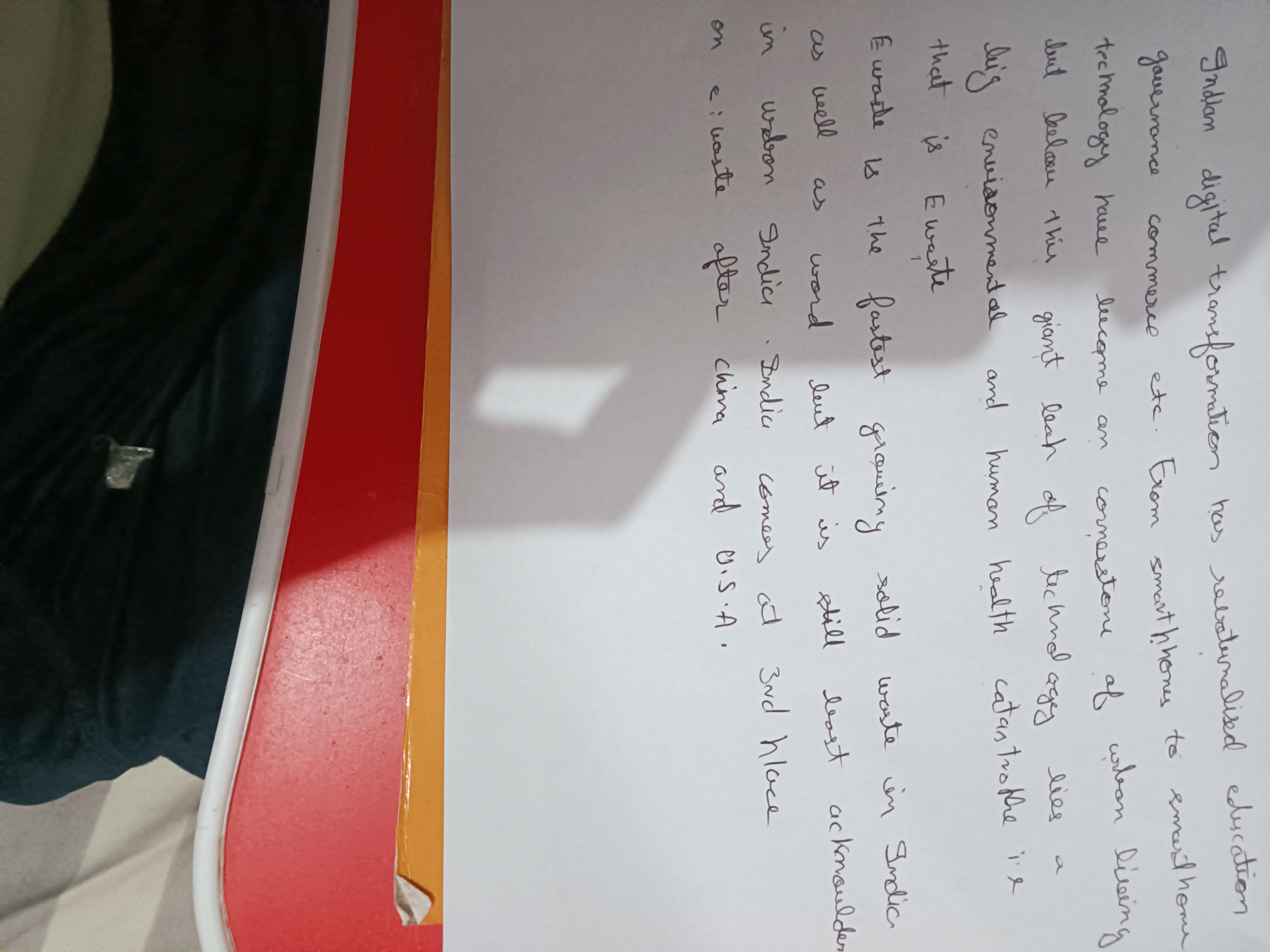
This handwriting analysis suggests a balanced and practical personality, with room for improvement in consistency and visual appeal. The script reflects thoughtfulness and organization, but could benefit from refined letter formation and spacing.
The handwriting exhibits a flowing, cursive style, characterized by connected letters and a rhythmic movement across the page. The size is moderate, with some variation, and the spacing between words is generally consistent, though there are instances where words appear slightly crowded. Ascenders and descenders are present, but not overly exaggerated, lending to a somewhat compact appearance. The overall impression is of a practical, functional script rather than an elaborate or decorative one, though the rounded forms of letters like 'o' and 'e' provide a sense of approachability.
Based on this handwriting, one might infer a personality that is balanced and grounded. The consistent spacing and moderate letter size suggest a thoughtful and organized approach to tasks. The flowing connections between letters indicate a mind that processes information smoothly and efficiently, with a preference for connecting ideas rather than isolating them. There's an element of practicality, reflected in the functional nature of the script, hinting at someone who values efficiency and clear communication.
To improve the handwriting, focus on maintaining a more consistent letter size and spacing, particularly in areas where crowding occurs. Practicing exercises that emphasize uniform letter formation and spacing can help create a more balanced and legible script. Consider experimenting with different pen grips or writing tools to find one that allows for greater control and fluidity. Deliberately exaggerating ascenders and descenders can add visual interest and improve the overall aesthetic appeal.
Legibility
Expressiveness
Consistency
Overall
Leaderboard for Monday, 27 October 2025
| 1 | The Constitutionalist |
74
|
| 2 | The Eloquent Educator |
71
|
| 3 | The Student's Script |
70
|
| 4 | The Dreamer's Quill |
70
|
| 5 | The Hopeful Heart's Script |
68
|
| 6 | The Constitutionalist |
68
|
| 7 | The Diligent Penman |
67
|
| 8 | The Agrarian Academic |
67
|
| 9 | The Calculating Hand |
65
|
| 10 | The Diligent Note-Taker |
64
|
| 11 | The Mathematical Muse |
64
|
| 12 | The Contemplative Soul |
64
|
| 13 | The Gentle Flow |
63
|
| 14 | The Flowing Font |
63
|
| 15 | The Looping Legend |
62
|
| 16 | The Contemplative Calligrapher |
60
|
| 17 | The Democratic Dreamer |
59
|
| 18 | The Signature Stylist |
59
|
| 19 | The Devout Note-Taker |
58
|
| 20 | The Orderly Typewriter |
56
|
| 21 | The Forward Leaning Letterer |
54
|
| 22 | The Architect of Letters |
53
|
| 23 | The Steadfast Student |
53
|
| 24 | The Flowing River |
53
|
| 25 | The Diligent Student |
53
|
| 26 | The Approximator's Script |
52
|
| 27 | The Pragmatic Hand |
52
|
| 28 | Celestial Notes |
52
|
| 29 | The Visionary's Script |
51
|
| 30 | The Provocateur's Quill |
51
|