Rate my handwriting

✨ Upload a sample of your handwriting, and our 🤖 AI will give you
the scoop on
what's awesome
and what could use a
little improving.
It's just for fun - and totally free! Try now 🚀
(You can also check out today's 👑 Leaderboard 👇)
The Confident Penman
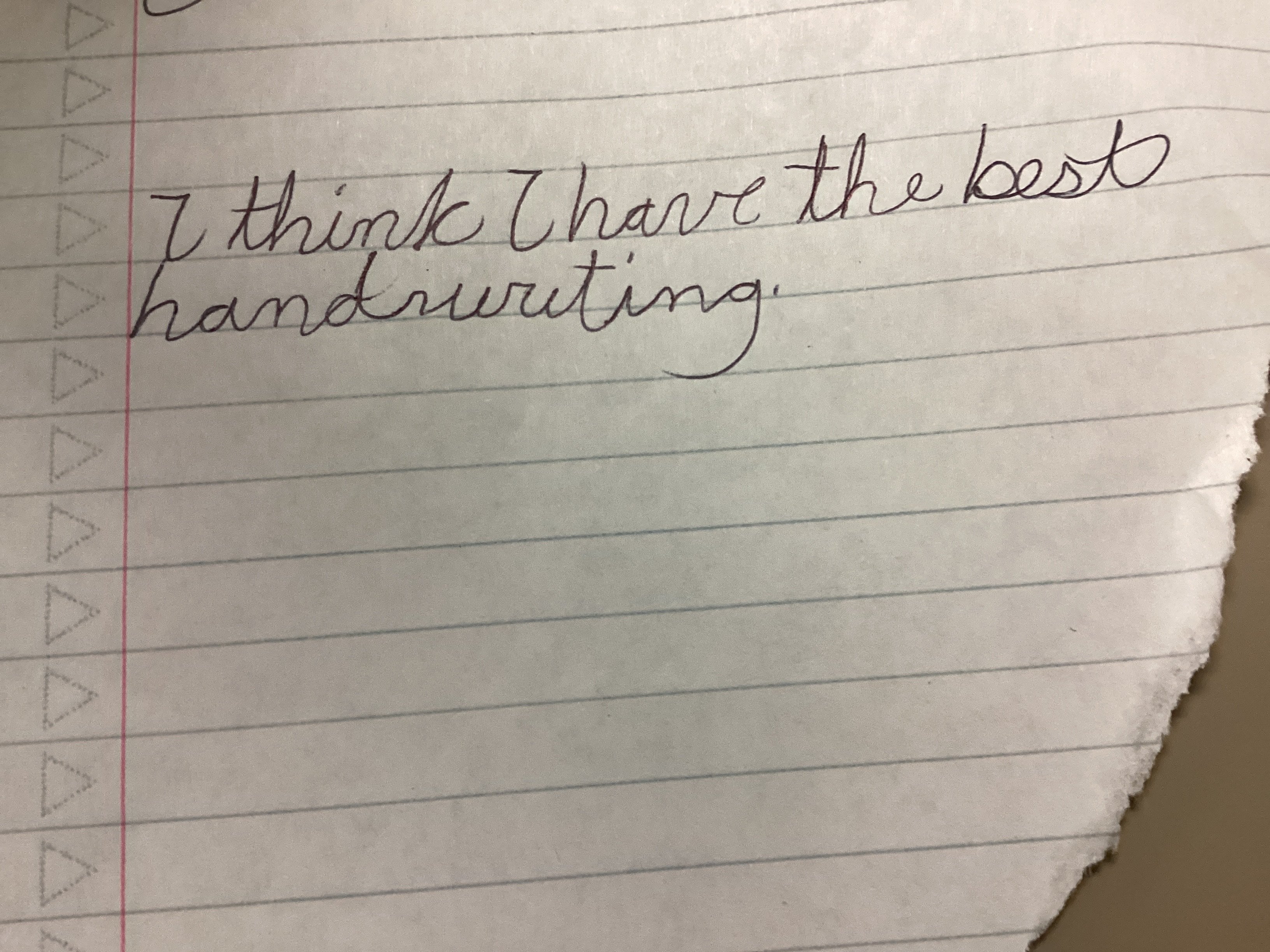
This is a legible and generally consistent cursive, showing confidence and a friendly nature with a hint of independence. Minor improvements in letter consistency would further enhance clarity and elegance.
This handwriting sample presents a generally legible and consistent cursive style. The letters are fairly uniform in size and shape, as seen in the repeated 'h' in 'think' and 'handwriting'. The baseline is relatively straight, showing good control. However, some letters like the 'v' in 'have' and the 'b' in 'best' exhibit a slight slant and flourish, indicating a touch of individuality. There is also a pleasing fluency to the writing, with connected letters and a smooth rhythm.
The confident, connected strokes, especially in the elongated 'h' and 'g', suggest a self-assured individual with a good flow of thoughts. The rounded forms of letters like 'a', 'n', and 'd' hint at a friendly and approachable nature. The overall neatness of the sample, along with the relatively straight baseline, may indicate a person who values order and organization. However, the occasional flourishes and slightly irregular slants also suggest an independent streak and a desire for self-expression. It's quite a charming style, a blend of confidence and creative flair.
While the handwriting is generally legible, focusing on consistency in letter sizes and slants could enhance clarity further. For example, maintaining a consistent slant for the 'v' in 'have' and the 'b' in 'best' would improve visual harmony. Also, the 'i' dots could be placed more accurately. Practicing letter formations with attention to uniformity can elevate this already good handwriting to a truly impressive level.
Legibility
Expressiveness
Consistency
Overall
Leaderboard for Wednesday, 29 October 2025
| 31 | The Diligent Diarist |
63
|
| 32 | The Pragmatic Pen |
61
|
| 33 | The Pragmatic Pen |
61
|
| 34 | The Elegant Elocutionist |
61
|
| 35 | The Meticulous Dreamer |
61
|
| 36 | The Dream Weaver |
61
|
| 37 | The Inquisitive Pen |
61
|
| 38 | The Artisan's Flourish |
60
|
| 39 | The Elegant Penman |
60
|
| 40 | The Budding Pianist's Plea |
60
|
| 41 | The Perpetual Cycler |
60
|
| 42 | The Flowing Hand |
59
|
| 43 | The Chromatic Calligrapher |
59
|
| 44 | The Flourishing One |
59
|
| 45 | Angelic Impressions |
59
|
| 46 | The Analytical Artisan |
58
|
| 47 | The Diligent Storyteller |
58
|
| 48 | The Flowing Pen |
57
|
| 49 | The Idealist's Italic |
57
|
| 50 | The Artful Calligrapher |
57
|
| 51 | The Mythical Typewriter |
57
|
| 52 | The Dreamer's Quill |
56
|
| 53 | The Elegant Optimist |
56
|
| 54 | The Peaceful Warrior |
56
|
| 55 | The Energetic Note-Taker |
55
|
| 56 | The Budding Scholar |
54
|
| 57 | The Optimistic Brushstroke |
54
|
| 58 | The Fluid Minimalist |
53
|
| 59 | The Sensitive Soul's Script |
53
|
| 60 | The Official's Elegant Cursive |
53
|