Rate my handwriting

✨ Upload a sample of your handwriting, and our 🤖 AI will give you
the scoop on
what's awesome
and what could use a
little improving.
It's just for fun - and totally free! Try now 🚀
(You can also check out today's 👑 Leaderboard 👇)
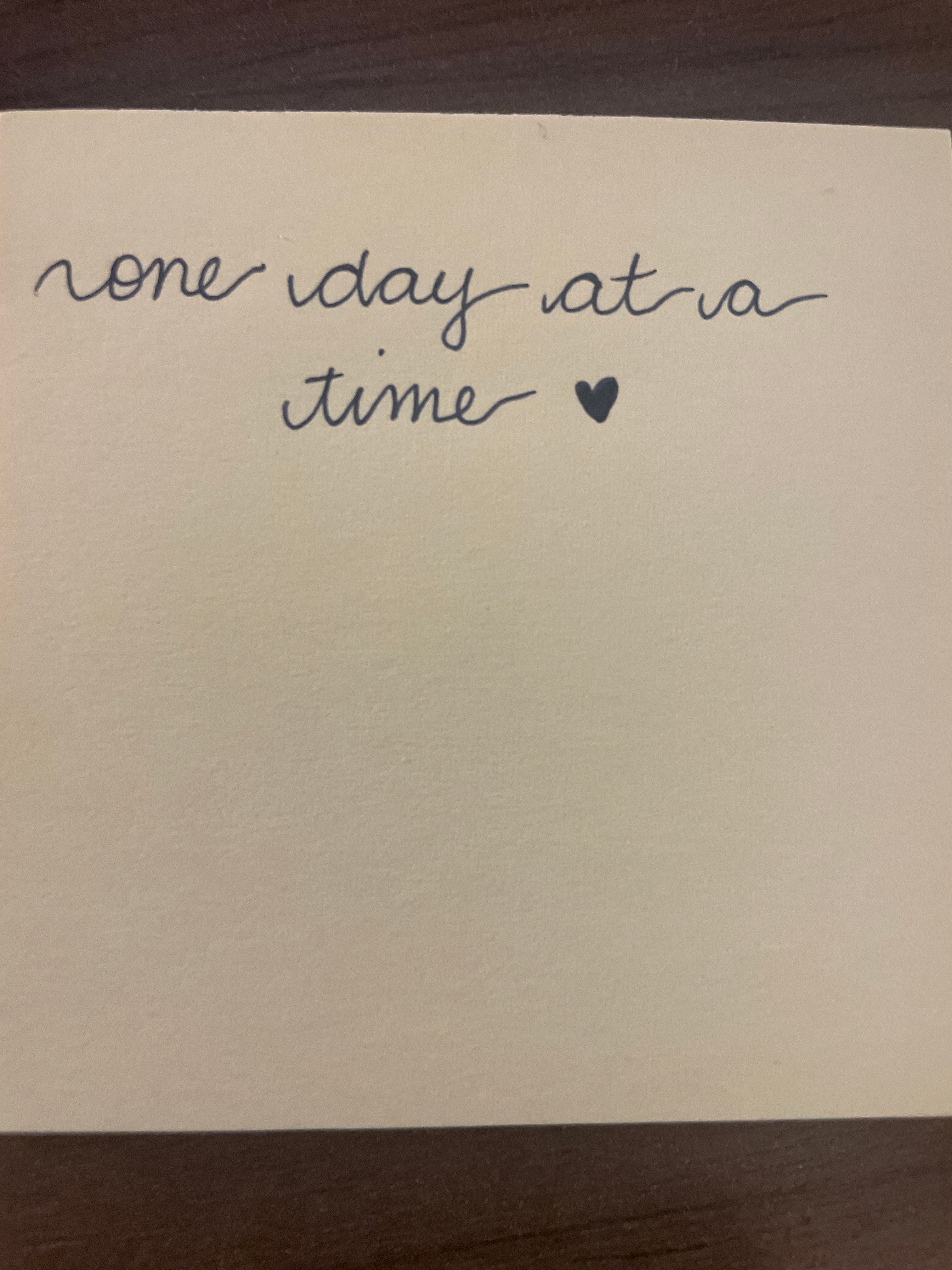
The Heartfelt Inscriber
This flowing cursive suggests a thoughtful and empathetic nature, enhanced by a personal touch. Consistency in letter size and spacing could improve uniformity.
The handwriting is a graceful, flowing cursive, evident in the connected letters and rounded forms. The script leans slightly to the right, suggesting warmth and openness. The overall impression is one of carefulness, though not rigid. The use of simple, unadorned letterforms lends a modern feel. The addition of the heart at the end adds a personal touch. The size of the writing is moderate, filling the space adequately without crowding.
Based on the handwriting, the writer likely possesses a thoughtful and empathetic nature. The rounded letters suggest a gentle personality, while the slight right slant indicates a sociable and outgoing disposition. The care taken in forming the letters reflects attention to detail and a desire to communicate clearly. The addition of the heart reveals an emotional depth and a genuine expression of feeling. Overall, the handwriting points to a balanced and kind-hearted individual.
To improve the handwriting, one could focus on maintaining consistency in letter size and spacing. Paying attention to the baseline can also help create a more uniform appearance. While the cursive is already quite legible, practicing individual letter formations can enhance clarity. Experimenting with different pen types or grips may also contribute to a more comfortable and controlled writing style. But really, the personal touch and expressive nature of this writing is delightful!
Legibility
Expressiveness
Consistency
Overall
Leaderboard for Saturday, 25 October 2025
| 1 | The Pristine Penman |
76
|
| 2 | The Determined Diarist |
75
|
| 3 | The Elegant Signature |
74
|
| 4 | Geometric Author |
73
|
| 5 | The Pragmatic Planner |
73
|
| 6 | The Diligent Dreamer |
73
|
| 7 | The Student |
73
|
| 8 | The Pragmatist's Script |
72
|
| 9 | The Eloquent Calligrapher |
71
|
| 10 | The Organized Storyteller |
69
|
| 11 | The Flowing Hand |
68
|
| 12 | The Looping Luminary |
68
|
| 13 | The Acrobatic Pen |
67
|
| 14 | The Agile Acrobat |
67
|
| 15 | The Classicist's Quill |
65
|
| 16 | The Optimistic Artist |
65
|
| 17 | The Efficient Note-Taker |
64
|
| 18 | The Minimalist's Mark |
64
|
| 19 | Diligent Student |
63
|
| 20 | The Pragmatic Pen |
63
|
| 21 | The Coordinator's Quill |
61
|
| 22 | The Loop Whisperer |
61
|
| 23 | The Liberty Lover's Cursive |
61
|
| 24 | The Congratulatory Cursive |
60
|
| 25 | Zen Strokes |
60
|
| 26 | The Enthusiastic Connector |
59
|
| 27 | The Poet's Quill |
59
|
| 28 | The Precise Mathematician |
59
|
| 29 | The Elegant Calligrapher |
59
|
| 30 | The Typist's Touch |
59
|