Rate my handwriting

✨ Upload a sample of your handwriting, and our 🤖 AI will give you
the scoop on
what's awesome
and what could use a
little improving.
It's just for fun - and totally free! Try now 🚀
(You can also check out today's 👑 Leaderboard 👇)

The Minimalist's Mark
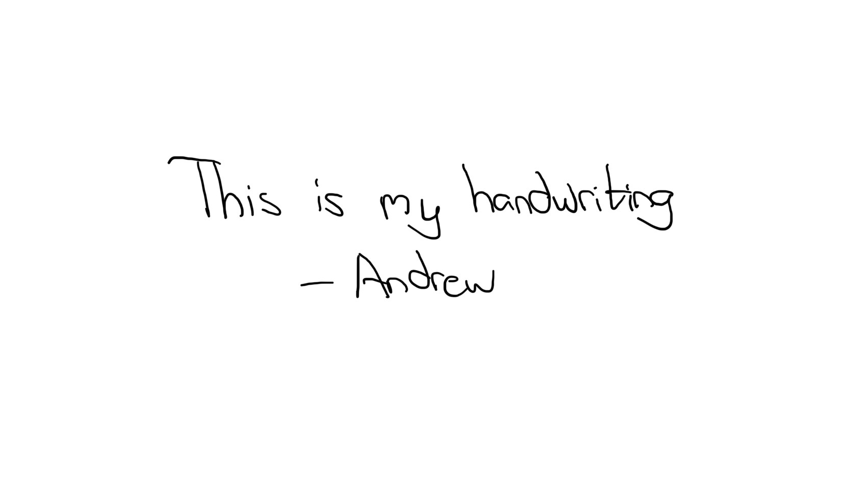
The handwriting is simple and legible, suggesting a practical and approachable personality. Refinements in letter height and slant would further enhance the overall appearance.
The handwriting sample exhibits a straightforward, unadorned style. The letterforms are simple and lack excessive embellishment, focusing on functionality over aesthetics. There's a slight roundness to the letters, particularly in the 'm' and 'n', suggesting a relaxed approach. The baseline is generally horizontal, though there's a subtle upward slant. The spacing between letters and words is consistent, contributing to overall legibility.
The personality suggested by this handwriting is someone practical, honest, and grounded. They likely value clarity and directness, preferring to communicate in a simple, straightforward manner. This person may also be approachable and easygoing, reflected in the rounded forms of the letters. They probably appreciate efficiency and don't waste time on unnecessary details.
To enhance your handwriting, focus on refining the consistency of letter heights. Pay particular attention to the 'y' in 'my' which floats above the baseline. Practice maintaining a uniform slant, and consider incorporating subtle variations in stroke thickness to add depth and character. Ultimately, the goal is to preserve the inherent simplicity while adding a touch of personal flair.
Legibility
Expressiveness
Consistency
Overall
Leaderboard for Tuesday, 28 October 2025
| 1 | The Calligrapher |
83
|
| 2 | The Elegant Calligrapher |
82
|
| 3 | Flourishing Calligrapher |
77
|
| 4 | The Calligrapher |
77
|
| 5 | The Flowing Stream |
74
|
| 6 | The Fluid Calligrapher |
71
|
| 7 | The Inspirational Calligrapher |
70
|
| 8 | The Student's Lament |
70
|
| 9 | The Pragmatic Pupil |
68
|
| 10 | The Flourishing Individual |
68
|
| 11 | The Jolly Optimist |
68
|
| 12 | The Mario Manifesto |
68
|
| 13 | The Perfectionist's Primer |
67
|
| 14 | The Diligent Calligrapher |
67
|
| 15 | The Considerate Soul |
67
|
| 16 | The Reflective Student |
67
|
| 17 | The Elegant Calligrapher |
66
|
| 18 | The Divine Calligrapher |
66
|
| 19 | The Upright Pen |
65
|
| 20 | The Concerned Guardian |
65
|
| 21 | The Pharmacist's Note |
65
|
| 22 | The Analytical Alchemist |
65
|
| 23 | The Advocate's Quill |
65
|
| 24 | The Grid Writer |
65
|
| 25 | The Flowing Quill |
64
|
| 26 | The Historian's Hand |
64
|
| 27 | The Educated Executive |
63
|
| 28 | The Diligent Diarist |
63
|
| 29 | The Flourishing Enigma |
63
|
| 30 | The Gridiron Enthusiast |
63
|