Rate my handwriting

✨ Upload a sample of your handwriting, and our 🤖 AI will give you
the scoop on
what's awesome
and what could use a
little improving.
It's just for fun - and totally free! Try now 🚀
(You can also check out today's 👑 Leaderboard 👇)
The Penitent Penman
This neat and fluent handwriting suggests a disciplined yet expressive personality with an appreciation for aesthetics and correctness. Minor improvements in spacing and stroke connection would enhance legibility and elegance.
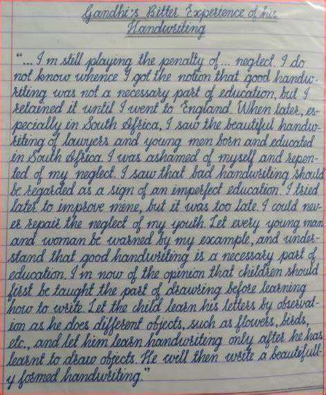
This handwriting sample exhibits a remarkable consistency and fluency. The letters are well-formed, with a distinctive style evident in the elongated ascenders and descenders, such as in the words "playing", "penalty", and "neglect". The slant is consistent, leaning slightly to the right, suggesting a forward-thinking and expressive personality. The baseline is relatively straight, indicating stability and focus. While the script is generally neat, occasional variations in letter size and spacing, like in the phrase "necessary part", add a touch of individuality.
This handwriting suggests a personality that is both disciplined and expressive. The neatness and consistency imply a methodical and organized mind, while the rightward slant hints at an outgoing and communicative nature. The attention to detail, reflected in the carefully formed letters, suggests a conscientious and thoughtful individual. The occasional variations in letter size and spacing add a touch of spontaneity and creativity, indicating a willingness to embrace new ideas and experiences. Phrases like "beautiful handwriting" and "necessary part" reveal a value placed on aesthetics and correctness.
While this handwriting is already quite legible and aesthetically pleasing, a few minor improvements could enhance its overall impact. Paying closer attention to the spacing between words, ensuring consistent sizing of letters like in the word "education", and minimizing variations in the baseline could further refine the neatness and legibility. Practicing connecting strokes more smoothly, particularly between letters within words, would add to the overall flow and elegance of the script. Experimenting with different pen widths could also introduce subtle variations and further personalize the style.
Legibility
Expressiveness
Consistency
Overall
Leaderboard for Saturday, 25 October 2025
| 1 | The Elegant Signature |
74
|
| 2 | The Student |
73
|
| 3 | The Pragmatic Planner |
73
|
| 4 | The Flowing Fableteller |
68
|
| 5 | The Agile Acrobat |
67
|
| 6 | The Precise Pen |
67
|
| 7 | The Acrobatic Pen |
67
|
| 8 | The Calligrapher's Apprentice |
67
|
| 9 | The Scholarly Scribe |
65
|
| 10 | The Pragmatic Pen |
63
|
| 11 | The Coordinator's Quill |
61
|
| 12 | The Enthusiastic Calligrapher |
60
|
| 13 | The Enthusiast |
60
|
| 14 | The Precise Mathematician |
59
|
| 15 | The Poet's Quill |
59
|
| 16 | The Typist's Touch |
59
|
| 17 | The Budding Botanist |
58
|
| 18 | The Arithmetician's Quill |
57
|
| 19 | The Stargazer's Quill |
56
|
| 20 | The Meticulous Note-Taker |
53
|
| 21 | The Leaping Feline's Tale |
53
|
| 22 | The Legal Eagle's Quill |
53
|
| 23 | The Calculating Calligrapher |
53
|
| 24 | The Structured List Maker |
53
|
| 25 | The Joyful Leaper |
52
|
| 26 | The Dreamer's Quill |
51
|
| 27 | The Diligent Petitioner |
51
|
| 28 | The Concentric Contemplator |
51
|