Rate my handwriting

✨ Upload a sample of your handwriting, and our 🤖 AI will give you
the scoop on
what's awesome
and what could use a
little improving.
It's just for fun - and totally free! Try now 🚀
(You can also check out today's 👑 Leaderboard 👇)
The Traditionalist's Quill
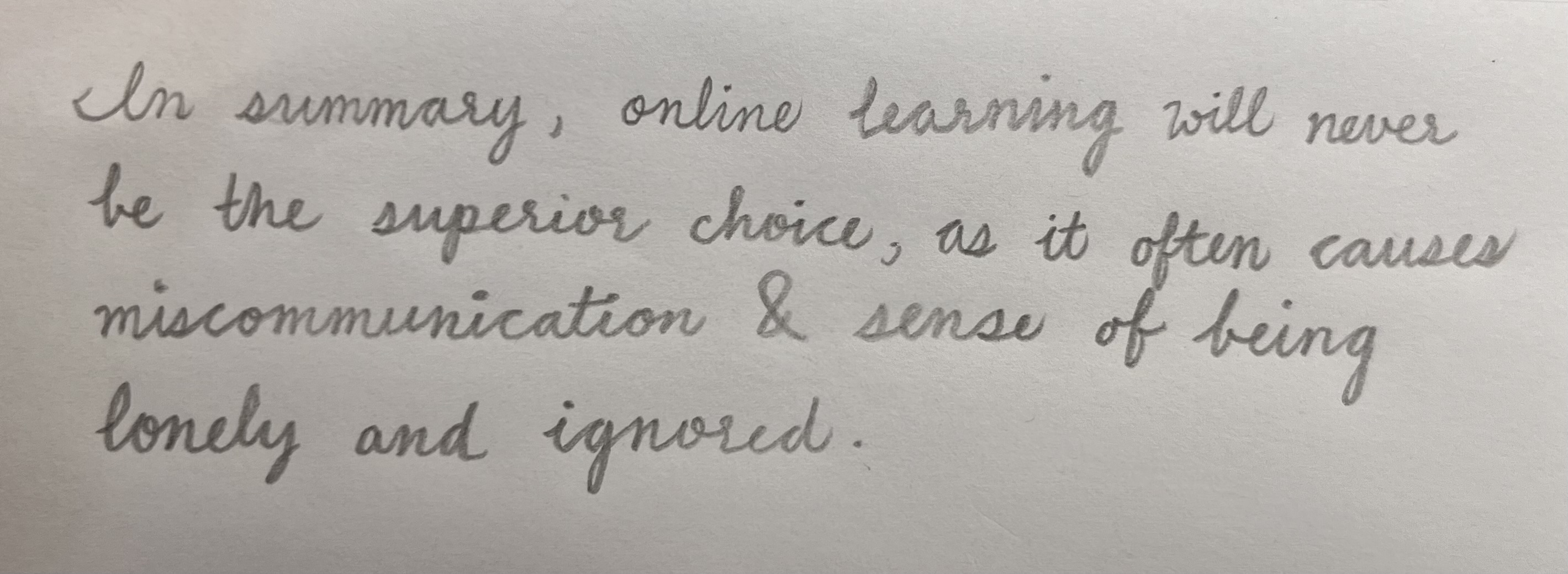
This cursive handwriting style suggests a thoughtful and considerate personality, with a touch of traditionalism. Some minor adjustments to letter consistency and spacing could further enhance its legibility.
This handwriting exhibits a cursive style, with letters connected in a flowing manner. The strokes are gentle and rounded, creating a soft, almost delicate appearance. The consistency is moderate, with some variation in letter size and spacing, for example the 'o' is sometimes quite circular and other times more oval. The handwriting is generally legible, though the connecting strokes between some letters could be clearer, particularly the ascenders and descenders, which sometimes appear a little cramped. The slant is mostly consistent and slightly to the right. Overall, it's a pleasant and readable style, leaning towards the formal.
Based on this handwriting, one might infer that the writer is thoughtful and considerate. The rounded letters suggest a gentle nature, while the consistency in slant implies a sense of stability. The clear and legible writing indicates a desire to communicate effectively and be understood. The slight rightward slant suggests a forward-thinking and approachable personality, someone who is open to new experiences and ideas but values tradition and structure. There may be a hint of perfectionism, striving for clarity and neatness in expression.
To improve this handwriting, consider focusing on the consistency of letter size and spacing. Practicing individual letter forms, especially ascenders and descenders, can help create a more uniform appearance. Paying attention to the pressure applied while writing can also enhance the clarity and definition of each stroke. Experimenting with different pen grips and paper types may also yield surprising improvements. Ultimately, the goal is to maintain the elegance of the cursive style while increasing its legibility and consistency.
Legibility
Expressiveness
Consistency
Overall
Leaderboard for Sunday, 26 October 2025
| 31 | The Diligent Student |
53
|
| 32 | The Steadfast Student |
53
|
| 33 | The Architect of Letters |
53
|
| 34 | The Flowing River |
53
|
| 35 | The Approximator's Script |
52
|
| 36 | The Optimistic Loopist |
51
|
| 37 | The Provocateur's Quill |
51
|
| 38 | The Visionary's Script |
51
|
| 39 | The Pragmatic Penman |
47
|