Rate my handwriting

✨ Upload a sample of your handwriting, and our 🤖 AI will give you
the scoop on
what's awesome
and what could use a
little improving.
It's just for fun - and totally free! Try now 🚀
(You can also check out today's 👑 Leaderboard 👇)

The Practical Penman
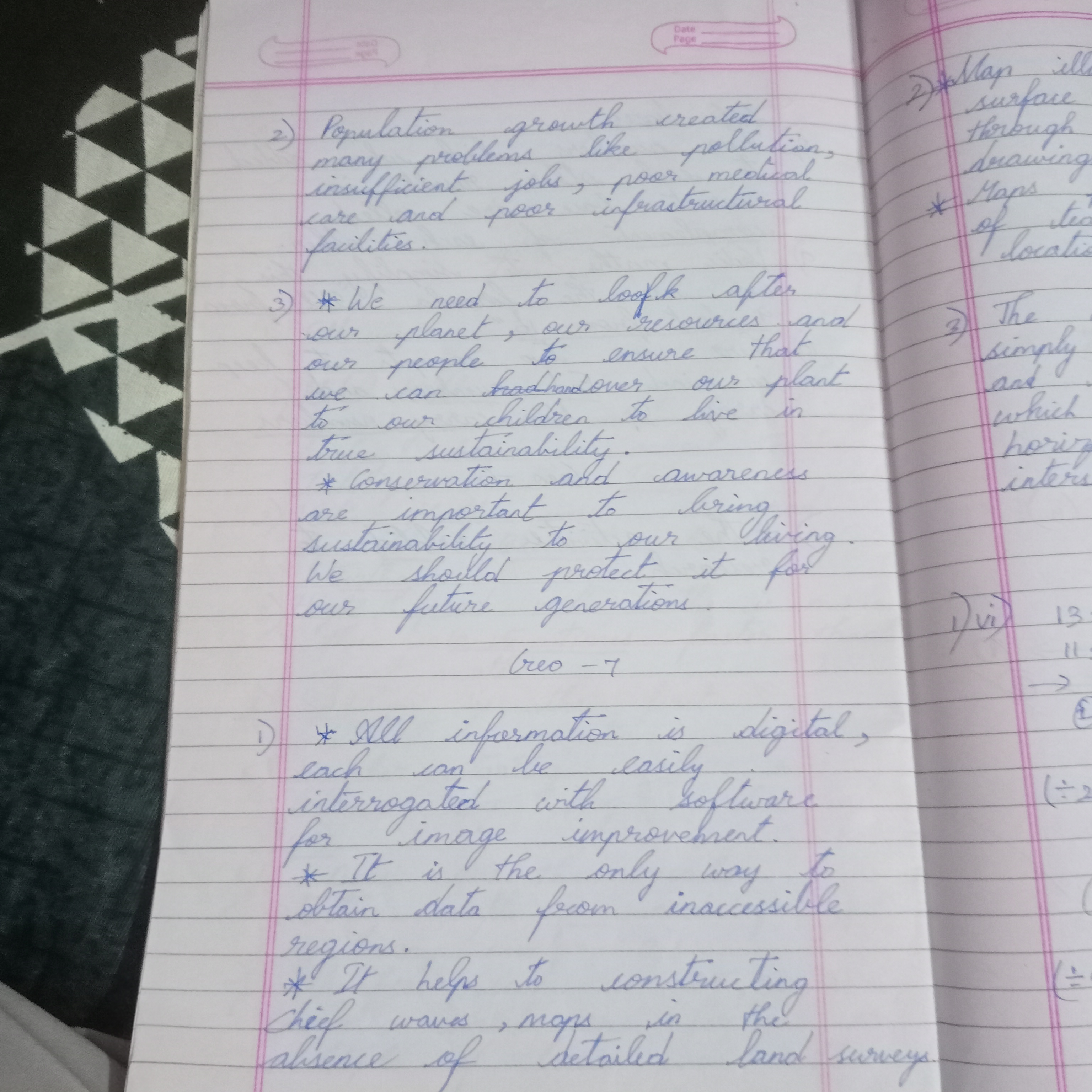
This handwriting sample reveals a practical, efficient, and logical individual, whose direct and straightforward style is occasionally marred by inconsistencies in slant and baseline.
The handwriting in this sample is generally legible and consistent, exhibiting a practical, utilitarian style. The script is primarily cursive, with occasional lapses into print, especially for uppercase letters like 'P', 'W' and 'I'. The letterforms are simple, unadorned, and generally well-formed. Words like 'information', 'obtain', and 'sustainability' showcase a comfortable rhythm and flow. However, some inconsistencies appear in letter size and slant, particularly noticeable in longer words. The baseline tends to drift slightly upwards across the page, adding a dynamic but somewhat unpolished feel. Overall, this style is not flashy, but conveys a sense of clear communication and straightforwardness.
This handwriting suggests a personality that values practicality and efficiency. The directness of the letterforms hints at a clear and logical mind, someone who prioritizes substance over style. The consistent rhythm and even spacing implies a methodical approach to tasks, while the upward slant suggests optimism and enthusiasm. The occasional variations in letterforms indicate adaptability and a willingness to deviate from the norm when necessary. While this individual may not be overly expressive or flamboyant, they are likely dependable and results-oriented.
While generally legible, some minor improvements could enhance the overall neatness and impact. Maintaining a consistent baseline would greatly improve the overall presentation. Pay closer attention to letter size and slant to create a more polished look. While speed and efficiency are evident, slightly slowing down to perfect letterforms would increase legibility and aesthetic appeal. Try incorporating more distinctive letter shapes to inject a touch of personal style and make your handwriting stand out. Consistent pen pressure could make your script more visually appealing.
Legibility
Expressiveness
Consistency
Overall
Leaderboard for Monday, 27 October 2025
| 31 | The Ambitious Note-Taker |
52
|
| 32 | Celestial Notes |
52
|
| 33 | The Pragmatic Hand |
52
|
| 34 | The Approximator's Script |
52
|
| 35 | The Budding Chemist |
51
|
| 36 | The Visionary's Script |
51
|
| 37 | The Pragmatic Penman |
47
|