Rate my handwriting

✨ Upload a sample of your handwriting, and our 🤖 AI will give you
the scoop on
what's awesome
and what could use a
little improving.
It's just for fun - and totally free! Try now 🚀
(You can also check out today's 👑 Leaderboard 👇)

The Flowing Pen
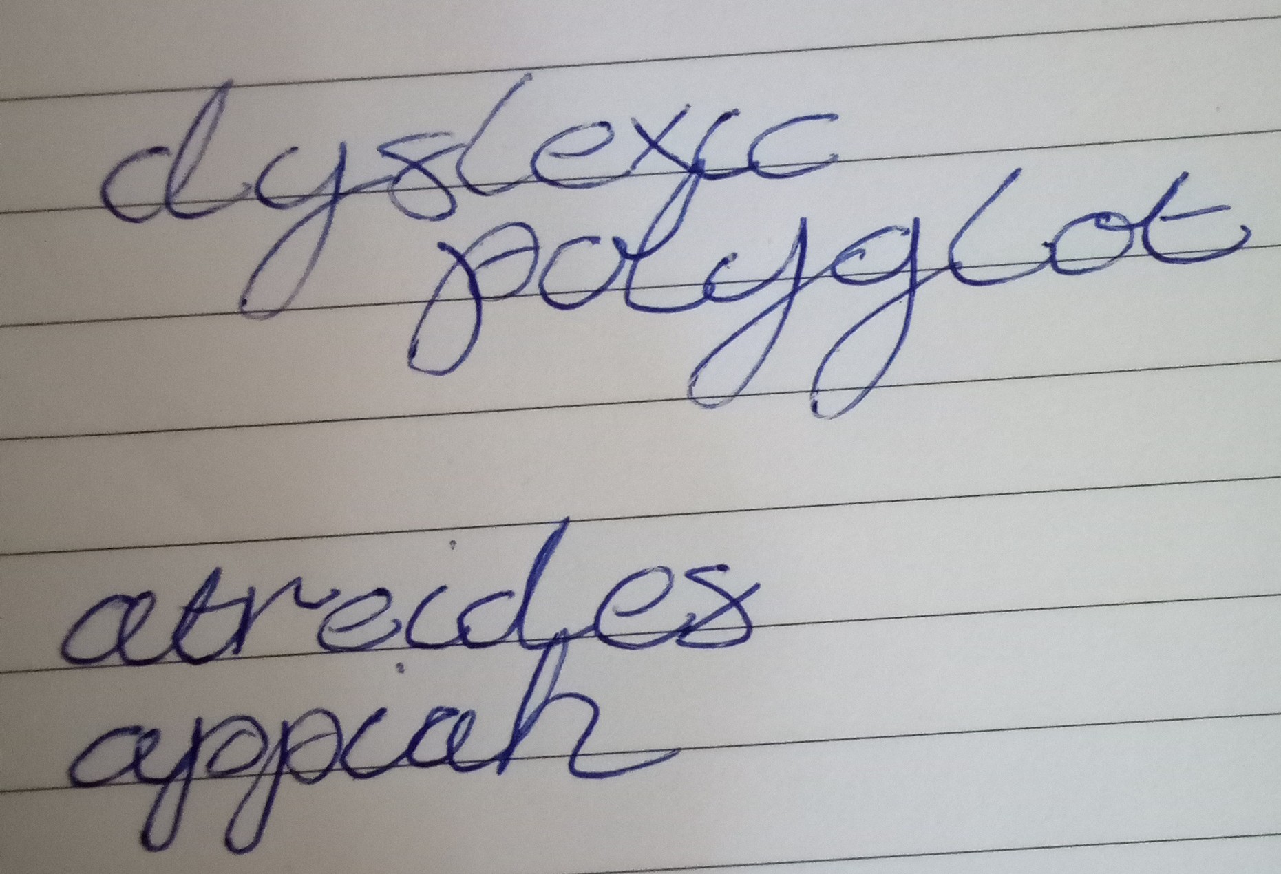
This handwriting suggests an affable personality with a logical mind, although consistency could be improved. Minor adjustments to spacing and pace could further refine this unique style.
The handwriting is characterized by a cursive style with rounded letterforms, as seen in the words "dyslexic", "polyglot", "atreides", and "appiah". There's a general lack of angularity, favoring curves and loops. The letter sizes appear relatively uniform, but the spacing between words varies slightly, leading to a slightly inconsistent flow. Overall the writing appears to be fairly legible despite a degree of flourish, with letters well-formed and distinguishable, though perhaps not exceptionally neat.
This style of handwriting suggests someone who is affable and agreeable. The rounded forms hint at a friendly and approachable nature. The connected letters indicate a logical and systematic mind, but the slight inconsistency in spacing could imply occasional distractions or a tendency to multitask. There is a certain degree of self-confidence implied by the fluidity of the strokes.
To improve the handwriting, focusing on maintaining a consistent word spacing would enhance legibility and neatness. Practicing writing with a slightly slower, more deliberate pace could also reduce inconsistencies. Paying attention to the baseline and ensuring letters consistently align along it will add a sense of structure. Ultimately, the current style is perfectly serviceable and reflects a unique personality, so any improvements are purely aesthetic.
Legibility
Expressiveness
Consistency
Overall
Leaderboard for Monday, 27 October 2025
| 1 | The Constitutionalist |
74
|
| 2 | The Eloquent Educator |
71
|
| 3 | The Student's Script |
70
|
| 4 | The Dreamer's Quill |
70
|
| 5 | The Hopeful Heart's Script |
68
|
| 6 | The Constitutionalist |
68
|
| 7 | The Diligent Penman |
67
|
| 8 | The Agrarian Academic |
67
|
| 9 | The Calculating Hand |
65
|
| 10 | The Diligent Note-Taker |
64
|
| 11 | The Mathematical Muse |
64
|
| 12 | The Contemplative Soul |
64
|
| 13 | The Gentle Flow |
63
|
| 14 | The Flowing Font |
63
|
| 15 | The Looping Legend |
62
|
| 16 | The Contemplative Calligrapher |
60
|
| 17 | The Democratic Dreamer |
59
|
| 18 | The Signature Stylist |
59
|
| 19 | The Devout Note-Taker |
58
|
| 20 | The Orderly Typewriter |
56
|
| 21 | The Forward Leaning Letterer |
54
|
| 22 | The Architect of Letters |
53
|
| 23 | The Steadfast Student |
53
|
| 24 | The Flowing River |
53
|
| 25 | The Diligent Student |
53
|
| 26 | The Approximator's Script |
52
|
| 27 | The Pragmatic Hand |
52
|
| 28 | Celestial Notes |
52
|
| 29 | The Visionary's Script |
51
|
| 30 | The Provocateur's Quill |
51
|