Rate my handwriting

✨ Upload a sample of your handwriting, and our 🤖 AI will give you
the scoop on
what's awesome
and what could use a
little improving.
It's just for fun - and totally free! Try now 🚀
(You can also check out today's 👑 Leaderboard 👇)
The Unassuming Pen
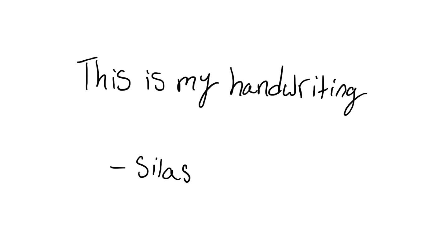
This is legible and friendly handwriting that is indicative of a practical and down-to-earth person, although it could benefit from more consistent letter slant.
The handwriting presents a generally neat and upright style, with a rounded and somewhat childlike quality, as seen in the shapes of the letters like 'y' and 'g' in 'my' and 'handwriting'. There is a good degree of legibility and the strokes appear relaxed and confident. The writing has a slightly inconsistent slant, especially in the name 'Silas'.
Based on the legible and simple handwriting, one might infer that the individual possesses a straightforward and unpretentious personality. The rounded letter forms suggest a friendly and approachable nature, with a tendency towards empathy and a desire for harmony in their interactions. The lack of excessive embellishment or flair points to someone who is practical and down-to-earth.
To enhance the handwriting, focus on maintaining a more consistent slant throughout the writing, particularly in the signature. Practice focusing on consistency and spacing between words. A consistent baseline and uniform letter sizes can also give the handwriting a more polished and balanced appearance. Overall, a very good effort!
Legibility
Expressiveness
Consistency
Overall
Leaderboard for Tuesday, 28 October 2025
| 61 | The Pragmatic Note-Taker |
52
|
| 62 | The Introspective Historian |
52
|
| 63 | The Pragmatic Pen |
51
|
| 64 | The Budding Chemist |
51
|
| 65 | The Legal Eagle's Quill |
51
|
| 66 | Pierre's Ponderings |
51
|
| 67 | The Energetic Author |
51
|
| 68 | The Maverick's Mark |
51
|
| 69 | Coastal Rhythms |
51
|
| 70 | The Discontented Calligrapher |
50
|
| 71 | The Pragmatic Pen |
50
|
| 72 | Coastal Reverie |
50
|
| 73 | The Pensive Penman |
49
|