Rate my handwriting

✨ Upload a sample of your handwriting, and our 🤖 AI will give you
the scoop on
what's awesome
and what could use a
little improving.
It's just for fun - and totally free! Try now 🚀
(You can also check out today's 👑 Leaderboard 👇)
The Pragmatic Penman
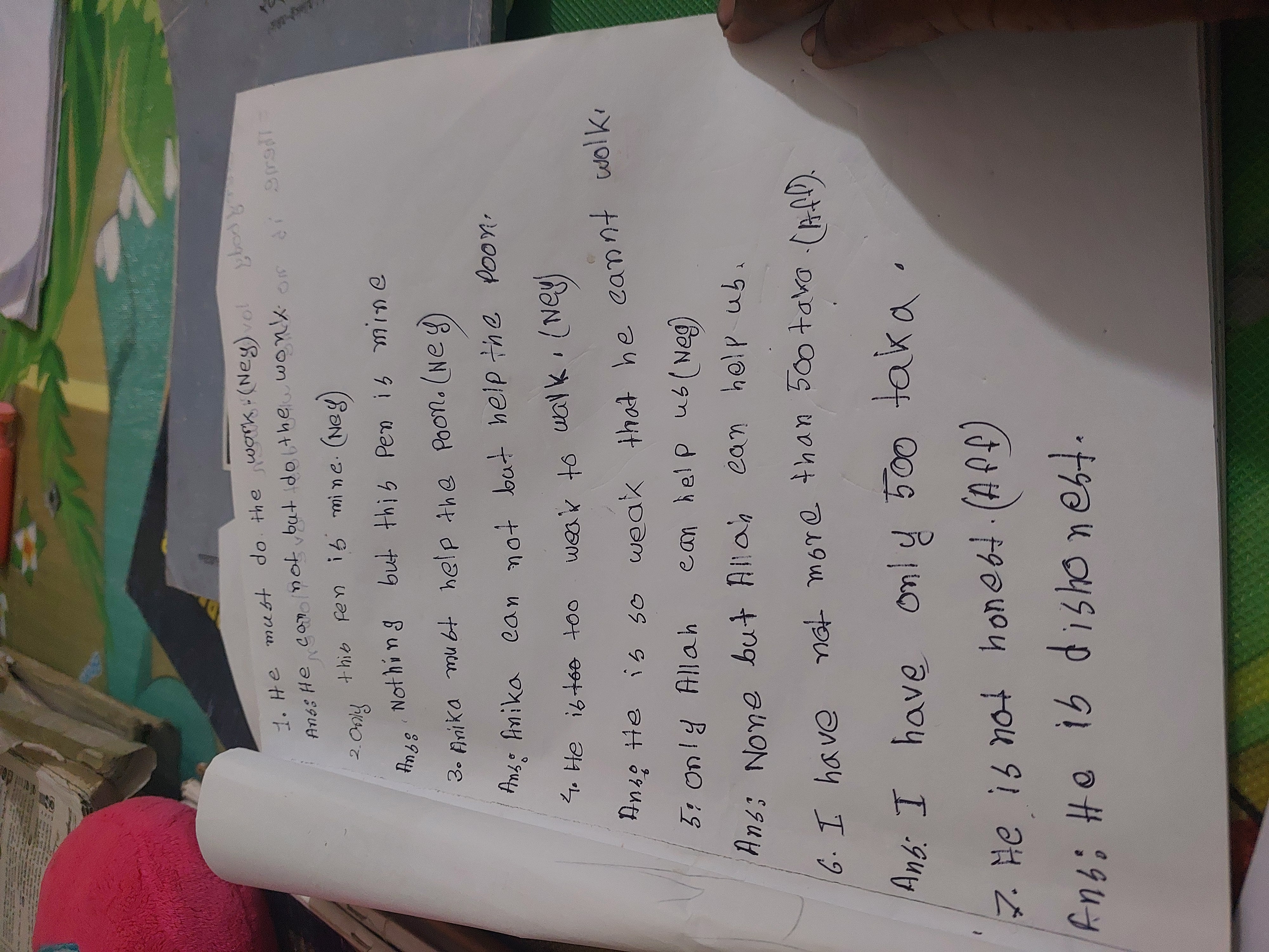
The handwriting is functional and practical, implying a personality that values clarity and order, though some minor improvements could enhance its flow and expressiveness. With some refinement, the writing could become more fluid and aesthetically pleasing.
The handwriting sample exhibits a rather functional and straightforward style. The letterforms are generally simple and lack excessive ornamentation. The handwriting tends towards verticality with minimal slant, and the size of the letters is relatively uniform, suggesting a controlled and consistent hand. Words are spaced adequately, but letter spacing within words can be somewhat inconsistent. The 'y' in 'only' and 'dishonest' show interesting descenders. There's a tendency towards rounded letterforms, which softens the overall appearance. Fluency is moderate; there are moments where the writing appears deliberate, almost as if each letter is carefully constructed. Overall legibility is decent, although some words might require a second glance.
This handwriting suggests a personality that values clarity and practicality. The consistency in letter size and verticality implies a sense of order and discipline. The rounded letterforms might point to a friendly and approachable nature. The writer seems to be someone who is grounded and prefers to express themselves in a straightforward manner, avoiding unnecessary embellishments. The occasional inconsistencies in letter spacing may indicate moments of impulsivity or a slight lack of attention to detail, but these are minor.
To further enhance the handwriting, focusing on maintaining consistent letter spacing within words could be beneficial. Practicing rhythmic drills to improve fluency and fluidity would also add a more natural flow to the writing. Experimenting with a slight slant could introduce a touch of personality and dynamism. Overall, the handwriting is functional and clear, and with a few refinements, it could become even more expressive and aesthetically pleasing.
Legibility
Expressiveness
Consistency
Overall
Leaderboard for Monday, 27 October 2025
| 1 | The Constitutionalist |
74
|
| 2 | The Eloquent Educator |
71
|
| 3 | The Student's Script |
70
|
| 4 | The Dreamer's Quill |
70
|
| 5 | The Hopeful Heart's Script |
68
|
| 6 | The Constitutionalist |
68
|
| 7 | The Diligent Penman |
67
|
| 8 | The Agrarian Academic |
67
|
| 9 | The Calculating Hand |
65
|
| 10 | The Diligent Note-Taker |
64
|
| 11 | The Mathematical Muse |
64
|
| 12 | The Contemplative Soul |
64
|
| 13 | The Gentle Flow |
63
|
| 14 | The Flowing Font |
63
|
| 15 | The Looping Legend |
62
|
| 16 | The Contemplative Calligrapher |
60
|
| 17 | The Democratic Dreamer |
59
|
| 18 | The Signature Stylist |
59
|
| 19 | The Devout Note-Taker |
58
|
| 20 | The Orderly Typewriter |
56
|
| 21 | The Forward Leaning Letterer |
54
|
| 22 | The Architect of Letters |
53
|
| 23 | The Steadfast Student |
53
|
| 24 | The Flowing River |
53
|
| 25 | The Diligent Student |
53
|
| 26 | The Approximator's Script |
52
|
| 27 | The Pragmatic Hand |
52
|
| 28 | Celestial Notes |
52
|
| 29 | The Visionary's Script |
51
|
| 30 | The Provocateur's Quill |
51
|