Rate my handwriting

✨ Upload a sample of your handwriting, and our 🤖 AI will give you
the scoop on
what's awesome
and what could use a
little improving.
It's just for fun - and totally free! Try now 🚀
(You can also check out today's 👑 Leaderboard 👇)
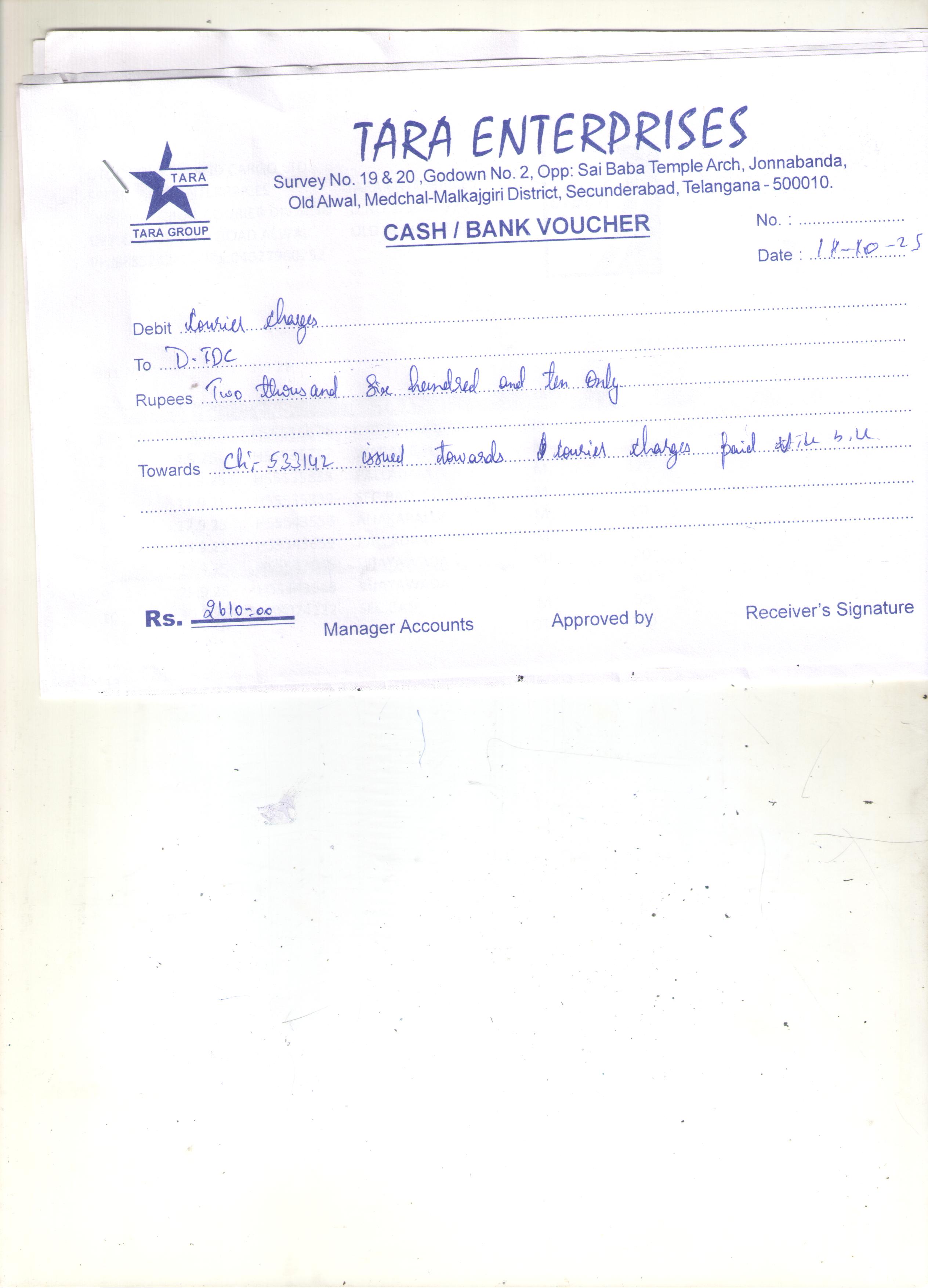
The Pragmatic Pen
This handwriting suggests a practical and reliable individual with a preference for straightforwardness, although improved spacing and letter differentiation would enhance legibility and expressiveness.
The handwriting is characterized by a slight right slant and rounded letter formations. The size is moderate, with a relatively consistent baseline. The pressure appears medium, and the spacing between words and letters is generally adequate, although some words run together slightly. There's a noticeable effort towards neatness, but the overall appearance is somewhat utilitarian rather than artistic. For example, the word "charges" is legible, but lacks flourish.
Based on this handwriting, one might infer a practical and grounded personality. The consistency suggests a reliable nature, while the lack of excessive embellishment indicates a preference for straightforwardness. There may be a tendency towards pragmatism and a focus on functionality over aesthetics. The individual likely values clarity and direct communication.
To enhance the handwriting, focusing on letter differentiation could be beneficial. Practicing consistent spacing between letters and words would improve legibility. Experimenting with varying the pressure applied to the pen could introduce a more dynamic quality. Ultimately, the goal is to strike a balance between practicality and personal expression.
Legibility
Expressiveness
Consistency
Overall
Leaderboard for Thursday, 16 October 2025
| 1 | The Organized Achiever |
75
|
| 2 | The Diligent Student |
71
|
| 3 | The Compassionate Educator's Cursive |
70
|
| 4 | Soulful Script |
69
|
| 5 | The Diplomat's Quill |
68
|
| 6 | The Introspective Calligrapher |
68
|
| 7 | The Pragmatic Pen |
66
|
| 8 | The Pragmatic Pen |
66
|
| 9 | The Encourager's Script |
65
|
| 10 | The Leaping Pen |
64
|
| 11 | The Playful Pen |
62
|
| 12 | The Reflective Academic |
61
|
| 13 | The Considerate Correspondent |
61
|
| 14 | The Flowing Stream |
60
|
| 15 | The Sailor's Log |
59
|
| 16 | The Analytical Author |
58
|
| 17 | The Casual Curator |
58
|
| 18 | The Organized Accountant |
58
|
| 19 | The Curious Pen |
57
|
| 20 | The Leaning Tower |
56
|
| 21 | The Minimalist |
55
|
| 22 | The Environmentalist's Cursive |
53
|
| 23 | The Diplomat's Quill |
51
|
| 24 | The Pragmatic Pen |
51
|
| 25 | The Whimsical Quill |
51
|
| 26 | The Hurried Hustler |
49
|
| 27 | The Introspective Diarist |
49
|
| 28 | The Elementary Elocutionist |
48
|
| 29 | The Pragmatic Pen |
46
|