Rate my handwriting

✨ Upload a sample of your handwriting, and our 🤖 AI will give you
the scoop on
what's awesome
and what could use a
little improving.
It's just for fun - and totally free! Try now 🚀
(You can also check out today's 👑 Leaderboard 👇)
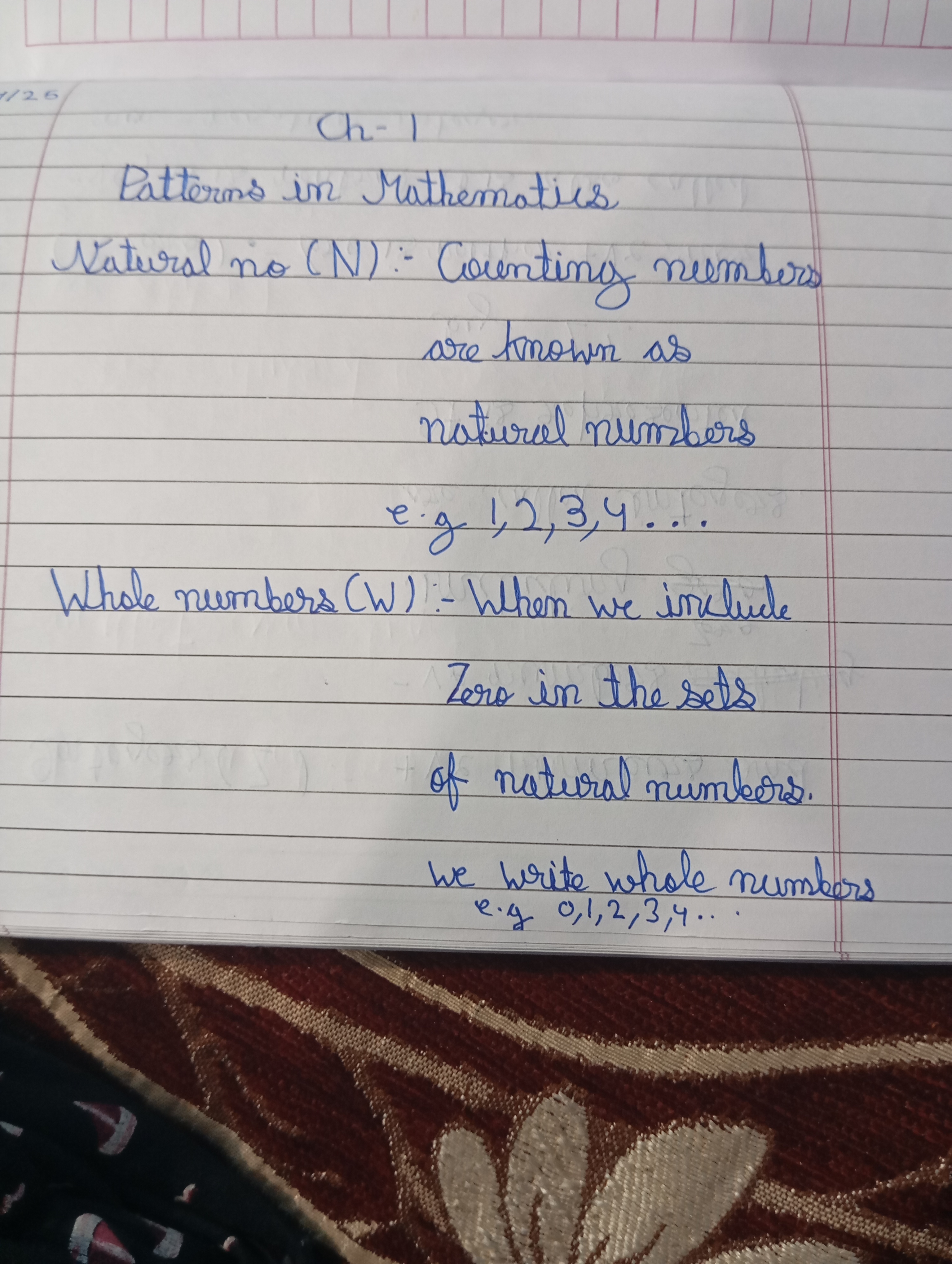
The Precise Mathematician
This handwriting demonstrates a balance of precision and expressiveness, suggesting a methodical yet imaginative mind.
This handwriting sample showcases a blend of consistency and subtle expressiveness. The script is generally neat and legible, as seen in the clearly formed letters of words like "Mathematics" and "numbers." The baseline is consistent, and letterforms like "a", "t", and "m" exhibit regular proportions. However, a closer look reveals traces of individuality. Notice the slight flourish in the starting stroke of words like "Patterns" and "Natural," and the distinct roundedness of letters like "o" and "e." The gentle slant to the right and occasional ligatures, where letters like "co" in "Counting" are smoothly connected, contribute to a rhythmic flow.
This writing style suggests a personality that values both clarity and creativity. The balanced proportions and controlled strokes hint at a methodical, detail-oriented approach. The ability to maintain a steady baseline reflects discipline and groundedness. However, the slight decorative touches, such as the elegant starting strokes and occasional loops, indicate an imaginative mind. The fluidity of the script suggests adaptability and openness to new ideas, especially within the precise world of mathematics. This individual likely enjoys structure but appreciates the beauty of expression within those boundaries. They find harmony in the patterns of logic, yet embrace the freedom of thought to explore beyond conventional formulas.
While this handwriting is already quite legible, a few tweaks can further enhance its visual appeal and efficiency. Focusing on the consistency of letter size, especially for ascenders like "h" and "l," can add a polished look. Ensuring a uniform slant, avoiding the slight wavering observed in some parts, would enhance readability. Minimizing ligatures in situations where they compromise clarity, such as the combination of "ou" in "Counting," would improve legibility at speed. Practicing joining letters consistently would give a more uniform, sophisticated look. Overall, a focus on maintaining consistent form without losing the personal touch would make this already good handwriting even more impressive.
Legibility
Expressiveness
Consistency
Overall
Leaderboard for Monday, 27 October 2025
| 31 | The Ambitious Note-Taker |
52
|
| 32 | Celestial Notes |
52
|
| 33 | The Pragmatic Hand |
52
|
| 34 | The Approximator's Script |
52
|
| 35 | The Budding Chemist |
51
|
| 36 | The Visionary's Script |
51
|
| 37 | The Pragmatic Penman |
47
|