Rate my handwriting

✨ Upload a sample of your handwriting, and our 🤖 AI will give you
the scoop on
what's awesome
and what could use a
little improving.
It's just for fun - and totally free! Try now 🚀
(You can also check out today's 👑 Leaderboard 👇)
The Navigator
This legible and neat cursive handwriting suggests a clear, direct, and organized personality, with a penchant for detail and efficiency, yet room for improvement in terms of consistent spacing and connections.
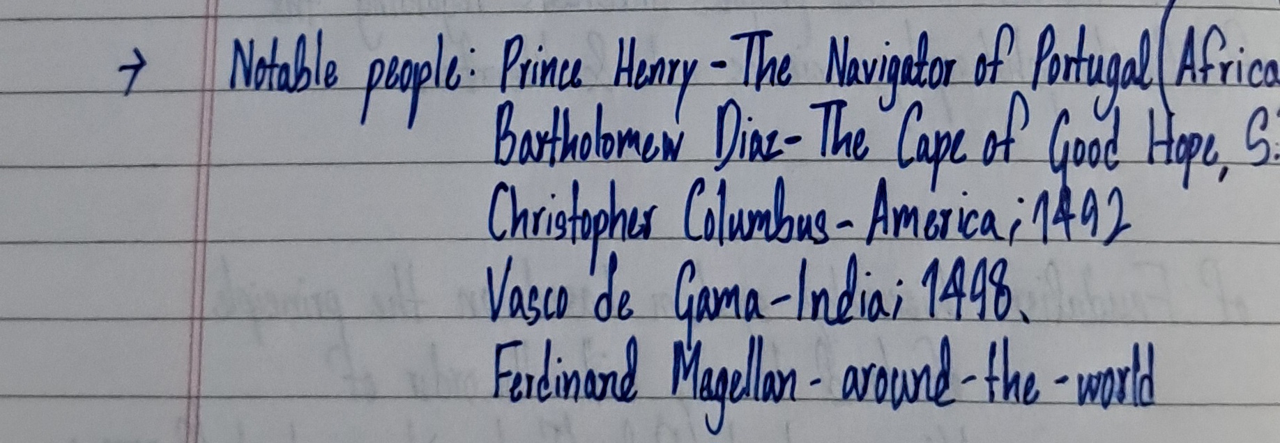
This handwriting sample presents a clear and legible cursive style. The letters are generally well-formed and consistent, as seen in the repeated 'o' in 'Notable', 'people', and 'Columbus'. The ascenders and descenders, such as in 'h' of 'Henry', 'p' of 'people', and 'g' of 'Portugal', are of a moderate length, and the baseline is relatively straight. There is a connectedness to the letters within words, although certain connections appear slightly strained, like between the 'e' and 'o' in 'people'. The overall appearance is somewhat rushed but generally neat, hinting at an efficient and organized mindset.
The neatness and legibility of the writing suggest a personality that values clarity and directness. The slight right slant might indicate a person who is open to experiences and connections with others. The consistent letter formations point to someone reliable and grounded. The rounded letters, as seen in the 'a', 'o', and 'd' throughout the sample, may signify an approachable and friendly demeanor. However, the occasional hurried appearance, particularly in the extended connections between words, may betray a tendency to prioritize speed over perfection, which could lead to occasional oversight or minor inaccuracies. The inclusion of specific dates alongside each name, '1492' and '1498', reveals a detail-oriented and precise approach to recording information.
To enhance this already pleasant handwriting, focusing on maintaining consistent spacing between letters and words could be beneficial. Paying particular attention to the connections between letters, especially those that appear slightly strained, could further improve the flow and overall appearance. Practicing more elaborate letter formations, such as loops and flourishes, could introduce a more personalized and expressive touch, elevating the aesthetic appeal. Lastly, slowing down slightly while writing might enhance the precision and consistency of the script.
Legibility
Expressiveness
Consistency
Overall
Leaderboard for Tuesday, 28 October 2025
| 1 | The Calligrapher |
83
|
| 2 | The Elegant Calligrapher |
82
|
| 3 | Flourishing Calligrapher |
77
|
| 4 | The Calligrapher |
77
|
| 5 | The Flowing Stream |
74
|
| 6 | The Fluid Calligrapher |
71
|
| 7 | The Inspirational Calligrapher |
70
|
| 8 | The Student's Lament |
70
|
| 9 | The Pragmatic Pupil |
68
|
| 10 | The Flourishing Individual |
68
|
| 11 | The Jolly Optimist |
68
|
| 12 | The Mario Manifesto |
68
|
| 13 | The Perfectionist's Primer |
67
|
| 14 | The Diligent Calligrapher |
67
|
| 15 | The Considerate Soul |
67
|
| 16 | The Reflective Student |
67
|
| 17 | The Elegant Calligrapher |
66
|
| 18 | The Divine Calligrapher |
66
|
| 19 | The Upright Pen |
65
|
| 20 | The Concerned Guardian |
65
|
| 21 | The Pharmacist's Note |
65
|
| 22 | The Analytical Alchemist |
65
|
| 23 | The Advocate's Quill |
65
|
| 24 | The Grid Writer |
65
|
| 25 | The Flowing Quill |
64
|
| 26 | The Historian's Hand |
64
|
| 27 | The Educated Executive |
63
|
| 28 | The Diligent Diarist |
63
|
| 29 | The Flourishing Enigma |
63
|
| 30 | The Gridiron Enthusiast |
63
|