Rate my handwriting

✨ Upload a sample of your handwriting, and our 🤖 AI will give you
the scoop on
what's awesome
and what could use a
little improving.
It's just for fun - and totally free! Try now 🚀
(You can also check out today's 👑 Leaderboard 👇)
The Monarch's Mark
This handwriting is simple and straightforward, suggesting an honest and practical personality. Focus on letter connections and varying pressure to add more personality and visual interest.
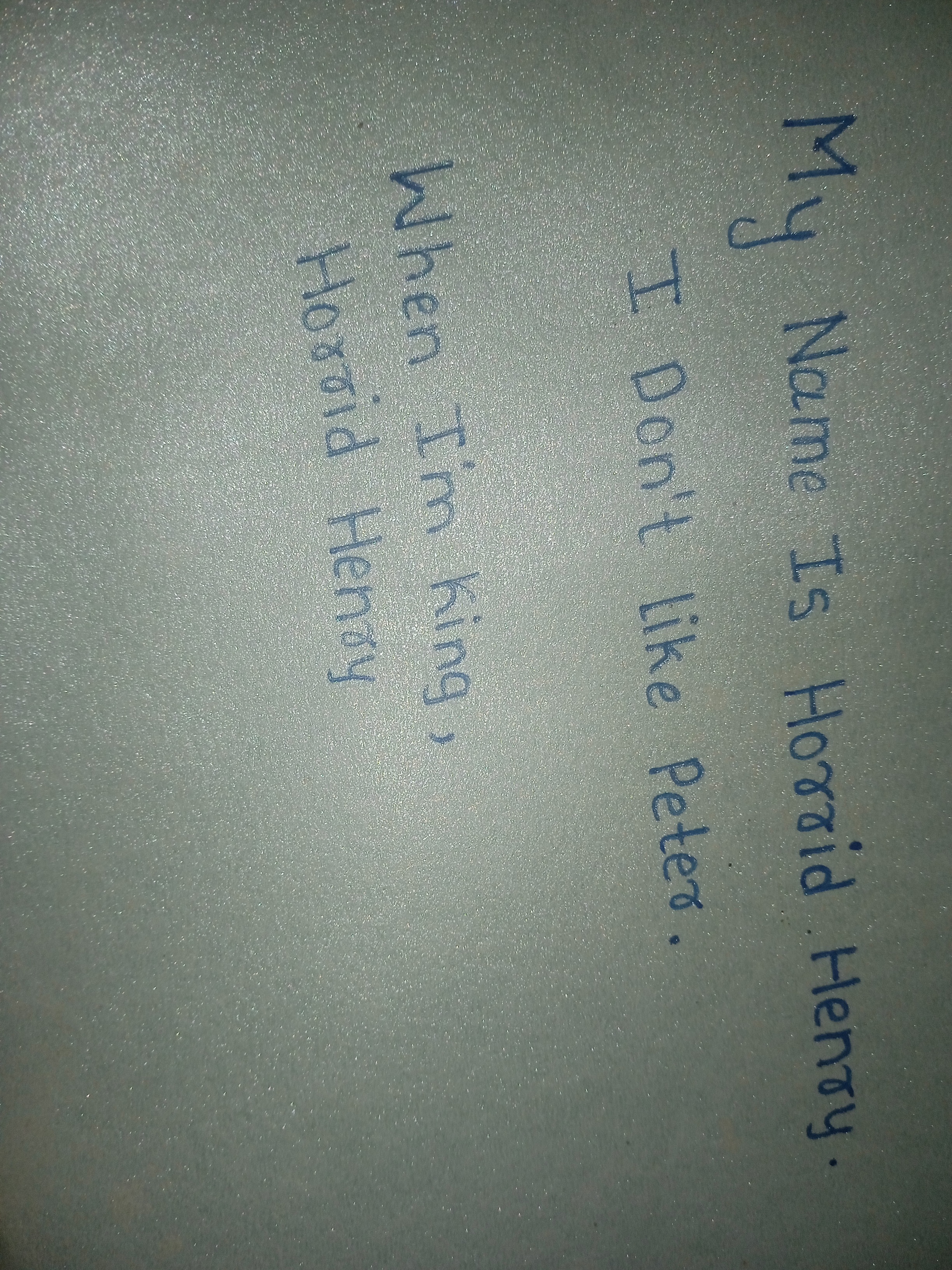
The handwriting exhibits a childish, upright style with simple letter formations. The rounded 'y' and the straightforward 'I' indicate a basic, unembellished approach to writing. The overall impression is that of a young person still developing their motor skills, seen in the slight inconsistency in letter size and spacing. The pressure applied seems even, suggesting a relaxed grip and perhaps a lack of emphasis or urgency.
Based on this handwriting, the writer likely possesses a straightforward and unpretentious personality. The simplicity of the letter forms suggests honesty and a lack of artifice. The consistent baseline implies stability and a practical outlook. There may be a degree of stubbornness or resistance to change, indicated by the upright slant and the somewhat rigid letter formations.
To improve, focus on refining letter connections for smoother flow. Experiment with a slight slant to add dynamism and personality. Practice varying the pressure to create emphasis and visual interest. Also, pay attention to the consistency of letter size to achieve a more polished and professional look. Perhaps practice the loops in letters such as 'y' and 'g' to add more flair.
Legibility
Expressiveness
Consistency
Overall
Leaderboard for Sunday, 16 November 2025
| 1 | The Loopy Luminary |
73
|
| 2 | The Diligent Student |
71
|
| 3 | Le Rêveur Éloquent |
71
|
| 4 | The Pragmatic Pen |
70
|
| 5 | The Linear Algebrist |
69
|
| 6 | The Underlined Authority |
69
|
| 7 | The Aspiring Performer |
68
|
| 8 | The Diligent Student |
68
|
| 9 | The Stoic Hand |
66
|
| 10 | The Diligent Jurist |
66
|
| 11 | The Playful Pen |
65
|
| 12 | The Monarch's Mark |
65
|
| 13 | The Logical Luminary |
64
|
| 14 | The Logical Luminary |
64
|
| 15 | The Young Voyager's Script |
63
|
| 16 | The Blue Flow |
63
|
| 17 | The Ledger Keeper |
62
|
| 18 | The Pragmatic Minimalist |
62
|
| 19 | The Academic Aspirant |
61
|
| 20 | The Regal Hand |
61
|
| 21 | The Diligent Student |
61
|
| 22 | The Dreamer's Script |
61
|
| 23 | The Curious Calligrapher |
60
|
| 24 | The Earnest Expression |
60
|
| 25 | The Dreamer's Doodles |
60
|
| 26 | The Flowing Fountain |
58
|
| 27 | The Gamer's Grievance |
58
|
| 28 | The Pragmatic Planner |
58
|
| 29 | The Taco Devotee |
58
|
| 30 | The Elusive Soul |
58
|