Rate my handwriting

✨ Upload a sample of your handwriting, and our 🤖 AI will give you
the scoop on
what's awesome
and what could use a
little improving.
It's just for fun - and totally free! Try now 🚀
(You can also check out today's 👑 Leaderboard 👇)
The Fluid Soul
The handwriting sample indicates a thoughtful and expressive individual with a penchant for clarity and balance, who could improve their handwriting with attention to spacing and baseline consistency. It reveals an optimistic and forward-looking person.
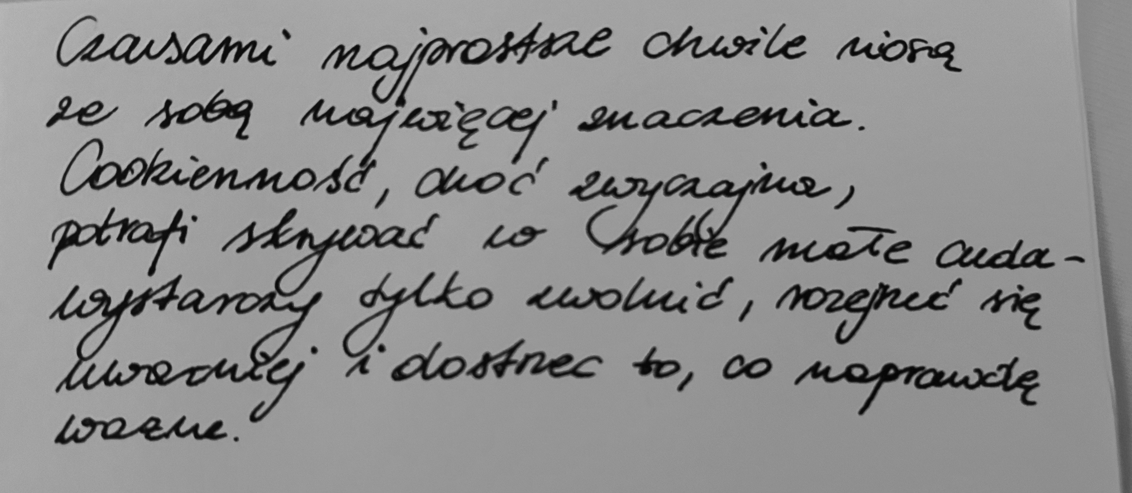
The handwriting presents a flowing, cursive style, where letters within words are generally connected, though there are some breaks, giving it a personal touch. The strokes are relatively even in thickness, and the pressure appears consistent throughout the sample. Letter formations, like the 's' in "najprostsze" and the 'w' in "chwile", are distinct and rounded, contributing to the overall legibility. The baseline is generally stable, though there's a slight upward trend towards the end of each line. The size of the letters is relatively uniform, enhancing readability, although the spacing between words varies, creating a slightly uneven rhythm.
Based on the handwriting, the writer likely possesses a thoughtful and reflective nature. The flowing style suggests a tendency towards creativity and emotional expression. The consistency in pressure and stroke indicates a balanced temperament and a capacity for focused attention. The upward trending lines could imply optimism and a forward-looking perspective. The writer appears to be someone who values clarity and precision, as evidenced by the generally legible and well-formed letters.
To further enhance the handwriting, focus on maintaining a more consistent spacing between words to improve the visual rhythm. Practice maintaining a consistently horizontal baseline for a more grounded appearance. Experiment with varying the pressure slightly to add more dynamic expression, but be mindful of maintaining legibility. Pay particular attention to the consistency of letter heights and sizes to enhance the overall neatness of the handwriting.
Legibility
Expressiveness
Consistency
Overall
Leaderboard for Monday, 27 October 2025
| 31 | The Approximator's Script |
52
|
| 32 | The Budding Chemist |
51
|
| 33 | The Visionary's Script |
51
|
| 34 | The Energetic Author |
51
|
| 35 | The Maverick's Mark |
51
|