Rate my handwriting

✨ Upload a sample of your handwriting, and our 🤖 AI will give you
the scoop on
what's awesome
and what could use a
little improving.
It's just for fun - and totally free! Try now 🚀
(You can also check out today's 👑 Leaderboard 👇)
The Village Voice
This charmingly rustic handwriting suggests a warm, adaptable, and artistic personality, with a penchant for quiet pursuits and an appreciation for the simple pleasures of life.
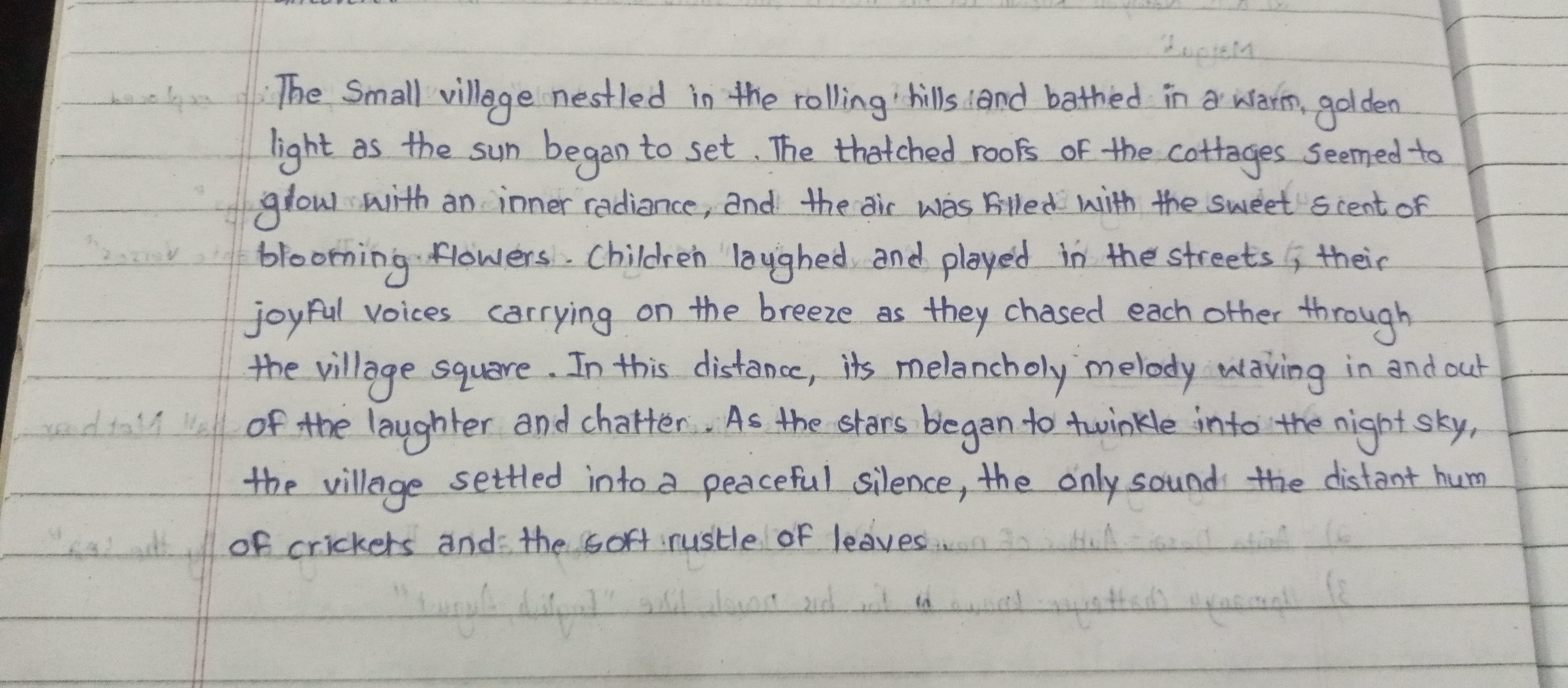
This handwriting sample presents a charmingly rustic style, reminiscent of a gentle breeze rustling through a peaceful village. The script is generally legible and consistent, with a slight rightward slant. Words like "thatched", "radiance", and "melancholy" flow smoothly, exhibiting a natural rhythm. While there's a pleasant variation in letter sizes and shapes, certain letters, such as "g" and "y", exhibit a unique flourish, extending gracefully below the baseline, like vines reaching for the earth. The overall impression is one of unhurried tranquility.
The relaxed flow and gentle curves of the writing suggest a personality that is adaptable, empathetic, and drawn to the simple pleasures of life. The rounded forms and lack of sharp angles hint at a warm and approachable nature. The rightward slant indicates a moderate level of expressiveness and a willingness to engage with the world. The careful attention to details, like the loops and flourishes on certain letters, suggests an appreciation for beauty and an artistic inclination. This individual is likely to be content in quiet pursuits, finding solace in nature and creativity.
While the handwriting is generally legible, a few minor adjustments could enhance its clarity and elegance. Focusing on consistent letter spacing, particularly between words, would prevent occasional crowding and improve readability. Paying attention to the height of lowercase letters, especially those that extend above the baseline, such as "h" and "l", would create a more uniform appearance. Finally, minimizing the rightward slant could prevent letters from leaning too heavily and further refine the overall presentation.
Legibility
Expressiveness
Consistency
Overall
Leaderboard for Monday, 27 October 2025
| 1 | The Constitutionalist |
74
|
| 2 | The Eloquent Educator |
71
|
| 3 | The Student's Script |
70
|
| 4 | The Dreamer's Quill |
70
|
| 5 | The Hopeful Heart's Script |
68
|
| 6 | The Constitutionalist |
68
|
| 7 | The Diligent Penman |
67
|
| 8 | The Agrarian Academic |
67
|
| 9 | The Calculating Hand |
65
|
| 10 | The Diligent Note-Taker |
64
|
| 11 | The Mathematical Muse |
64
|
| 12 | The Contemplative Soul |
64
|
| 13 | The Gentle Flow |
63
|
| 14 | The Flowing Font |
63
|
| 15 | The Looping Legend |
62
|
| 16 | The Contemplative Calligrapher |
60
|
| 17 | The Democratic Dreamer |
59
|
| 18 | The Signature Stylist |
59
|
| 19 | The Devout Note-Taker |
58
|
| 20 | The Orderly Typewriter |
56
|
| 21 | The Forward Leaning Letterer |
54
|
| 22 | The Architect of Letters |
53
|
| 23 | The Steadfast Student |
53
|
| 24 | The Flowing River |
53
|
| 25 | The Diligent Student |
53
|
| 26 | The Approximator's Script |
52
|
| 27 | The Pragmatic Hand |
52
|
| 28 | Celestial Notes |
52
|
| 29 | The Visionary's Script |
51
|
| 30 | The Provocateur's Quill |
51
|