Rate my handwriting

✨ Upload a sample of your handwriting, and our 🤖 AI will give you
the scoop on
what's awesome
and what could use a
little improving.
It's just for fun - and totally free! Try now 🚀
(You can also check out today's 👑 Leaderboard 👇)
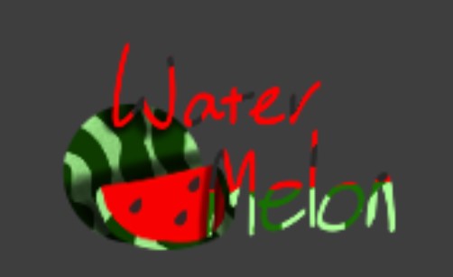
The Watermelon Wizard's Cursive
This handwriting displays a creative and imaginative spirit with room for minor refinement. It communicates a friendly and approachable personality.
The handwriting is characterized by a whimsical and playful style, with a noticeable slant to the right. The letters are somewhat rounded, giving it a soft and approachable feel. The words 'Water Melon' are stacked, with the 'Water' being in red and 'Melon' in green, adding to the overall visual appeal. The stroke thickness varies, giving it a somewhat inconsistent yet dynamic look. There's a clear effort to present the text in an artistic way, almost as if it were part of the watermelon drawing itself.
This handwriting suggests someone who is creative, imaginative, and not afraid to express themselves. The varying colors and rounded forms hint at a person who is approachable, friendly, and enjoys adding a personal touch to everything they do. The slight inconsistency might indicate a spontaneous and perhaps slightly disorganized nature, but in a charming and endearing way. There's a sense of fun and lightheartedness conveyed through this script.
To improve the handwriting, focusing on consistency in stroke thickness and letter formation could be beneficial. Practicing basic letterforms and spacing could help refine the overall appearance without losing its unique character. Paying attention to baseline alignment would add a touch of neatness. However, the beauty of this handwriting lies in its imperfections, so maintaining its playful spirit is key.
Legibility
Expressiveness
Consistency
Overall
Leaderboard for Monday, 10 November 2025
| 1 | The Neon Artist |
77
|
| 2 | The Industrious Student |
71
|
| 3 | The Calligrapher |
71
|
| 4 | The Rhythm Weaver's Script |
71
|
| 5 | The Loopy Optimist |
71
|
| 6 | The Musical Hand |
68
|
| 7 | The Strategic Analyst |
67
|
| 8 | The Meticulous Botanist |
64
|
| 9 | The Determined Dreamer |
62
|
| 10 | The Enigmatic Loop |
62
|
| 11 | The Flowing Hand |
60
|
| 12 | The Watermelon Wizard's Cursive |
60
|
| 13 | The Diligent List-Maker |
59
|
| 14 | The Maverick's Manifesto |
58
|
| 15 | The Vigilant Informant |
57
|
| 16 | The Groundbreaker |
57
|
| 17 | The Diligent Demonstrator |
56
|
| 18 | The Founding Pen |
56
|
| 19 | The Architect's Mark |
53
|
| 20 | The Determined Idealist |
51
|