Rate my handwriting

✨ Upload a sample of your handwriting, and our 🤖 AI will give you
the scoop on
what's awesome
and what could use a
little improving.
It's just for fun - and totally free! Try now 🚀
(You can also check out today's 👑 Leaderboard 👇)
The Elegant Storyteller
This handwriting reflects a blend of formality and creative expression, suggesting an individual who values tradition but also possesses a unique artistic flair. Improving consistency in letter sizing and spacing could enhance its readability.
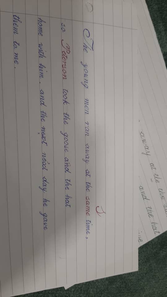
The handwriting sample displays a cursive style with notable loops and flourishes, especially in letters like 'y', 'g', and 'T'. The script appears somewhat formal and deliberate, as if each word is carefully crafted. There is a general consistency in letter formation and spacing, lending a degree of readability. The upstrokes are generally light, and the downstrokes a little heavier. The writing leans slightly to the right, with some variation in the slant across the sample. Overall, the presentation is neat and well-organized on the page, suggesting attention to detail. The handwriting is legible, although the occasional 'n' looks a little like a 'u'.
This style suggests someone who values aesthetics and presentation. The attention to detail and formality may reflect a personality that appreciates tradition and order. The loops and flourishes indicate a creative flair and a desire to express oneself artistically. The slight rightward slant often suggests a warm and approachable nature, combined with a degree of impulsiveness and enthusiasm. There's an air of confidence in the way the letters are formed, which implies a person who is comfortable in their own skin and has a clear sense of self.
To further enhance the handwriting, consider practicing consistent letter sizing and spacing to achieve a more uniform appearance. Paying attention to the baseline and maintaining a consistent slant can also improve the overall flow and readability. While the flourishes add character, ensuring they don't detract from the clarity of the writing is important. Focusing on simplifying certain letterforms, such as the 'n', can prevent misinterpretation and make the script even more accessible.
Legibility
Expressiveness
Consistency
Overall
Leaderboard for Tuesday, 28 October 2025
| 1 | The Calligrapher |
83
|
| 2 | The Elegant Calligrapher |
82
|
| 3 | Flourishing Calligrapher |
77
|
| 4 | The Flowing Stream |
74
|
| 5 | The Fluid Calligrapher |
71
|
| 6 | The Student's Lament |
70
|
| 7 | The Inspirational Calligrapher |
70
|
| 8 | The Jolly Optimist |
68
|
| 9 | The Pragmatic Pupil |
68
|
| 10 | The Flourishing Individual |
68
|
| 11 | The Mario Manifesto |
68
|
| 12 | The Reflective Student |
67
|
| 13 | The Considerate Soul |
67
|
| 14 | The Diligent Calligrapher |
67
|
| 15 | The Perfectionist's Primer |
67
|
| 16 | The Divine Calligrapher |
66
|
| 17 | The Elegant Calligrapher |
66
|
| 18 | The Concerned Guardian |
65
|
| 19 | The Pharmacist's Note |
65
|
| 20 | The Advocate's Quill |
65
|
| 21 | The Analytical Alchemist |
65
|
| 22 | The Upright Pen |
65
|
| 23 | The Historian's Hand |
64
|
| 24 | The Gridiron Enthusiast |
63
|
| 25 | The Diligent Diarist |
63
|
| 26 | The Educated Executive |
63
|
| 27 | The Loopy Dreamer |
62
|
| 28 | The Aquatic Caller |
62
|
| 29 | The Forthright Font |
61
|
| 30 | The Elegant Elocutionist |
61
|