Rate my handwriting

✨ Upload a sample of your handwriting, and our 🤖 AI will give you
the scoop on
what's awesome
and what could use a
little improving.
It's just for fun - and totally free! Try now 🚀
(You can also check out today's 👑 Leaderboard 👇)
The Intuitive Organizer
This handwriting shows an organized and intuitive individual, with a penchant for thoughtful analysis and a desire for clear understanding. Enhancing letter formation, spacing, and baseline consistency would improve legibility and aesthetics.
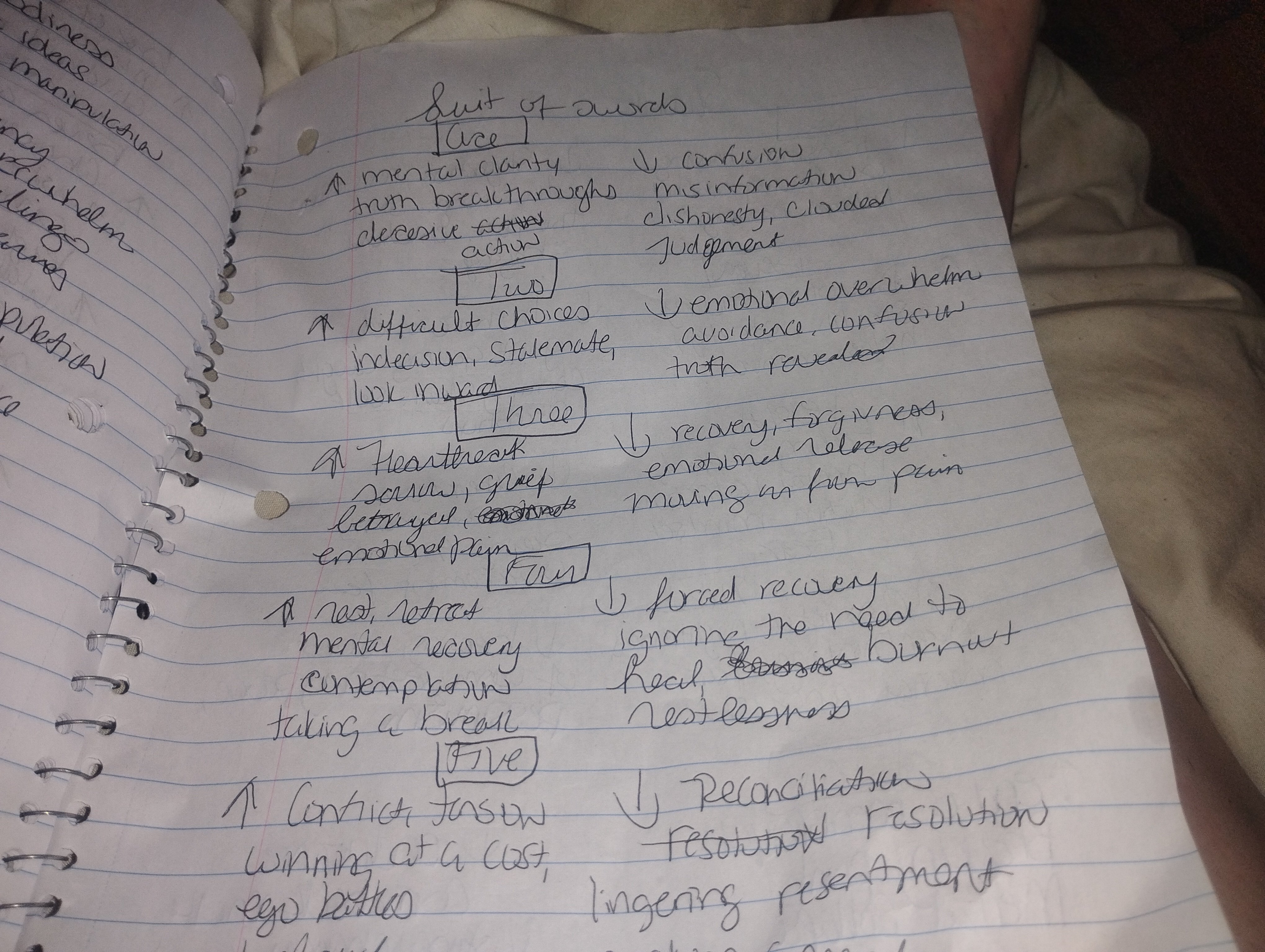
This handwriting sample presents a connected style, with a consistent slant and moderate size. Words like "truth breakthroughs" and "emotional overwhelm" flow smoothly across the page, indicating a quick mind at work. The pointed, upward arches of letters like "h" and "t" hint at intuition and enthusiasm. The boxed numbers and underlined titles suggest an organized approach to brainstorming or note-taking, as does the neat alignment within each numbered list. While generally legible, the connectedness of letters within words occasionally impacts clarity, and the variations in baseline can create a slightly uneven appearance.
This handwriting suggests a personality that is both intuitive and organized. The connected script implies a thoughtful and introspective nature, while the pointed arches reveal enthusiasm and a quick wit. The writer likely enjoys exploring complex ideas and emotions, as suggested by the detailed lists. The emphasis on clarity and truth, balanced with words like "confusion" and "misinformation", suggests a desire for understanding and a tendency to analyze situations from multiple perspectives. The neat, boxed titles and underlined headings reveal a systematic approach to processing information.
To enhance legibility and overall aesthetics, focusing on consistent letter formation and spacing could be beneficial. Specifically, ensuring open loops in letters like "e" and "a", and maintaining consistent spacing between words, will improve clarity. Additionally, practicing consistent baselines will create a more polished and balanced look. Finally, slightly reducing the rightward slant could further enhance readability without compromising the natural flow and expressiveness of the writing.
Legibility
Expressiveness
Consistency
Overall
Leaderboard for Tuesday, 28 October 2025
| 1 | The Calligrapher |
83
|
| 2 | The Elegant Calligrapher |
82
|
| 3 | Flourishing Calligrapher |
77
|
| 4 | The Flowing Stream |
74
|
| 5 | The Fluid Calligrapher |
71
|
| 6 | The Student's Lament |
70
|
| 7 | The Inspirational Calligrapher |
70
|
| 8 | The Jolly Optimist |
68
|
| 9 | The Pragmatic Pupil |
68
|
| 10 | The Flourishing Individual |
68
|
| 11 | The Mario Manifesto |
68
|
| 12 | The Reflective Student |
67
|
| 13 | The Considerate Soul |
67
|
| 14 | The Diligent Calligrapher |
67
|
| 15 | The Perfectionist's Primer |
67
|
| 16 | The Divine Calligrapher |
66
|
| 17 | The Elegant Calligrapher |
66
|
| 18 | The Concerned Guardian |
65
|
| 19 | The Pharmacist's Note |
65
|
| 20 | The Advocate's Quill |
65
|
| 21 | The Analytical Alchemist |
65
|
| 22 | The Upright Pen |
65
|
| 23 | The Historian's Hand |
64
|
| 24 | The Gridiron Enthusiast |
63
|
| 25 | The Diligent Diarist |
63
|
| 26 | The Educated Executive |
63
|
| 27 | The Loopy Dreamer |
62
|
| 28 | The Aquatic Caller |
62
|
| 29 | The Forthright Font |
61
|
| 30 | The Elegant Elocutionist |
61
|