Rate my handwriting

✨ Upload a sample of your handwriting, and our 🤖 AI will give you
the scoop on
what's awesome
and what could use a
little improving.
It's just for fun - and totally free! Try now 🚀
(You can also check out today's 👑 Leaderboard 👇)

The Philosophical Hand
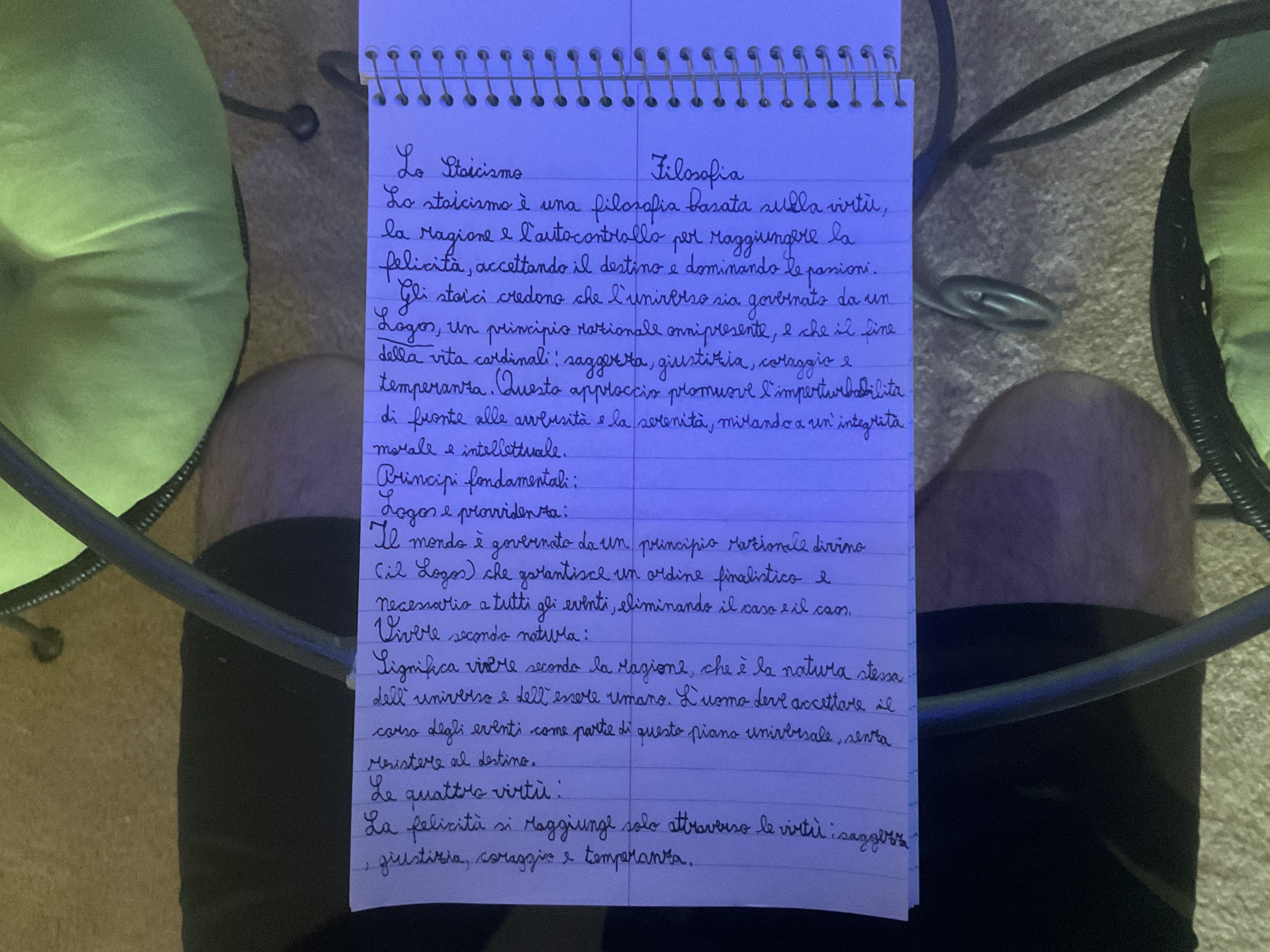
This handwriting suggests a thoughtful and proactive individual with a desire for clarity and structure. Practicing consistent pressure and letter size could further enhance its legibility and elegance.
The handwriting presents as neat and relatively legible, with a slight forward slant that suggests a sense of purpose. The letter formations are generally well-defined, as seen in the clear distinction between letters in words like "filosofia" and "ragione". There is a good sense of spacing between words, contributing to the overall readability. The size of the letters is consistent, which speaks to a certain level of control and attention to detail. However, there is some variability in pressure, particularly noticeable in the heavier strokes of letters like 'g' and 'p', indicating moments of emphasis or perhaps slight inconsistency in writing technique.
Based on this handwriting, one might infer a personality that values clarity and structure. The legibility suggests a desire to be understood and a thoughtful approach to communication. The slight forward slant implies a proactive and engaged nature, someone who is not afraid to lean into life's challenges. The overall neatness indicates a degree of self-discipline and a preference for order, though the variations in pressure reveal a capacity for emotion and expressiveness. The choice of subject matter, Stoicism, also suggests a reflective and thoughtful personality.
To further improve your handwriting, consider practicing consistent pressure throughout your writing. This can create a smoother, more uniform appearance. Additionally, focusing on the consistency of letter size, particularly with lowercase letters, could enhance the overall visual appeal. Pay attention to the baseline, ensuring letters sit evenly to improve the tidiness of your handwriting. While your handwriting is already quite legible, these small adjustments could elevate it to an even higher level of clarity and elegance.
Legibility
Expressiveness
Consistency
Overall
Leaderboard for Sunday, 26 October 2025
| 1 | The Constitutionalist |
74
|
| 2 | The Flowing Quill |
74
|
| 3 | The Curator's Script |
72
|
| 4 | The Eloquent Educator |
71
|
| 5 | The Dreamer's Quill |
70
|
| 6 | The Constitutionalist |
68
|
| 7 | The Hopeful Heart's Script |
68
|
| 8 | The Flowing Hand |
68
|
| 9 | The Flowing Quill |
68
|
| 10 | The Agrarian Academic |
67
|
| 11 | The Unassuming Hand |
66
|
| 12 | The Studious Student |
65
|
| 13 | The Calculating Hand |
65
|
| 14 | The Contemplative Soul |
64
|
| 15 | The Flowing Font |
63
|
| 16 | The Gentle Flow |
63
|
| 17 | The Looping Legend |
62
|
| 18 | The Contemplative Calligrapher |
60
|
| 19 | The Congratulatory Cursive |
60
|
| 20 | The Signature Stylist |
59
|
| 21 | The Democratic Dreamer |
59
|
| 22 | The Pragmatic Idealist |
59
|
| 23 | The Devout Note-Taker |
58
|
| 24 | The Atom Alchemist |
57
|
| 25 | The Cipher's Quill |
57
|
| 26 | The Reproductive Note-Taker |
57
|
| 27 | The Scientific Mind |
56
|
| 28 | The Loop-de-Loop Legend |
56
|
| 29 | The Bold Artisan |
55
|
| 30 | The Forward Leaning Letterer |
54
|