Rate my handwriting

✨ Upload a sample of your handwriting, and our 🤖 AI will give you
the scoop on
what's awesome
and what could use a
little improving.
It's just for fun - and totally free! Try now 🚀
(You can also check out today's 👑 Leaderboard 👇)
The Cartographer's Quill
This handwriting style is legible and well-formed, suggesting an organized and detail-oriented personality, though it could benefit from added individuality.
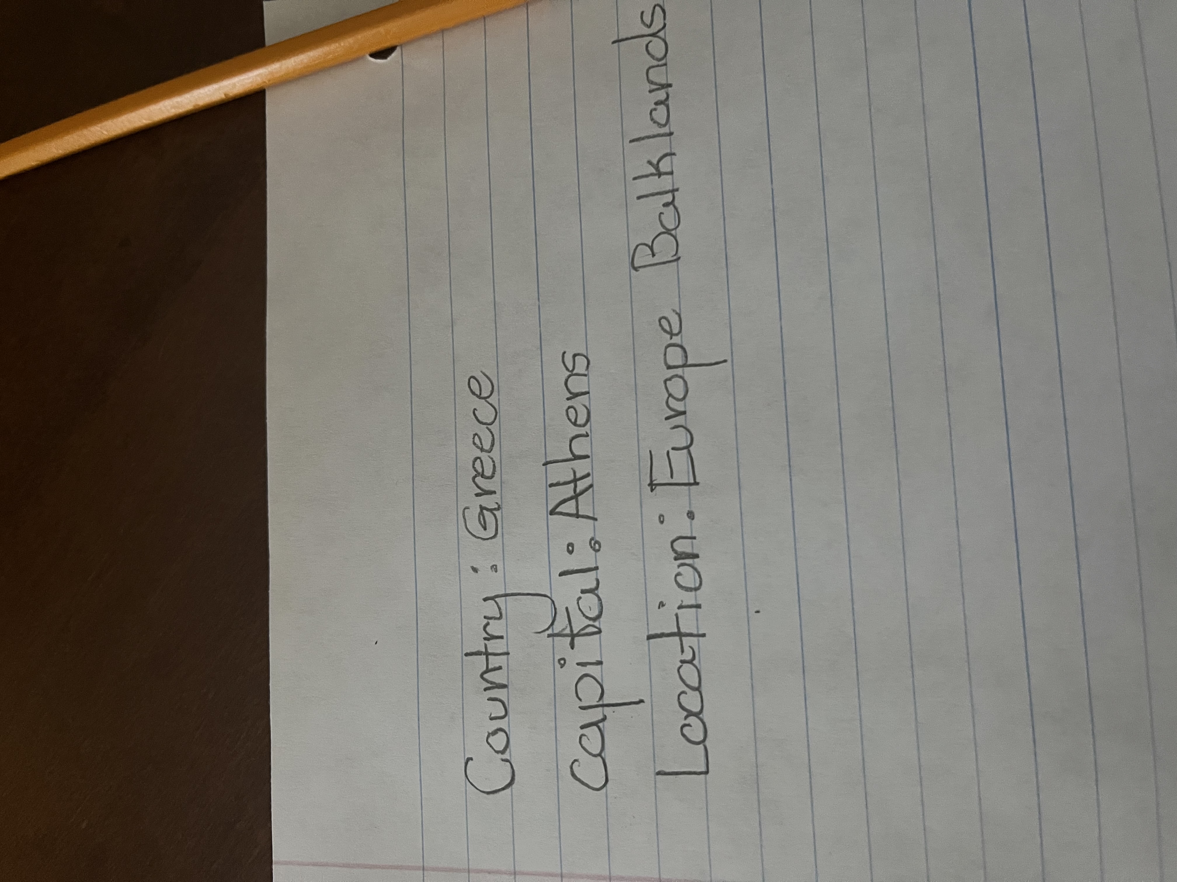
The handwriting exhibits a print-like style, characterized by clear, separated letters, especially noticeable in words like "Country" and "Capital". The writing maintains a consistent size and spacing throughout, creating a neat appearance. The pressure applied is moderate, resulting in uniform line thickness. Overall, the writing is quite legible and well-formed, but somewhat lacks in individuality. The rounded shapes of letters like 'o' and 'a' contribute to a gentle, approachable aesthetic.
Based on this handwriting, it's possible the writer values clarity, organization, and perhaps a touch of traditionalism. The careful formation of each letter suggests a methodical and detail-oriented nature. They might be someone who appreciates structure and precision in their work and personal life. This person likely aims for clear communication and strives to present information in an easily understandable manner.
To add a personal flair, experiment with varying the slant or pressure slightly. Consider adding loops or unique strokes to certain letters to inject more personality. Practicing cursive could also introduce more fluidity and expressiveness into your handwriting, allowing it to better reflect your individuality.
Legibility
Expressiveness
Consistency
Overall
Leaderboard for Sunday, 26 October 2025
| 31 | Zen Strokes |
60
|
| 32 | The Precise Mathematician |
59
|
| 33 | The Typist's Touch |
59
|
| 34 | The Elegant Calligrapher |
59
|
| 35 | The Pragmatic Idealist |
59
|
| 36 | The Enthusiastic Connector |
59
|
| 37 | The Signature Stylist |
59
|
| 38 | The Determined Motivator |
58
|
| 39 | The Arithmetician's Quill |
57
|
| 40 | The Atom Alchemist |
57
|
| 41 | The Cipher's Quill |
57
|
| 42 | The Reproductive Note-Taker |
57
|
| 43 | The Scientific Mind |
56
|
| 44 | The Atmospheric Artist |
56
|
| 45 | The Loop-de-Loop Legend |
56
|
| 46 | The Bold Artisan |
55
|
| 47 | The Minimalist |
55
|
| 48 | The Stoic Calligrapher |
54
|
| 49 | The Celestial Stylist |
54
|
| 50 | The Calligrapher's Flourish |
54
|
| 51 | The Diligent Student |
53
|
| 52 | The Flowing River |
53
|
| 53 | The Optimistic Loopist |
51
|
| 54 | The Architect's Alphabet |
51
|
| 55 | The Provocateur's Quill |
51
|
| 56 | The Concentric Contemplator |
51
|
| 57 | The Minimalist's Mark |
43
|