Rate my handwriting

✨ Upload a sample of your handwriting, and our 🤖 AI will give you
the scoop on
what's awesome
and what could use a
little improving.
It's just for fun - and totally free! Try now 🚀
(You can also check out today's 👑 Leaderboard 👇)
The Calm Protester
This handwriting style suggests a thoughtful and balanced personality with a potential for refinement. Attention to consistency and spacing could further enhance the overall legibility and aesthetic appeal.
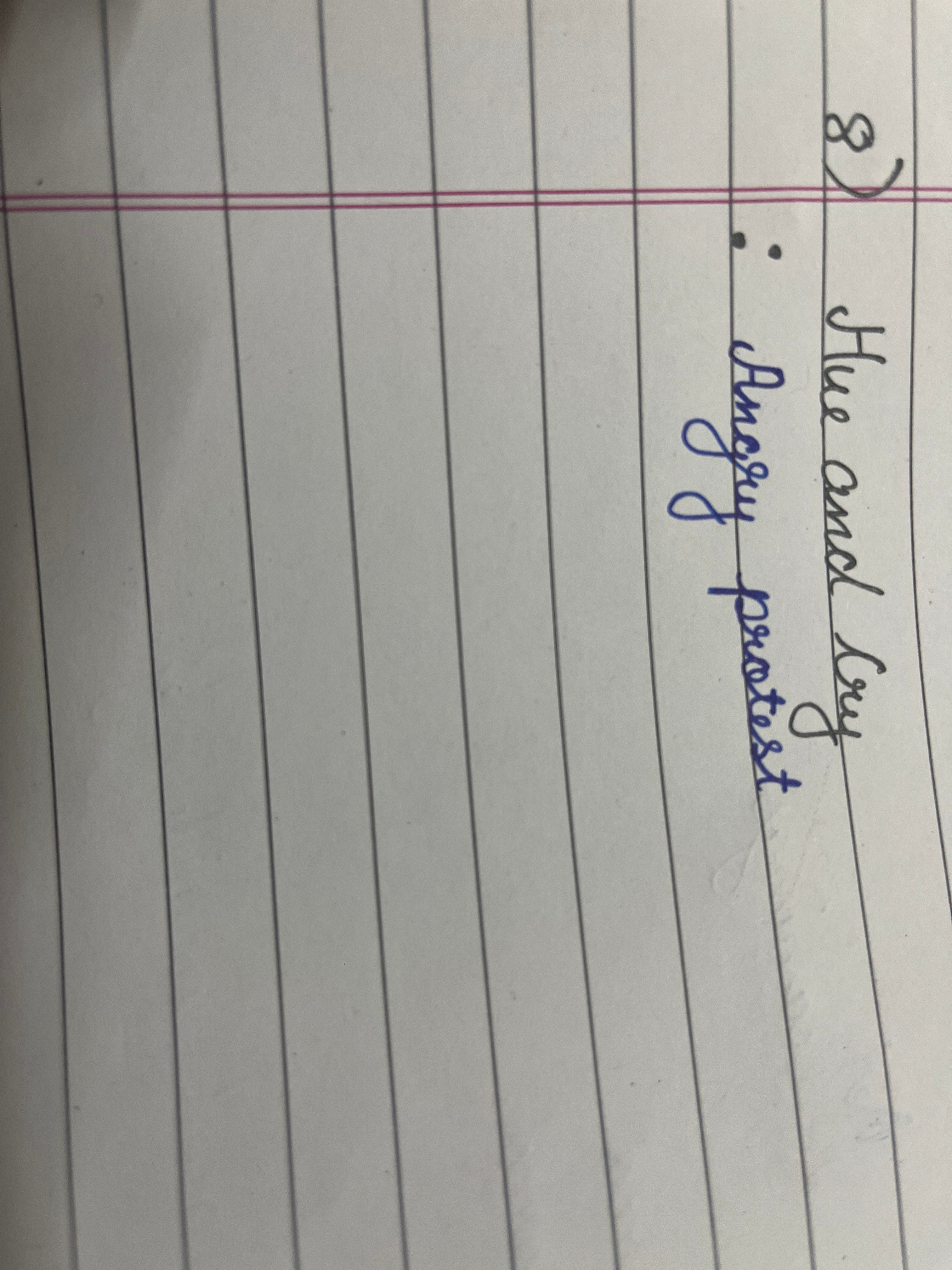
The handwriting exhibits a neat, slightly rounded style, seen in words like "Hue" and "protest." The letters are generally well-formed, suggesting a degree of care and control. The use of cursive is moderate, with some letters connected while others stand alone. The baseline adherence is consistent, and the writing generally flows smoothly, though with slight variations in letter size and spacing. The 'y' in "cry" and "angry" has a particularly distinctive, looping descent.
This style suggests a personality that is balanced between structure and expression. The neatness indicates a person who values order and attention to detail, possibly reflecting conscientiousness and a desire to present oneself well. The slight variations in letter size and the rounded forms might indicate a friendly, approachable nature, with a touch of artistic flair. The choice of words, "angry protest", written in blue ink, might hint at a thoughtful and considered approach to emotional expression, suggesting someone who feels deeply but prefers a calm, reasoned articulation of their feelings.
To enhance the handwriting, focus on maintaining a more consistent slant across all letters and words. Pay attention to the spacing between words to ensure clarity and rhythm. Practicing letter forms, especially those with loops like 'y' and 'g', can refine the overall aesthetic. Aim for a more uniform letter size to enhance the professional and polished look of the writing.
Legibility
Expressiveness
Consistency
Overall
Leaderboard for Sunday, 26 October 2025
| 1 | The Constitutionalist |
74
|
| 2 | The Flowing Quill |
74
|
| 3 | The Curator's Script |
72
|
| 4 | The Eloquent Educator |
71
|
| 5 | The Dreamer's Quill |
70
|
| 6 | The Constitutionalist |
68
|
| 7 | The Hopeful Heart's Script |
68
|
| 8 | The Flowing Hand |
68
|
| 9 | The Flowing Quill |
68
|
| 10 | The Agrarian Academic |
67
|
| 11 | The Unassuming Hand |
66
|
| 12 | The Studious Student |
65
|
| 13 | The Calculating Hand |
65
|
| 14 | The Contemplative Soul |
64
|
| 15 | The Flowing Font |
63
|
| 16 | The Gentle Flow |
63
|
| 17 | The Looping Legend |
62
|
| 18 | The Contemplative Calligrapher |
60
|
| 19 | The Congratulatory Cursive |
60
|
| 20 | The Signature Stylist |
59
|
| 21 | The Democratic Dreamer |
59
|
| 22 | The Pragmatic Idealist |
59
|
| 23 | The Devout Note-Taker |
58
|
| 24 | The Atom Alchemist |
57
|
| 25 | The Cipher's Quill |
57
|
| 26 | The Reproductive Note-Taker |
57
|
| 27 | The Scientific Mind |
56
|
| 28 | The Loop-de-Loop Legend |
56
|
| 29 | The Bold Artisan |
55
|
| 30 | The Forward Leaning Letterer |
54
|