Rate my handwriting

✨ Upload a sample of your handwriting, and our 🤖 AI will give you
the scoop on
what's awesome
and what could use a
little improving.
It's just for fun - and totally free! Try now 🚀
(You can also check out today's 👑 Leaderboard 👇)
The Upright Idealist
The handwriting is structured and upright, suggesting an organized and confident individual who values clarity and directness. Incorporating more fluidity could enhance its expressiveness.
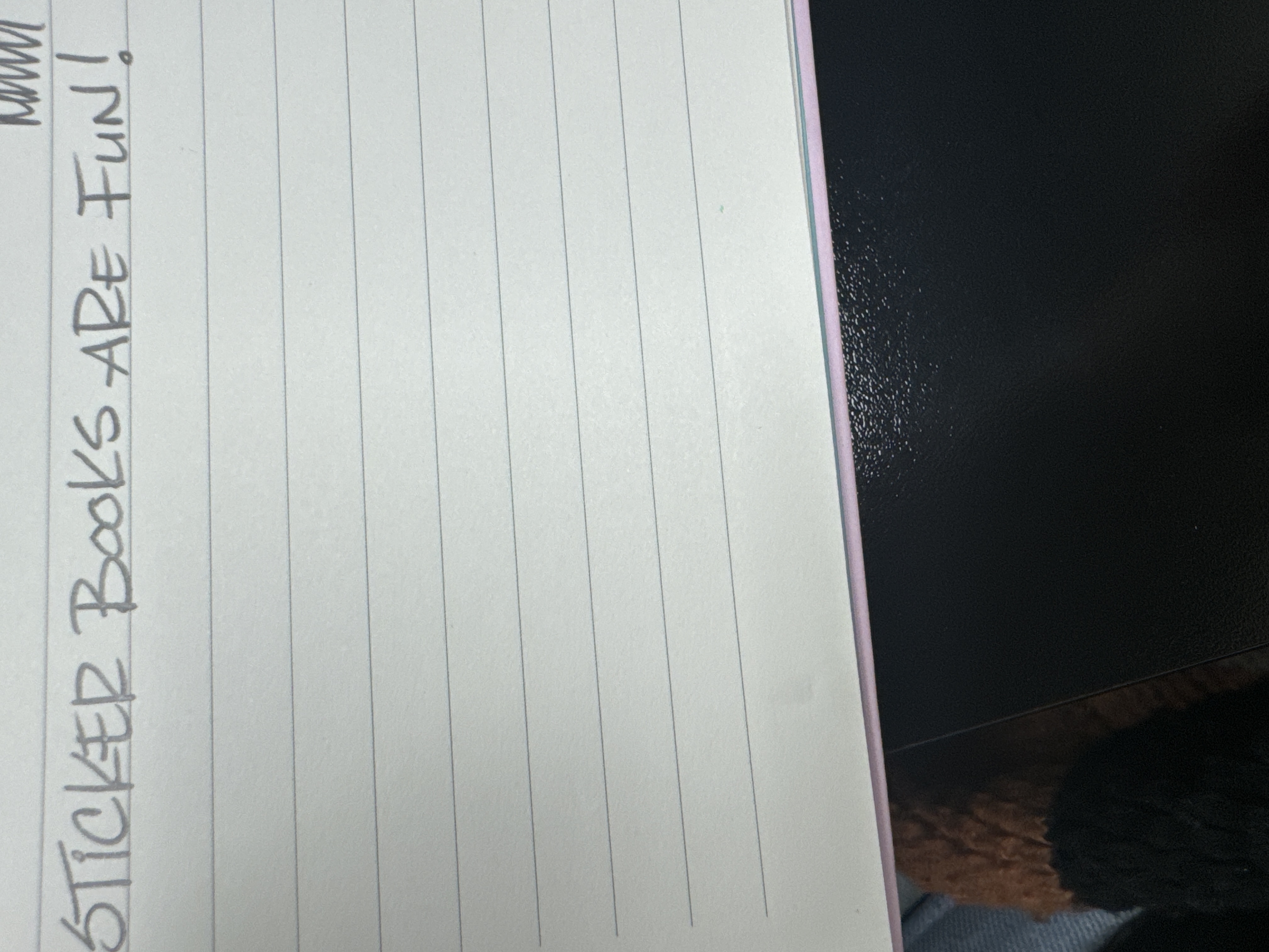
The handwriting sample displays a block-letter style with distinct, separated characters. The writing is mostly upright, showing minimal slant, and the letters are generally well-formed. The size is relatively large and the strokes are firm, suggesting a deliberate and controlled hand movement. The baseline adherence is good, indicating a structured approach. The use of uppercase letters gives a bold and prominent look to the text. Spacing between words and letters appears consistent, promoting legibility. There's a slight variation in the thickness of strokes, adding some visual interest without compromising clarity. Overall, the style presents a clean and straightforward appearance, emphasizing clarity and directness.
This style of handwriting may suggest someone who is organized, practical, and values clarity in communication. The deliberate, controlled strokes can reflect a personality that is conscientious and methodical. The upright stance might imply a direct and straightforward approach to life. The consistent spacing and neatness could indicate a person who appreciates order and structure. The bold, uppercase style suggests a confident and assertive nature. This combination of traits points to someone who is reliable, detail-oriented, and has a clear sense of purpose.
To enhance the handwriting, focus on introducing slight variations in letter forms to add more personality and fluidity. Practicing lowercase letters could also bring a softer, more approachable quality to the overall style. Experimenting with slant and curve can introduce dynamism, but maintaining legibility is key. Incorporating ligatures (connecting letters) could make the handwriting flow more smoothly and appear more natural. Ultimately, the goal is to strike a balance between structure and expressiveness to create a unique and engaging personal style.
Legibility
Expressiveness
Consistency
Overall
Leaderboard for Sunday, 26 October 2025
| 1 | The Constitutionalist |
74
|
| 2 | The Flowing Quill |
74
|
| 3 | The Curator's Script |
72
|
| 4 | The Eloquent Educator |
71
|
| 5 | The Dreamer's Quill |
70
|
| 6 | The Constitutionalist |
68
|
| 7 | The Hopeful Heart's Script |
68
|
| 8 | The Flowing Hand |
68
|
| 9 | The Flowing Quill |
68
|
| 10 | The Agrarian Academic |
67
|
| 11 | The Unassuming Hand |
66
|
| 12 | The Studious Student |
65
|
| 13 | The Calculating Hand |
65
|
| 14 | The Contemplative Soul |
64
|
| 15 | The Flowing Font |
63
|
| 16 | The Gentle Flow |
63
|
| 17 | The Looping Legend |
62
|
| 18 | The Contemplative Calligrapher |
60
|
| 19 | The Congratulatory Cursive |
60
|
| 20 | The Signature Stylist |
59
|
| 21 | The Democratic Dreamer |
59
|
| 22 | The Pragmatic Idealist |
59
|
| 23 | The Devout Note-Taker |
58
|
| 24 | The Atom Alchemist |
57
|
| 25 | The Cipher's Quill |
57
|
| 26 | The Reproductive Note-Taker |
57
|
| 27 | The Scientific Mind |
56
|
| 28 | The Loop-de-Loop Legend |
56
|
| 29 | The Bold Artisan |
55
|
| 30 | The Forward Leaning Letterer |
54
|