Rate my handwriting

✨ Upload a sample of your handwriting, and our 🤖 AI will give you
the scoop on
what's awesome
and what could use a
little improving.
It's just for fun - and totally free! Try now 🚀
(You can also check out today's 👑 Leaderboard 👇)
The Unassuming Penman
The handwriting displays a clear, neat, and straightforward style, suggesting a preference for order and simplicity. Some refinements to letter consistency and pressure could add depth and personal flair.
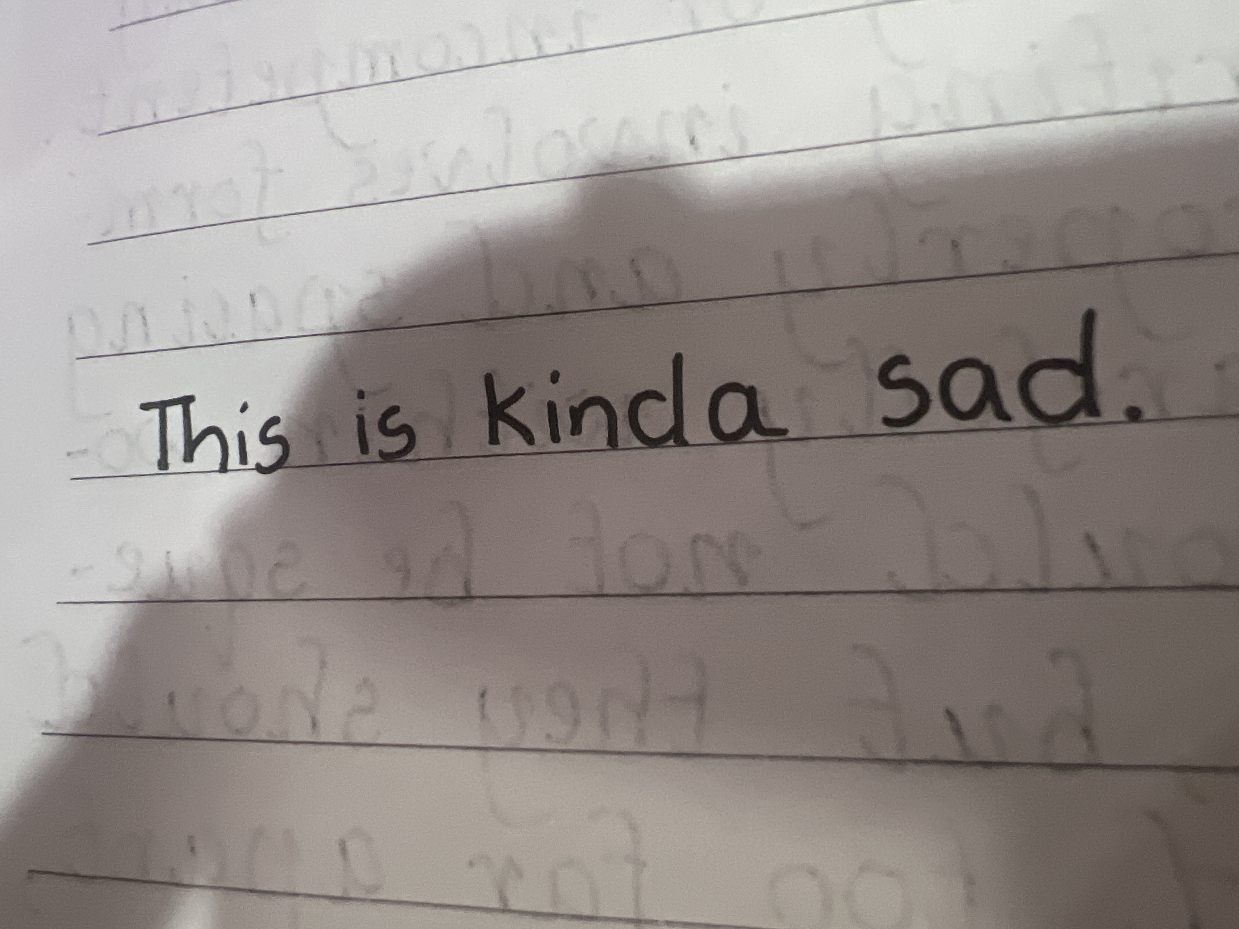
The handwriting sample presents a neat, upright style, with consistent baseline adherence, thanks to the lined paper. The letters are generally well-formed, though the 'a' in "kinda" has a slight open top. There is a simplicity to the script, lacking excessive loops or flourishes. The size of the letters is moderate and uniform. Overall, the handwriting is clear and easily readable, with even spacing between words, lending a sense of calm and order.
Based on this handwriting, the writer may be a person who values clarity and simplicity. The neatness suggests a desire for order and a thoughtful approach to tasks. The lack of excessive ornamentation could imply a preference for straightforwardness and practicality. There may be a tendency towards introversion, or at least a reserved expression of personality, as the writing doesn't project strong emotion or flamboyance.
To further improve the handwriting, focus on refining the consistency of letter forms. For example, practice closing the tops of 'a's to ensure uniformity. Experiment with slight variations in slant to add a touch of personal flair, while maintaining legibility. Varying the pressure applied to the pen can create a more dynamic appearance, adding depth and character to the script.
Legibility
Expressiveness
Consistency
Overall
Leaderboard for Tuesday, 28 October 2025
| 1 | The Calligrapher |
83
|
| 2 | The Elegant Calligrapher |
82
|
| 3 | Flourishing Calligrapher |
77
|
| 4 | The Flowing Stream |
74
|
| 5 | The Fluid Calligrapher |
71
|
| 6 | The Student's Lament |
70
|
| 7 | The Inspirational Calligrapher |
70
|
| 8 | The Jolly Optimist |
68
|
| 9 | The Pragmatic Pupil |
68
|
| 10 | The Flourishing Individual |
68
|
| 11 | The Mario Manifesto |
68
|
| 12 | The Reflective Student |
67
|
| 13 | The Considerate Soul |
67
|
| 14 | The Diligent Calligrapher |
67
|
| 15 | The Perfectionist's Primer |
67
|
| 16 | The Divine Calligrapher |
66
|
| 17 | The Elegant Calligrapher |
66
|
| 18 | The Concerned Guardian |
65
|
| 19 | The Pharmacist's Note |
65
|
| 20 | The Advocate's Quill |
65
|
| 21 | The Analytical Alchemist |
65
|
| 22 | The Upright Pen |
65
|
| 23 | The Historian's Hand |
64
|
| 24 | The Gridiron Enthusiast |
63
|
| 25 | The Diligent Diarist |
63
|
| 26 | The Educated Executive |
63
|
| 27 | The Loopy Dreamer |
62
|
| 28 | The Aquatic Caller |
62
|
| 29 | The Forthright Font |
61
|
| 30 | The Elegant Elocutionist |
61
|