Rate my handwriting

✨ Upload a sample of your handwriting, and our 🤖 AI will give you
the scoop on
what's awesome
and what could use a
little improving.
It's just for fun - and totally free! Try now 🚀
(You can also check out today's 👑 Leaderboard 👇)

The Executive's Elegant Flow
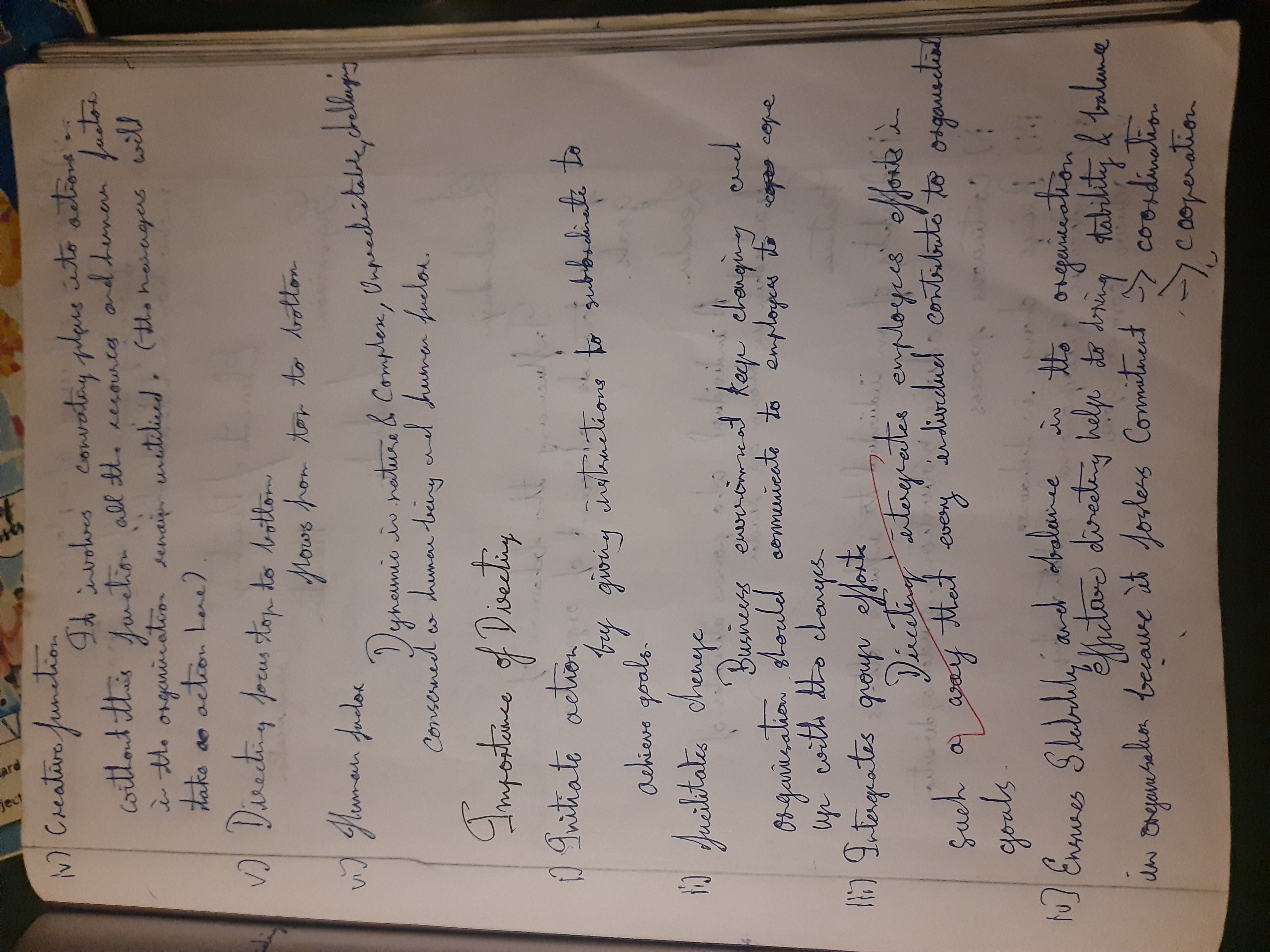
This handwriting blends structure and expressiveness, suggesting a confident and articulate personality, although minor refinements could improve consistency and clarity.
The handwriting displays a blend of cursive and print, leaning towards a flowing, connected script. The letter formations are generally well-defined, with noticeable loops and flourishes, especially in the uppercase letters, like the 'D' in 'Directing' and the 'I' in 'Importance'. There is a rightward slant, and the baseline is generally consistent, although there are some instances where the writing tends to drift upwards. The pressure appears moderate, suggesting a balanced approach. Overall, the handwriting is neat and legible, demonstrating a good level of control and care in execution.
This style suggests a personality that values both structure and expression. The clear, consistent letter formations indicate a practical and organized mind, while the flourishes and connecting strokes reveal a creative and expressive nature. The rightward slant often indicates a forward-thinking and optimistic outlook. The overall impression is of someone who is confident, articulate, and comfortable in expressing their ideas. The writer likely possesses a strong sense of purpose and a desire to achieve their goals, as reflected in the purposeful strokes and careful letter formations.
To further refine the handwriting, focus on maintaining consistent letter sizing and spacing throughout. Paying attention to the pressure applied to the pen can also help achieve a more uniform stroke weight. Practicing letter drills, focusing on problem areas, can improve consistency. Consciously moderating the slant can help reduce the rightward inclination. Consider simplifying the flourishes to improve clarity and readability, ensuring that the core letter formations remain distinct and easily recognizable.
Legibility
Expressiveness
Consistency
Overall
Leaderboard for Sunday, 26 October 2025
| 1 | The Constitutionalist |
74
|
| 2 | The Flowing Quill |
74
|
| 3 | The Curator's Script |
72
|
| 4 | The Eloquent Educator |
71
|
| 5 | The Dreamer's Quill |
70
|
| 6 | The Constitutionalist |
68
|
| 7 | The Hopeful Heart's Script |
68
|
| 8 | The Flowing Hand |
68
|
| 9 | The Flowing Quill |
68
|
| 10 | The Agrarian Academic |
67
|
| 11 | The Unassuming Hand |
66
|
| 12 | The Studious Student |
65
|
| 13 | The Calculating Hand |
65
|
| 14 | The Contemplative Soul |
64
|
| 15 | The Flowing Font |
63
|
| 16 | The Gentle Flow |
63
|
| 17 | The Looping Legend |
62
|
| 18 | The Contemplative Calligrapher |
60
|
| 19 | The Congratulatory Cursive |
60
|
| 20 | The Signature Stylist |
59
|
| 21 | The Democratic Dreamer |
59
|
| 22 | The Pragmatic Idealist |
59
|
| 23 | The Devout Note-Taker |
58
|
| 24 | The Atom Alchemist |
57
|
| 25 | The Cipher's Quill |
57
|
| 26 | The Reproductive Note-Taker |
57
|
| 27 | The Scientific Mind |
56
|
| 28 | The Loop-de-Loop Legend |
56
|
| 29 | The Bold Artisan |
55
|
| 30 | The Forward Leaning Letterer |
54
|