Rate my handwriting

✨ Upload a sample of your handwriting, and our 🤖 AI will give you
the scoop on
what's awesome
and what could use a
little improving.
It's just for fun - and totally free! Try now 🚀
(You can also check out today's 👑 Leaderboard 👇)
The Heartfelt Hand
This handwriting suggests a thoughtful, sensitive, and expressive individual, with opportunities to enhance legibility through consistent letter formations and spacing. The writing reflects a blend of outgoing tendencies and moments of introspection.
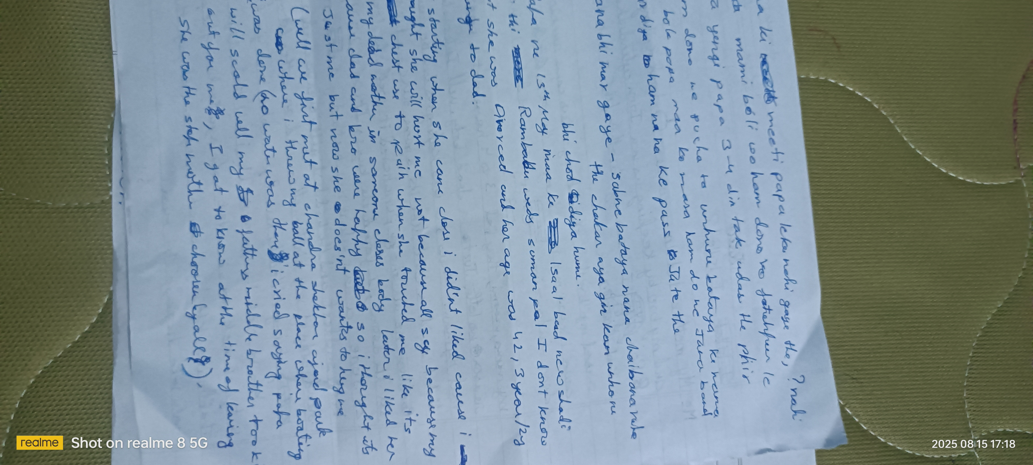
The handwriting sample presents a blend of cursive and print styles, with a noticeable forward slant. The size of the letters is moderately small, and there's a sense of compactness in the writing. Some words like "Divorced" and "Rambabu" are legible, while others, like "unhure" and "chaibanarate", present more of a challenge due to the cursive joins and somewhat inconsistent letter formations. The spacing between words varies, contributing to an overall impression of slightly hurried execution. The pressure applied appears to be medium, with occasional heavier strokes, indicating a varying level of emphasis or emotional intensity.
Based on the handwriting, one might infer a personality that is thoughtful and perhaps introspective. The forward slant suggests a person who is outgoing and eager to engage with the world, yet the compactness and varying legibility could point to moments of self-doubt or internal conflict. The heavier strokes in certain areas could indicate strong emotions or a passionate nature, while the mix of cursive and print suggests adaptability and a willingness to express oneself in different ways. There is also an emotional element to the text, so they may be sensitive and empathetic.
To improve the handwriting, focusing on consistent letter formations and spacing could enhance legibility. Practicing the connection of cursive letters with a deliberate, even flow would create a more cohesive and readable style. Paying attention to the baseline and maintaining a more uniform slant would also contribute to a neater appearance. Ultimately, the goal is to strike a balance between personal expression and clarity, making the writing more accessible to others.
Legibility
Expressiveness
Consistency
Overall
Leaderboard for Tuesday, 28 October 2025
| 1 | The Calligrapher |
83
|
| 2 | The Elegant Calligrapher |
82
|
| 3 | Flourishing Calligrapher |
77
|
| 4 | The Fluid Calligrapher |
71
|
| 5 | The Student's Lament |
70
|
| 6 | The Inspirational Calligrapher |
70
|
| 7 | The Flourishing Individual |
68
|
| 8 | The Pragmatic Pupil |
68
|
| 9 | The Jolly Optimist |
68
|
| 10 | The Diligent Calligrapher |
67
|
| 11 | The Considerate Soul |
67
|
| 12 | The Reflective Student |
67
|
| 13 | The Perfectionist's Primer |
67
|
| 14 | The Divine Calligrapher |
66
|
| 15 | The Analytical Alchemist |
65
|
| 16 | The Pharmacist's Note |
65
|
| 17 | The Advocate's Quill |
65
|
| 18 | The Upright Pen |
65
|
| 19 | The Concerned Guardian |
65
|
| 20 | The Historian's Hand |
64
|
| 21 | The Diligent Diarist |
63
|
| 22 | The Educated Executive |
63
|
| 23 | The Gridiron Enthusiast |
63
|
| 24 | The Loopy Dreamer |
62
|
| 25 | The Aquatic Caller |
62
|
| 26 | The Forthright Font |
61
|
| 27 | The Dream Weaver |
61
|
| 28 | The Elegant Elocutionist |
61
|
| 29 | The Pragmatic Pen |
61
|
| 30 | The Pragmatic Professor |
61
|