Rate my handwriting

✨ Upload a sample of your handwriting, and our 🤖 AI will give you
the scoop on
what's awesome
and what could use a
little improving.
It's just for fun - and totally free! Try now 🚀
(You can also check out today's 👑 Leaderboard 👇)
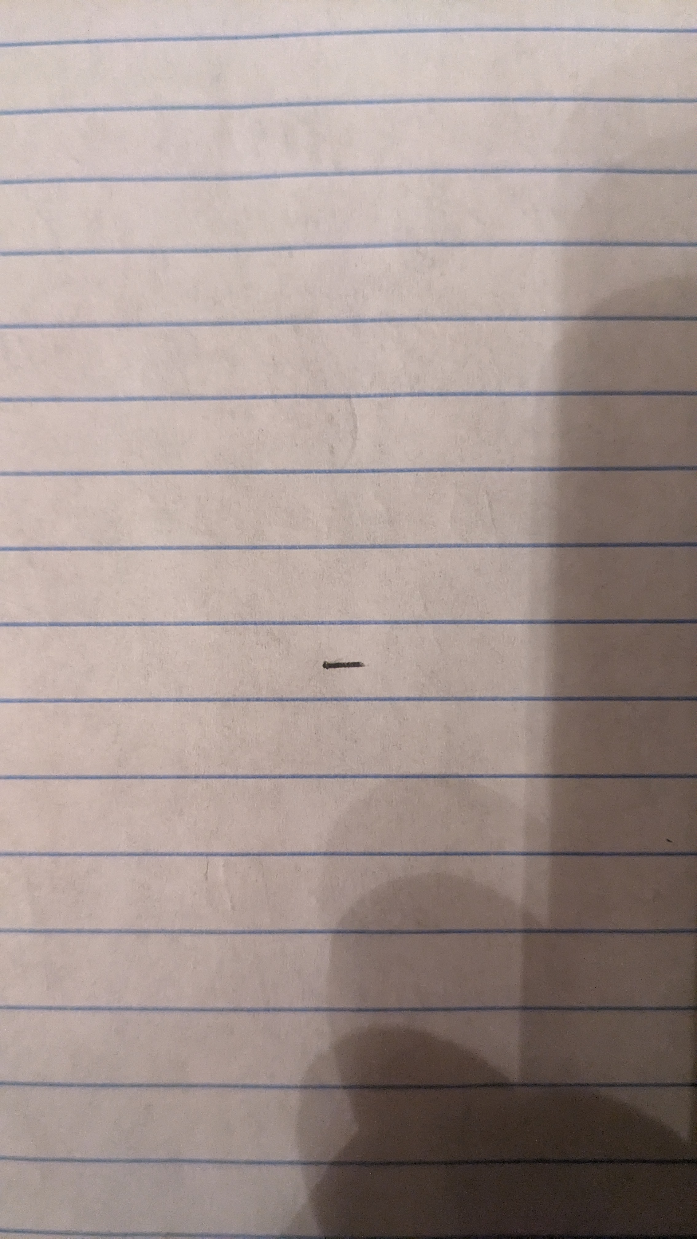
The Minimalist's Mark
This handwriting sample reveals a minimalist style with a preference for directness and efficiency. More variety in stroke and form would enhance its expressiveness.
The handwriting sample presents as a single, solitary dash on a lined page. The stroke is firm and deliberate, showing a direct application of pressure. There are no curves or embellishments; it is purely functional in its execution. The line itself appears relatively straight and evenly weighted from start to finish. The simplicity of the mark, its placement on the line, and the stark contrast against the paper are all notable features. The absence of any accompanying text or further marks amplifies its significance, forcing one to consider the intention behind its creation.
Given the nature of the handwriting sample, it is difficult to make definitive claims about the writer's personality. However, one could infer a preference for minimalism and directness. The single dash may suggest a person who values efficiency and does not engage in unnecessary flourish. There may be a tendency toward introspection or a need for simplicity in a complex world. The precision of the line could indicate a focus on detail or a desire for control.
To improve your handwriting, I recommend exploring a wider range of strokes and letter formations. Practice creating different shapes and sizes to add more expressiveness. Experiment with varying pressure to create dynamic lines. Also, consider adding some curves and loops to give your handwriting more fluidity. Perhaps even adding another dash for company!
Legibility
Expressiveness
Consistency
Overall
Leaderboard for Tuesday, 28 October 2025
| 1 | The Calligrapher |
83
|
| 2 | The Elegant Calligrapher |
82
|
| 3 | Flourishing Calligrapher |
77
|
| 4 | The Flowing Stream |
74
|
| 5 | The Fluid Calligrapher |
71
|
| 6 | The Student's Lament |
70
|
| 7 | The Inspirational Calligrapher |
70
|
| 8 | The Jolly Optimist |
68
|
| 9 | The Pragmatic Pupil |
68
|
| 10 | The Flourishing Individual |
68
|
| 11 | The Mario Manifesto |
68
|
| 12 | The Reflective Student |
67
|
| 13 | The Considerate Soul |
67
|
| 14 | The Diligent Calligrapher |
67
|
| 15 | The Perfectionist's Primer |
67
|
| 16 | The Divine Calligrapher |
66
|
| 17 | The Elegant Calligrapher |
66
|
| 18 | The Concerned Guardian |
65
|
| 19 | The Pharmacist's Note |
65
|
| 20 | The Advocate's Quill |
65
|
| 21 | The Analytical Alchemist |
65
|
| 22 | The Upright Pen |
65
|
| 23 | The Historian's Hand |
64
|
| 24 | The Gridiron Enthusiast |
63
|
| 25 | The Diligent Diarist |
63
|
| 26 | The Educated Executive |
63
|
| 27 | The Loopy Dreamer |
62
|
| 28 | The Aquatic Caller |
62
|
| 29 | The Forthright Font |
61
|
| 30 | The Elegant Elocutionist |
61
|