Rate my handwriting

✨ Upload a sample of your handwriting, and our 🤖 AI will give you
the scoop on
what's awesome
and what could use a
little improving.
It's just for fun - and totally free! Try now 🚀
(You can also check out today's 👑 Leaderboard 👇)
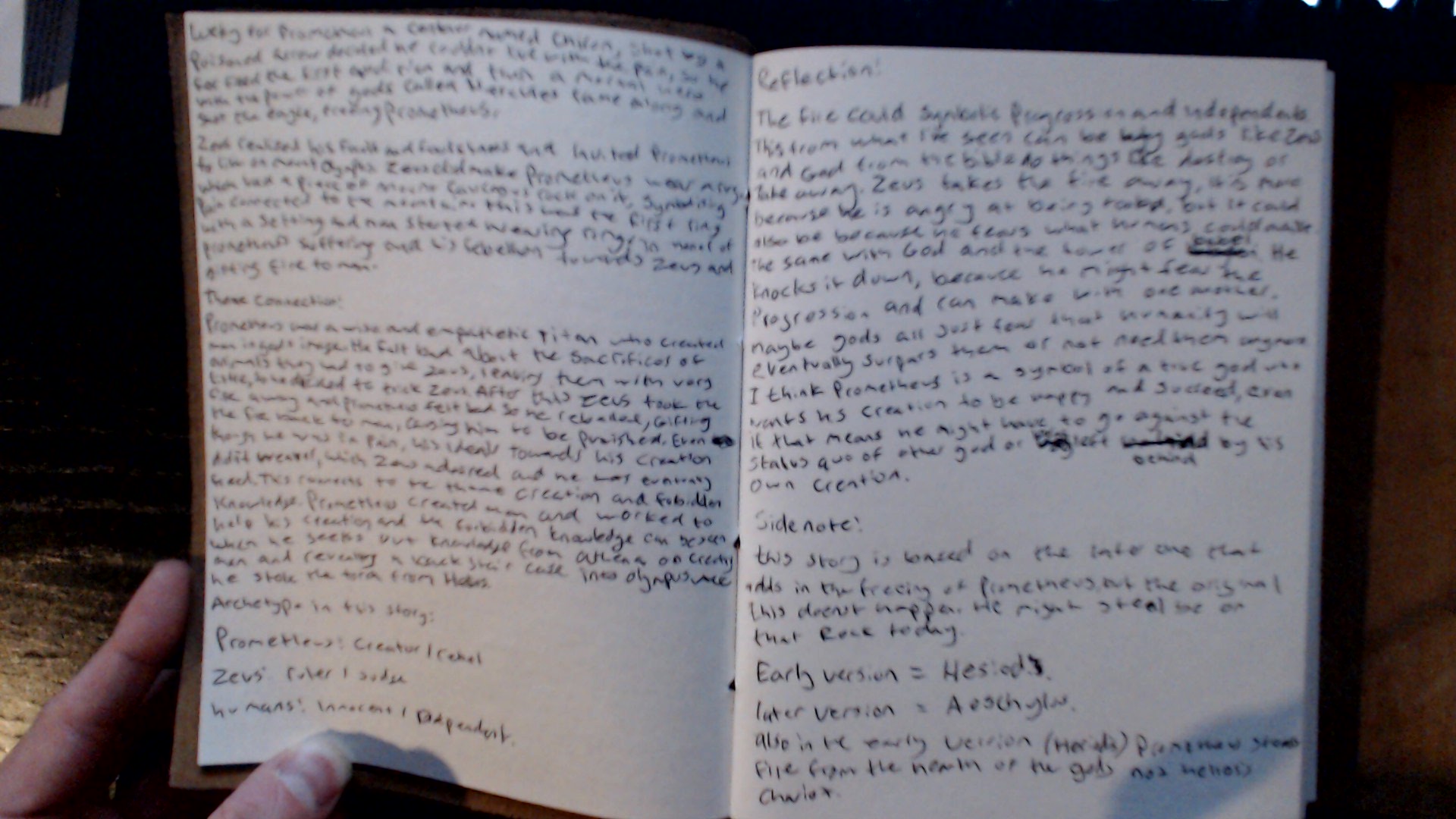
Prometheus' Quill
This practical handwriting style reflects a thoughtful and precise personality, but could benefit from improved spacing and a more relaxed approach.
The handwriting leans towards a functional style, prioritising legibility over artistic flair. The letter formation is generally consistent, though there are some variations in size and slant. Note the somewhat loopy 'p' in "Prometheus", and the distinct separation of letters within words, for example, the phrase "This comes to the thane". Overall, the writing appears somewhat cramped, suggesting a need for more space and freedom of expression.
This handwriting style suggests a thoughtful and practical nature. The writer likely values clarity and precision in their communication, and prefers to convey information in a straightforward manner. The somewhat compressed nature of the writing might also indicate a tendency towards introversion, or a preference for focused, individual work. There's a hint of rebelliousness too, in the way some letters break free from conventional forms.
To improve the handwriting, consider practicing letter spacing and allowing for more space between words. Experimenting with different pen grips and paper types could also help to increase comfort and fluency. Most importantly, try to relax and enjoy the process of writing – let your personality shine through on the page!
Legibility
Expressiveness
Consistency
Overall
Leaderboard for Monday, 13 October 2025
| 1 | The Pragmatic Planner |
72
|
| 2 | The Environmentalist's Elegant Cursive |
71
|
| 3 | The Poet's Quill |
71
|
| 4 | The Population Pyramids Analyst |
71
|
| 5 | The Pragmatic Planner |
70
|
| 6 | The Upright Citizen |
68
|
| 7 | The Pragmatic Penman |
68
|
| 8 | The Cartographer's Quill |
66
|
| 9 | Prometheus' Quill |
65
|
| 10 | The Fire Bringer's Italic |
65
|
| 11 | The Analytical Thinker |
64
|
| 12 | The Pensive Professor |
63
|
| 13 | The Pragmatic Note-Taker |
61
|
| 14 | The Flowing Font |
61
|
| 15 | The Practical Student |
61
|
| 16 | The Ornate Innovator |
61
|
| 17 | The Elegant Upright |
60
|
| 18 | The Mathematical Muse |
60
|
| 19 | The Looping Dreamer |
59
|
| 20 | The Academic's Scratchpad |
58
|
| 21 | The Diligent Student |
58
|
| 22 | The Coastal Chronicler |
58
|
| 23 | The Diligent Experimenter |
57
|
| 24 | The Navigator's Log |
57
|
| 25 | The Egalitarian Dreamer |
57
|
| 26 | The Navigator's Log |
56
|
| 27 | The Mythic Muser |
56
|
| 28 | The Cursive Cartographer |
56
|
| 29 | The Silent Sufferer |
55
|
| 30 | The Upright Penman |
54
|