Rate my handwriting

✨ Upload a sample of your handwriting, and our 🤖 AI will give you
the scoop on
what's awesome
and what could use a
little improving.
It's just for fun - and totally free! Try now 🚀
(You can also check out today's 👑 Leaderboard 👇)
The Diligent Documenter
The handwriting displays traits of conscientiousness and attention to detail, but can be improved through consistent slant and letter height practice. The style balances control and personal expression, leading to a neat and legible result.
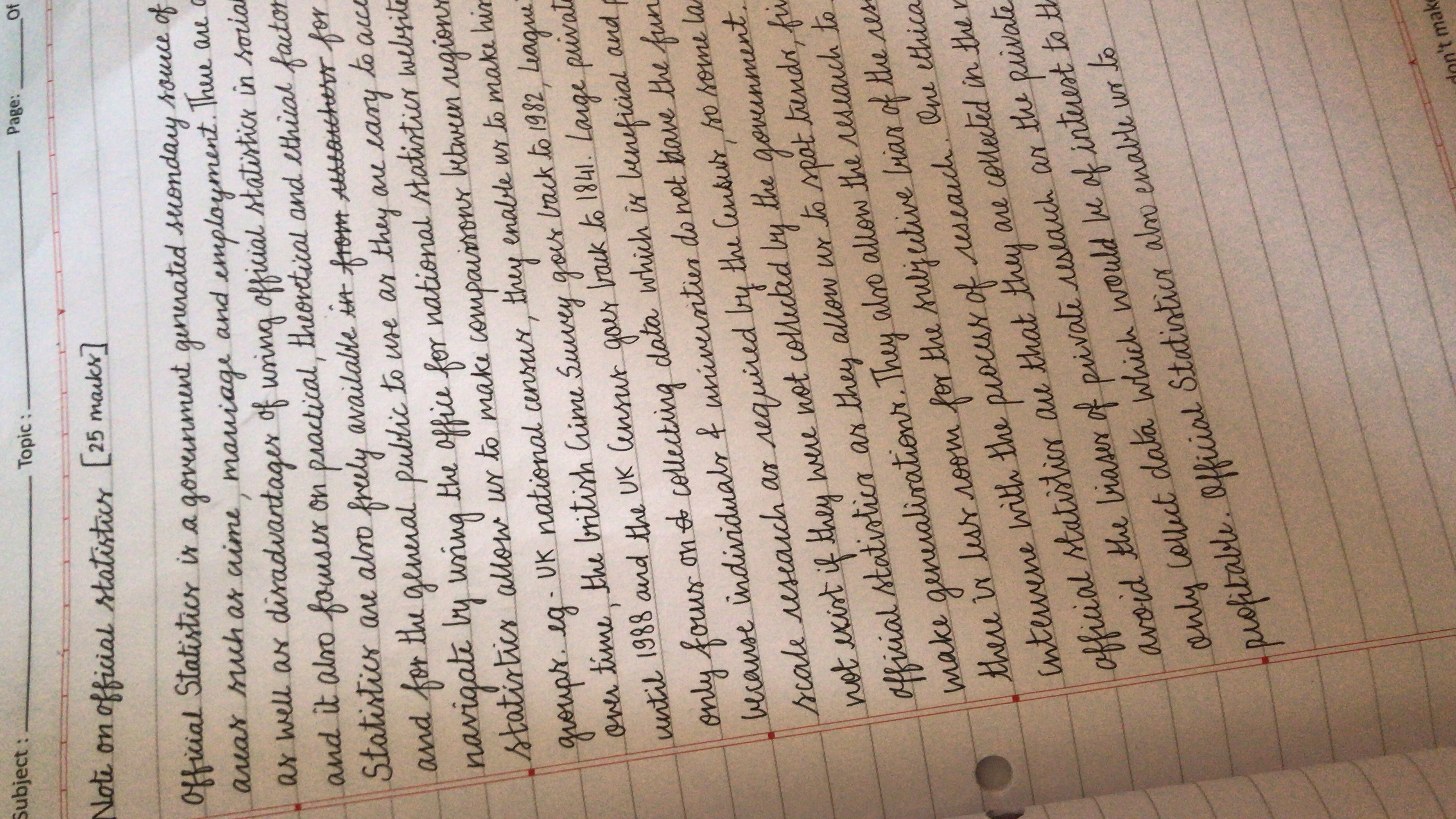
The handwriting style is characterized by its cursive nature, with loops and curves connecting most letters within words. The writing leans slightly to the right, and there is a degree of uniformity in letter height, especially in the body of the text. Ascenders and descenders are present but not overly exaggerated. The spacing between words is generally consistent, contributing to overall legibility. The 'f' in 'official' and 'statistics' is often written with a distinctive loop. There's an attempt at neatness, with consistent baseline adherence. Overall, it is a legible and relatively uniform script.
Based on this handwriting, it's plausible to suggest traits of conscientiousness and attention to detail. The consistency in letter formation and spacing may indicate a desire for order and clarity. The slight right slant suggests a forward-thinking and perhaps sociable disposition. The controlled nature of the handwriting might imply a person who is thoughtful and deliberate in their actions and decisions. There is a good balance between expressiveness and control, suggesting a person who values both structure and personal expression.
To further enhance the handwriting, consider practicing maintaining a consistent slant throughout the text. Focus on the uniformity of letter height, especially with lowercase letters. Paying attention to the formation of individual letters, like the 's', can improve overall clarity. While the handwriting is legible, striving for more defined letterforms could enhance its aesthetic appeal. Experimenting with slightly more spacing between words could also contribute to improved readability.
Legibility
Expressiveness
Consistency
Overall
Leaderboard for Tuesday, 28 October 2025
| 1 | The Calligrapher |
83
|
| 2 | The Elegant Calligrapher |
82
|
| 3 | Flourishing Calligrapher |
77
|
| 4 | The Flowing Stream |
74
|
| 5 | The Fluid Calligrapher |
71
|
| 6 | The Student's Lament |
70
|
| 7 | The Inspirational Calligrapher |
70
|
| 8 | The Jolly Optimist |
68
|
| 9 | The Pragmatic Pupil |
68
|
| 10 | The Flourishing Individual |
68
|
| 11 | The Mario Manifesto |
68
|
| 12 | The Reflective Student |
67
|
| 13 | The Considerate Soul |
67
|
| 14 | The Diligent Calligrapher |
67
|
| 15 | The Perfectionist's Primer |
67
|
| 16 | The Divine Calligrapher |
66
|
| 17 | The Elegant Calligrapher |
66
|
| 18 | The Concerned Guardian |
65
|
| 19 | The Pharmacist's Note |
65
|
| 20 | The Advocate's Quill |
65
|
| 21 | The Analytical Alchemist |
65
|
| 22 | The Upright Pen |
65
|
| 23 | The Historian's Hand |
64
|
| 24 | The Gridiron Enthusiast |
63
|
| 25 | The Diligent Diarist |
63
|
| 26 | The Educated Executive |
63
|
| 27 | The Loopy Dreamer |
62
|
| 28 | The Aquatic Caller |
62
|
| 29 | The Forthright Font |
61
|
| 30 | The Elegant Elocutionist |
61
|