Rate my handwriting

✨ Upload a sample of your handwriting, and our 🤖 AI will give you
the scoop on
what's awesome
and what could use a
little improving.
It's just for fun - and totally free! Try now 🚀
(You can also check out today's 👑 Leaderboard 👇)
The Dreamer's Quill
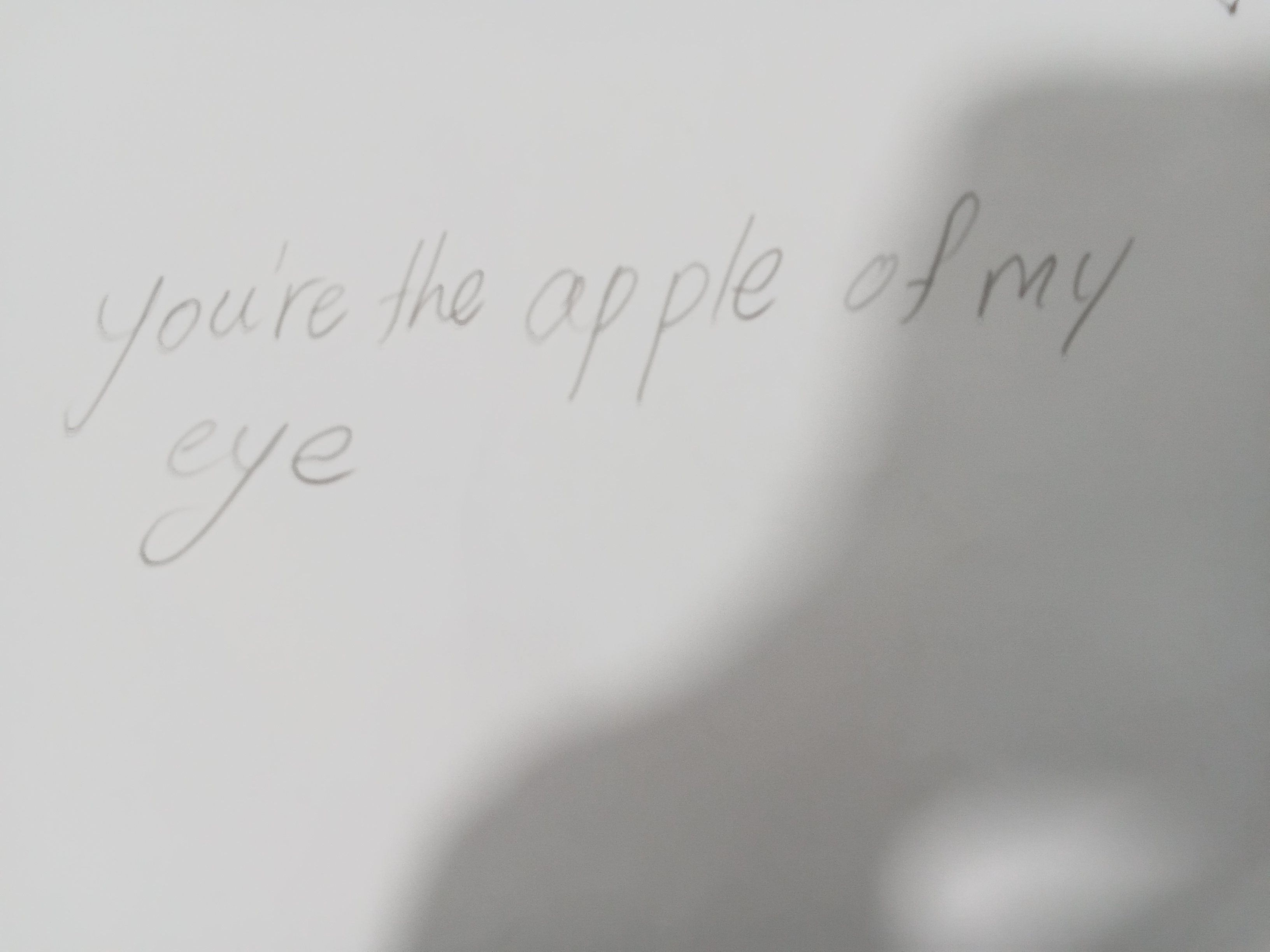
This handwriting suggests a sensitive and imaginative individual with a gentle approach to life, but greater consistency in letter formation and pressure would improve legibility.
The handwriting sample exhibits a delicate, almost ethereal quality. The light pressure used in forming the letters gives them a faded appearance, as if they might disappear at any moment. The script is cursive, with connections between letters, although these connections are not always consistent, leading to a slightly disjointed flow. The rounded shapes of letters like 'o' and 'e' contribute to a soft and gentle aesthetic. There's a slight forward slant, suggesting a sense of forward momentum, but the overall impression is one of lightness and fragility.
Based on this handwriting, it's possible the writer possesses a sensitive and introspective nature. The light pressure and delicate strokes might indicate a gentle and empathetic personality, someone who is thoughtful and considerate of others. The slight inconsistency in the letter connections could suggest a certain level of adaptability, but also perhaps a tendency to be easily distracted or influenced by external factors. There's a dreamy, almost whimsical quality to the writing that hints at a rich inner world and a strong imagination.
To improve the handwriting, focusing on consistent pressure and letter formation could bring greater clarity and definition to the script. Practicing connecting letters more smoothly would enhance the flow and legibility. Experimenting with slightly bolder strokes might also add a sense of confidence and assertiveness to the overall impression. Consider using lined paper as well to help you practice uniformity in letter sizing.
Legibility
Expressiveness
Consistency
Overall
Leaderboard for Tuesday, 28 October 2025
| 31 | The Forthright Font |
61
|
| 32 | The Pragmatic Pen |
61
|
| 33 | The Perpetual Cycler |
60
|
| 34 | The Budding Pianist's Plea |
60
|
| 35 | The Elegant Penman |
60
|
| 36 | The Flowing Pen |
60
|
| 37 | The Flourishing One |
59
|
| 38 | Angelic Impressions |
59
|
| 39 | The Casual Communicator |
59
|
| 40 | The Diligent Storyteller |
58
|
| 41 | The Analytical Artisan |
58
|
| 42 | The Furious Finisher |
58
|
| 43 | The Mythical Typewriter |
57
|
| 44 | The Flowing Pen |
57
|
| 45 | The Elegant Optimist |
56
|
| 46 | The Peaceful Warrior |
56
|
| 47 | The Dreamer's Quill |
56
|
| 48 | The Deliberate Doodler |
56
|
| 49 | The Energetic Note-Taker |
55
|
| 50 | The Optimistic Brushstroke |
54
|
| 51 | The Budding Scholar |
54
|
| 52 | The Serene Hand |
53
|
| 53 | The Fluid Minimalist |
53
|
| 54 | The Pragmatic Note-Taker |
53
|
| 55 | The Official's Elegant Cursive |
53
|
| 56 | The Pragmatic Pen |
53
|
| 57 | The Bold Capitalist |
52
|
| 58 | The Diligent Student |
52
|
| 59 | The Historian's Quill |
52
|
| 60 | The Dutiful Student |
52
|