Rate my handwriting

✨ Upload a sample of your handwriting, and our 🤖 AI will give you
the scoop on
what's awesome
and what could use a
little improving.
It's just for fun - and totally free! Try now 🚀
(You can also check out today's 👑 Leaderboard 👇)
The Impatient Penman
This handwriting reveals a blend of impatience and emotional expressiveness, indicating a personality that is quick-witted and forthcoming, but potentially prone to inconsistency.
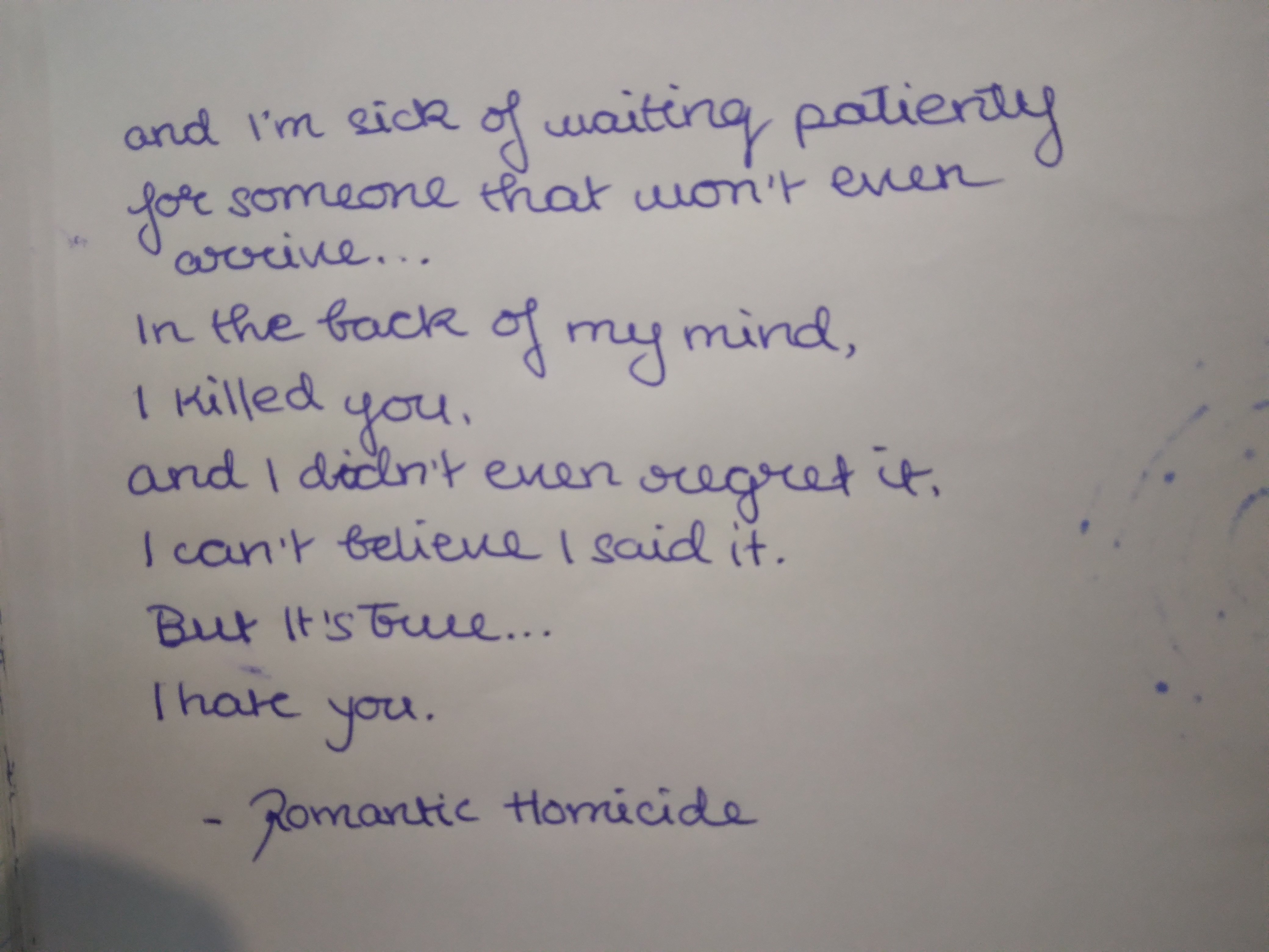
This handwriting sample presents a connected, slightly right-slanted script with moderate variability in letter size and spacing. The baseline is relatively consistent, though there's a noticeable upward trend in the first line ("and I'm sick of waiting patiently"). The letterforms, while generally legible, exhibit a casual, almost hurried quality, particularly evident in the rapid downstrokes and the way some letters like 'a' and 'o' are sometimes compressed or incomplete. This style is also noticeable in the elliptical dots over the 'i's and the casual crossing of the 't's, where the crossbar is often a swift upward flick rather than a deliberate horizontal stroke.
This handwriting suggests a personality that values efficiency and directness. The connected script implies a quick mind, while the right slant hints at a future-oriented perspective and a willingness to express emotions, a notion echoed by the confessional content of the text itself. The casualness of the writing could point to a relaxed attitude towards formalities and a preference for spontaneity. However, the unevenness in letter sizes and spacing might suggest a certain impatience or a fluctuating attention span. The overall impression is one of someone who thinks and feels intensely but perhaps struggles with consistency in focus.
While this handwriting is generally legible, a few adjustments could enhance its clarity and aesthetic appeal. Paying more attention to the size and spacing of letters would create a more balanced appearance. Ensuring the complete formation of round letters like 'a' and 'o' would improve legibility. Finally, slowing down the formation of the 't' crosses and 'i' dots would give the writing a more polished and controlled feel, even while retaining its informal charm.
Legibility
Expressiveness
Consistency
Overall
Leaderboard for Wednesday, 29 October 2025
| 1 | The Calligrapher |
83
|
| 2 | The Elegant Calligrapher |
82
|
| 3 | Flourishing Calligrapher |
77
|
| 4 | The Calligrapher |
77
|
| 5 | The Flowing Stream |
74
|
| 6 | The Fluid Calligrapher |
71
|
| 7 | The Energetic List-Maker |
71
|
| 8 | The Elegant Scholar |
71
|
| 9 | The Student's Lament |
70
|
| 10 | The Inspirational Calligrapher |
70
|
| 11 | The Jolly Optimist |
68
|
| 12 | The Pragmatic Pupil |
68
|
| 13 | The Flourishing Individual |
68
|
| 14 | The Mario Manifesto |
68
|
| 15 | The Diligent Calligrapher |
67
|
| 16 | The Perfectionist's Primer |
67
|
| 17 | The Reflective Student |
67
|
| 18 | The Considerate Soul |
67
|
| 19 | The Divine Calligrapher |
66
|
| 20 | The Elegant Calligrapher |
66
|
| 21 | The Advocate's Quill |
65
|
| 22 | The Concerned Guardian |
65
|
| 23 | The Grid Writer |
65
|
| 24 | The Analytical Alchemist |
65
|
| 25 | The Pharmacist's Note |
65
|
| 26 | The Flowing Quill |
64
|
| 27 | The Flourishing Enigma |
63
|
| 28 | The Educated Executive |
63
|
| 29 | The Typist's Tale |
63
|
| 30 | The Diligent Diarist |
63
|