Rate my handwriting

✨ Upload a sample of your handwriting, and our 🤖 AI will give you
the scoop on
what's awesome
and what could use a
little improving.
It's just for fun - and totally free! Try now 🚀
(You can also check out today's 👑 Leaderboard 👇)
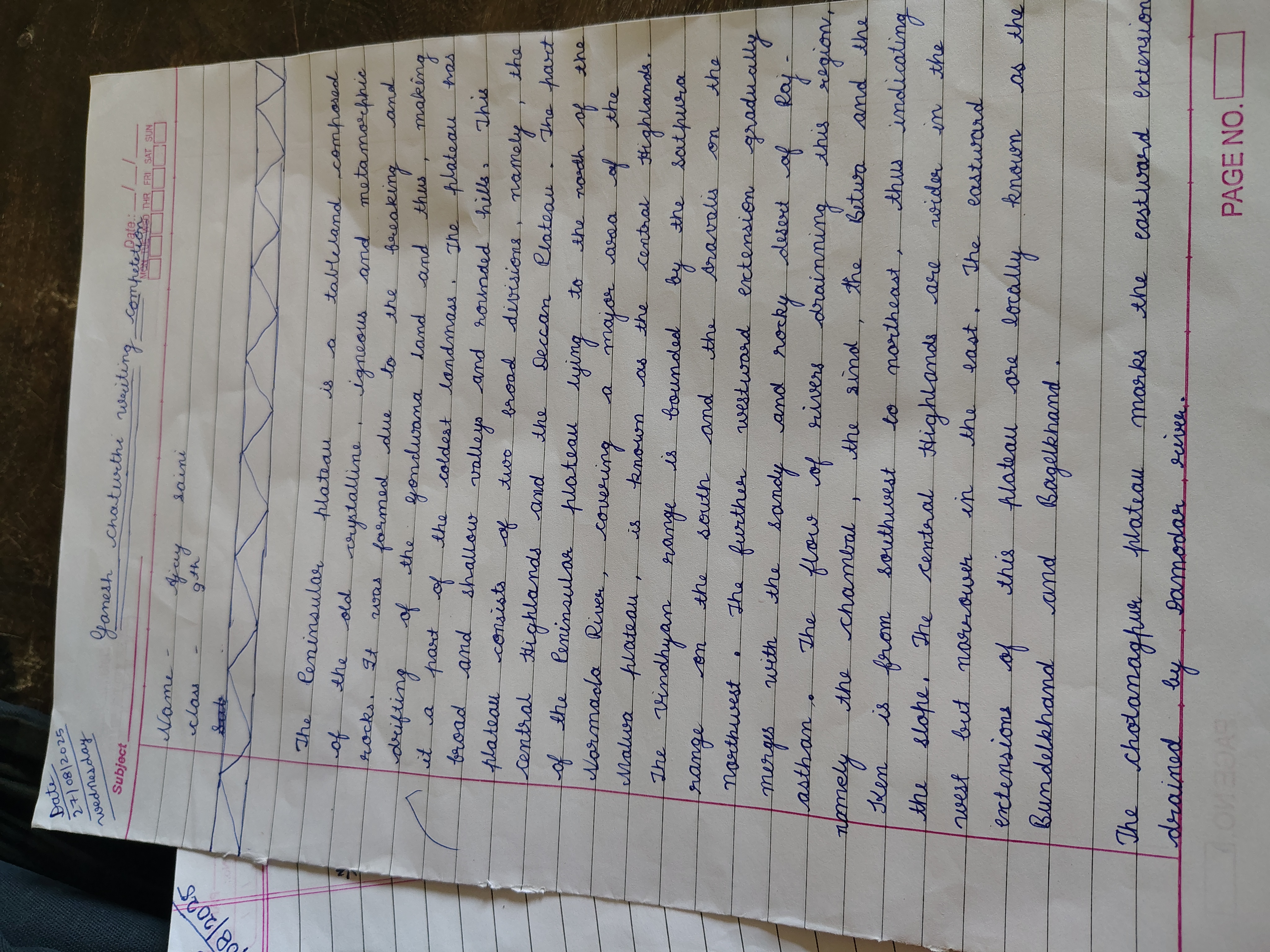
The Crystalline Geographer
This handwriting reflects an organized and forward-thinking personality, blending practicality with creative expression. Smoother letter transitions and consistent letter height could further enhance its visual appeal.
The handwriting style leans towards neatness, with a consistent slant to the right, which can be observed across the text, for example, in words like "crystalline", "igneous", and "metamorphic". The letter formation is generally well-defined, making the text quite legible, although some connections between letters are slightly angular rather than smoothly cursive. The size of the letters is fairly uniform, contributing to an overall organized appearance. The spacing between words is adequate, avoiding crowding and further aiding readability. There is evidence of some embellishment in the capital letters in words like 'The', and 'Central', which have a certain elegance. The use of neat underlines to separate different pieces of information demonstrates attention to detail.
This handwriting suggests a personality that values clarity and organization. The rightward slant often indicates a forward-thinking and sociable nature, with an inclination towards engagement with the world. The consistent letter formation and spacing reveal a methodical and conscientious approach to tasks. The added embellishments point to a creative flair and a desire to present information in an aesthetically pleasing manner. Overall, this individual likely possesses a blend of practicality and artistic expression.
To further refine this handwriting, focusing on smoother transitions between letters could enhance the cursive flow and make the writing even more visually appealing. Paying attention to the consistency of letter height, particularly in lowercase letters, could further improve uniformity. Experimenting with varying the pressure applied to the pen could introduce more dynamic strokes and add character to the handwriting.
Legibility
Expressiveness
Consistency
Overall
Leaderboard for Sunday, 26 October 2025
| 31 | Zen Strokes |
60
|
| 32 | The Precise Mathematician |
59
|
| 33 | The Typist's Touch |
59
|
| 34 | The Elegant Calligrapher |
59
|
| 35 | The Pragmatic Idealist |
59
|
| 36 | The Enthusiastic Connector |
59
|
| 37 | The Signature Stylist |
59
|
| 38 | The Determined Motivator |
58
|
| 39 | The Arithmetician's Quill |
57
|
| 40 | The Atom Alchemist |
57
|
| 41 | The Cipher's Quill |
57
|
| 42 | The Reproductive Note-Taker |
57
|
| 43 | The Scientific Mind |
56
|
| 44 | The Atmospheric Artist |
56
|
| 45 | The Loop-de-Loop Legend |
56
|
| 46 | The Bold Artisan |
55
|
| 47 | The Minimalist |
55
|
| 48 | The Stoic Calligrapher |
54
|
| 49 | The Celestial Stylist |
54
|
| 50 | The Calligrapher's Flourish |
54
|
| 51 | The Diligent Student |
53
|
| 52 | The Flowing River |
53
|
| 53 | The Optimistic Loopist |
51
|
| 54 | The Architect's Alphabet |
51
|
| 55 | The Provocateur's Quill |
51
|
| 56 | The Concentric Contemplator |
51
|
| 57 | The Minimalist's Mark |
43
|