Rate my handwriting

✨ Upload a sample of your handwriting, and our 🤖 AI will give you
the scoop on
what's awesome
and what could use a
little improving.
It's just for fun - and totally free! Try now 🚀
(You can also check out today's 👑 Leaderboard 👇)

The Architect's Sketch
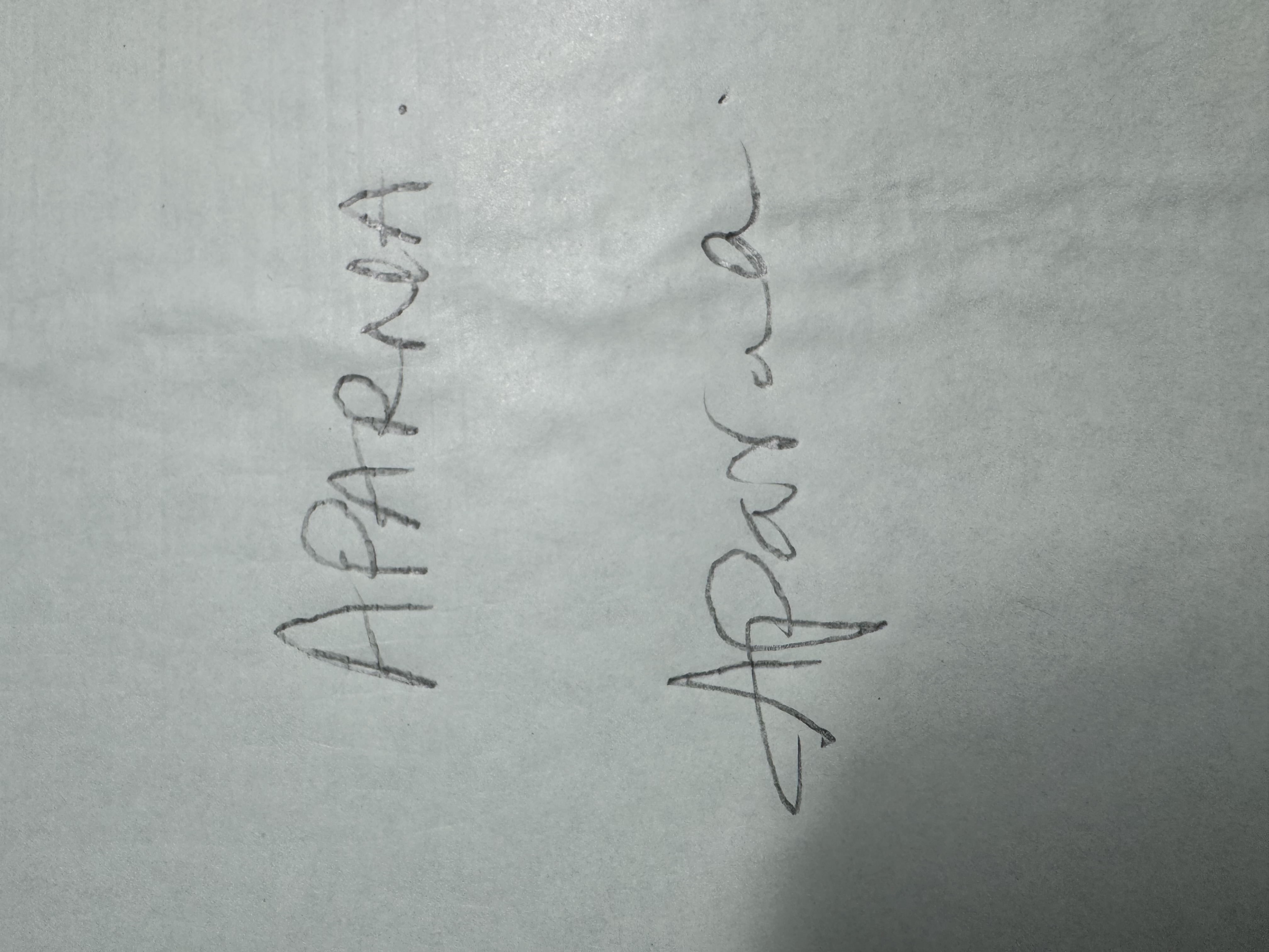
This handwriting suggests a detail-oriented and adaptable individual, but consistency and flow could be improved. Further attention to slant, letter connections, and pressure could lead to more expressive and refined handwriting.
The handwriting presented has a distinctive vertical slant and a generally angular form, especially noticeable in the capital letters such as the 'A' and 'N' in 'APARNA'. There's a mix of print and cursive styles, with some letters distinctly separated while others flow into each other. The pressure applied seems light, resulting in thin strokes that give a delicate appearance to the writing. Overall, the writing appears deliberate but lacks consistent flow, which could suggest a thoughtful and considered approach.
Based on this handwriting, one might infer a personality that is detail-oriented and values precision. The deliberate strokes and angular forms suggest a degree of control and perhaps a methodical nature. The combination of print and cursive could indicate adaptability, blending a structured approach with a more fluid, creative side. The lightness of the strokes might reflect a gentle demeanor, or a sensitive nature.
To improve this handwriting, focusing on achieving a more consistent slant would be beneficial. Practicing letter connections to create a smoother flow can also enhance the overall appearance. Additionally, experimenting with varying pressure could add more depth and character to the writing, making it more dynamic and expressive.
Legibility
Expressiveness
Consistency
Overall
Leaderboard for Friday, 19 September 2025
| 1 | The Considerate Author |
71
|
| 2 | The Import-Export Enthusiast |
67
|
| 3 | The Import Export Mogul |
65
|
| 4 | The Anatomist's Italic |
65
|
| 5 | The Candid Narrator |
65
|
| 6 | The Strategic Hand |
64
|
| 7 | The Conformist's Cursive |
64
|
| 8 | The Curious Narrator |
61
|
| 9 | The Vertical Bard |
61
|
| 10 | The Curious Coder |
61
|
| 11 | The Pragmatic Penman |
60
|
| 12 | The Scholarly Hand |
59
|
| 13 | The Med Scheduler |
59
|
| 14 | The Loopy Luminary |
57
|
| 15 | The Natural Philosopher |
56
|
| 16 | The Architect's Sketch |
55
|
| 17 | The Inventory Keeper |
55
|
| 18 | The Graceful Academic |
52
|
| 19 | The Geographer's Quill |
51
|
| 20 | The Existential Doodler |
51
|
| 21 | The Naturalist's Script |
51
|
| 22 | The Programmer's Quill |
49
|
| 23 | The Inquisitive Explorer |
49
|